exhibit design

floating on a bubble

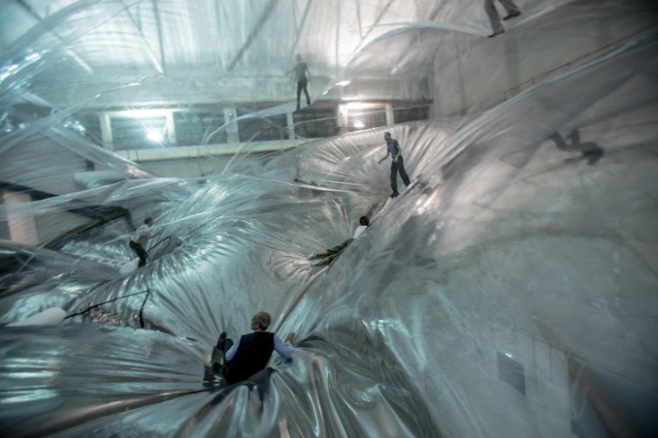
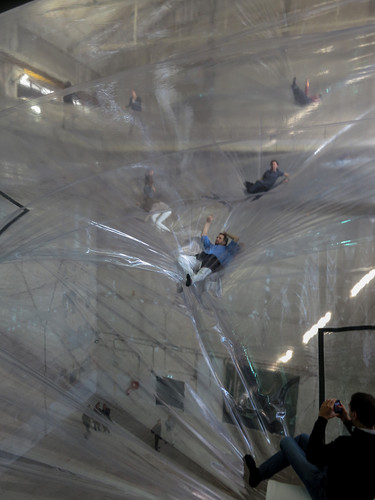
A museum/gallery experience that has been making the rounds a while in the studio is Tomás Saraceno’s On Space Time Foam.


We are excited and intrigued with the opportunity it gives visitors to actually float in or step on a mega scale bubble/foam structure. This certainly fits into our whole fascination with scale.

One can imagine this is what it is like to be miniaturized and walk amongst a soap bubble cluster.

Obviously this experience could be an incredibly powerful additional component to a bubble area.

But more intriguing is to use such an experience to communicate something about materials, or about the very structure of the universe. Just imagine finding this experience in a space or planetarium institution. It would be an exhibit that might change the very nature of what people expect in institutions such as this.

What other connections does it suggest to you?

Posted in: Alchemy Today, Experiences and Museums

Tags: , ,

1 Response

firewall – inspiration weekly

The first thing that has captured our eye this year is this engaging and beautiful piece called Firewall:

It’s both artistic and musical and has an almost magical feel. It certainly would fit into many of the institutions we know. This was created by Aaron Sherwood created in collaboration with Michael Allison.

In addition, the experience has made us “riff” off of this piece for new experiences we might be part of, including:

-          explaining topography

-          exploring earthquakes

-          physically demonstrating sound waves

-          creating an illusionary environment

We would love to hear your ideas!

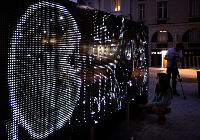
Meanwhile, back in October we were captured by the work of Antonin Fourneau and the Water Light Graffiti system. So now we have both fire and water. We just need to add earth and air and we’ll have the alchemy quattro.


Posted in: Alchemy Today, Experiences and Museums

Tags: , , ,

Leave a comment

Isaac Newton vs. Rube Goldberg – Inspiration for the Holidays

As we are fully in the holiday season, here is a little gift of inspiration.

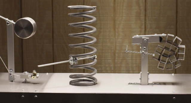
Some of our favorite concepts and experiences – ones that, to us, always reflect a bit of alchemy – are Rube Goldberg devices. We recently came across this latest version by 2D House, a Toronto-based photography studio.

It’s a wonder we don’t see more of these in our museums and science centers. Here’s an idea: We would love to engage with someone on a Rube Goldberg exhibition. Imagine the “tinkering” space that could be added to this type of exhibition.

Lets have a Rube Goldberg movement

We hope you enjoyed this video as much as we did. By the way, want to see more? Take a look here at some of 2D House’s other work inspired by Rube Goldberg.

Happy Holidays for 2012 from alchemy studio

Posted in: Alchemy Today, Experiences and Museums

Tags: , ,

3 Responses

“Maker” Science Spaces

Recently, there has been intense interest in the idea of Tinkering Spaces or Maker Spaces in the museum filed, especially science centers. This interest stems from the success and undeniable energy and innovation occurring at such events as Maker Faires, which we have experienced and attest to from personal visits. These spaces in museums have some characteristics that we have described earlier as “evolving experiences” where activities and content change constantly.  These “maker” spaces often have a workshop-like environment, where the design aesthetic is thought about but intentionally does not looked over-designed. They must certainly be functional for the activities.  Finally, the content tends to focus on technology, engineering to some extent, and often also morphs into art and creative expression.

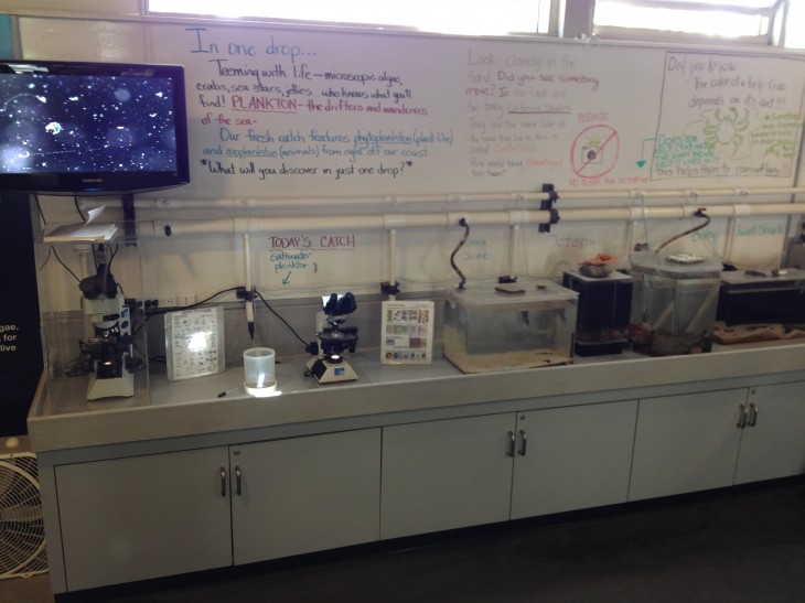
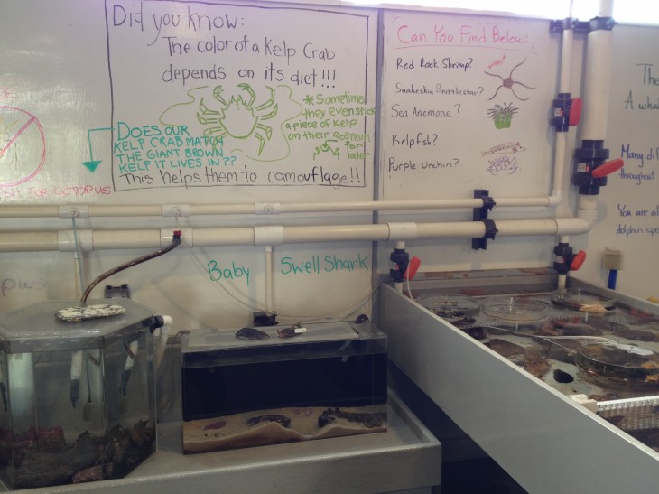
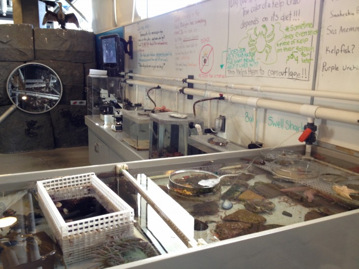
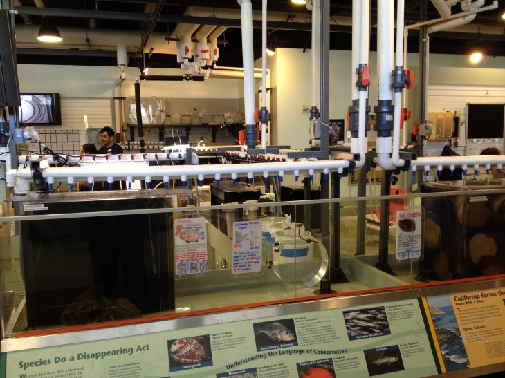
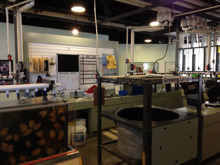
Recently we visited the Cabrillo Marine Aquarium, in San Pedro California and fell in love with several of its spaces. The images below show what we saw there.


Immediately what leapt to mind was these were what we termed “Maker” Science spaces. A “Maker” Science space is focused more on science content than technology but has some of the same characteristics and attributes as the original. Here we were tinkering with biology and marine sciences. There was certainly an authenticity and a reflection of constantly changing content that marks an “evolving experience.”

The use of the dry erase boards, the real tanks, and full expression of operating life support systems to study the wildlife are all part of this approach. Certainly, white PVC piping never looked more purposeful and in keeping with the space’s intent.

This has inspired us here at ALCHEMY studio to wonder how we might create more and design more “Maker” Science spaces. Especially in museums and science centers where there is actual research occurring. We would love to work with institutions interested in “making” this happen. (Sorry for the pun!)

We would love to hear of any other spaces that you feel capture this same quality as a science space. Let us know.

Posted in: Experiences and Museums

Tags: ,

Leave a comment

Inspiration – Water Light Graffiti

Having been a part of doing a digital “graffiti” wall in an earlier project for the Liberty Science Center, this new form of a digital “graffiti” wall that uses water is a new source of inspiration.  This is the Water Light Graffiti system


Check out the video

This project was project done under the Digitalarti Artlab by the artist Antonin Fourneau in Paris.  This graffiti wall uses a large wall of LEDs that are activated by moisture sensitive sensors. Participants can use a variety of tools to participate. We love the way this could add a bit of art/digital to water spaces in museums and science centers.

Part of the Wayne LaBar, ALCHEMY studio inspiration set at the ASTC session “Design Inspiration” being presented Tuesday.

Posted in: Alchemy Today, Experiences and Museums

Tags: , , ,

Leave a comment

web of engagement

Recently, at the Giant Screen Cinema Association conference, we here at ALCHEMY studio were asked to speak on how to maximize the educational impact of giant screen films while still reserving the entertainment aspect of this impressive medium. The thinking we shared is one that we feel is applicable to exhibitions as well as films, since we work in both mediums. While there clearly are differences between large screen films and exhibitions, there are some similarities that tie them together in terms of impact and entertainment.

  1. They both try to be impact-driven as well as meet  leisure time entertainment goals.
  2. They are mass communication mediums – they are for the general public, taken in by large numbers at the same time.
  3. Increasingly, there is a desire by either the medium or the institutions exhibiting these experiences to impact not only  the mass public but some very targeted groups including policy makers, and even those who don’t usually interact with these mediums.
  4. To various degrees, the experience is determined by the designer/producer, not by the visitor/viewer.
  5. And finally, perhaps most importantly, exhibitions and giant screen films are both storytelling mediums.
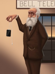
  But in our world these mediums and the stories they tell no longer sit in a vacuum. With the rise of social media and the ever-growing sophistication of the devices that we use while on the move – ipods, smart phones, eyeglass interfaces, etc. – the audience expectations of  who, how , when and with whom interactions occur is changing.   This means that, to be successful in both in impact and storytelling (entertainment):

we as designers and producers must incorporate all mediums – the “web of engagement” – that now surround us.

This clearly comes through in the recent research being done by Latitude Research. We really recommend reading their short summary. Their recent work in the future of storytelling is a clear sign that as we develop our stories in either exhibitions or films, we need to use this web of engagement if we are to meet the desires and the place where our visitors and viewers are. They target four ”I’s” to think about: Immersion- instant access to deeper information, provide context, different viewpoints, heighten the sensory experience, extend the story Interactivity – change the plot, interact with virtual and real characters and ideas, interact with others taking in the story, heighten the sensory experiences Integration – integrate the real/my world into the story, seamless interaction between media, use location, time, environment Impact – empowering action from the audience, self-improvement, commercial and philanthropic All of these require using the ubiquitous web of information and the anytime, anyplace technology.  Imagine these scenarios (taken, in this instance, from upcoming giant screen films):

  • What was/is school like for a Muslim in Jerusalem?
  • Can we direct where the tornado hunters go today?
  • Can you give me live “news updates” on the wildebeest migration?
  • Can we use Kickstarter to start a sequel?
  • When is the cosplay Dragon gala ball across the country?

These are just a few examples of the kinds of things the new generations are asking for from their stories. And, again, it’s not just films on the receiving end of this need – it will include exhibitions and other storytelling mediums (transmedia) as time moves forward.
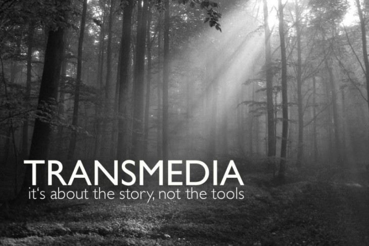
                                                                                                Flow Media

We need to break out of our model of thinking of siloed one media projects when we start on a subject from the beginning.

We should let the story tell us what media to use to create which impacts.  This is the future of film and exhibitions that really make a difference. 

Clearly, as we design experiences, all of us must think across multiple mediums and determine which impacts and what parts of the story should be told where and how. These modes should be synced from the start because our audiences will be looking for that seamless coherence and alignment.

illustration from Latitude
Posted in: Experiences and Museums, Uncategorized

Tags: , , ,

Leave a comment

Fun with scale (part 3) – the city as a canvas

So over the past few weeks there has been another set of playing with scale that caught our eye and perhaps some of this blog’s readers since they may have seen them in person. The examples continue the theme:

The unexpected and almost whimsical use of scale attracts attention, inspires levity and whimsy, and can often bring a point home.

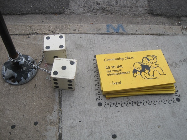
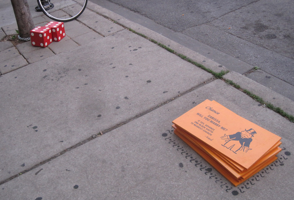
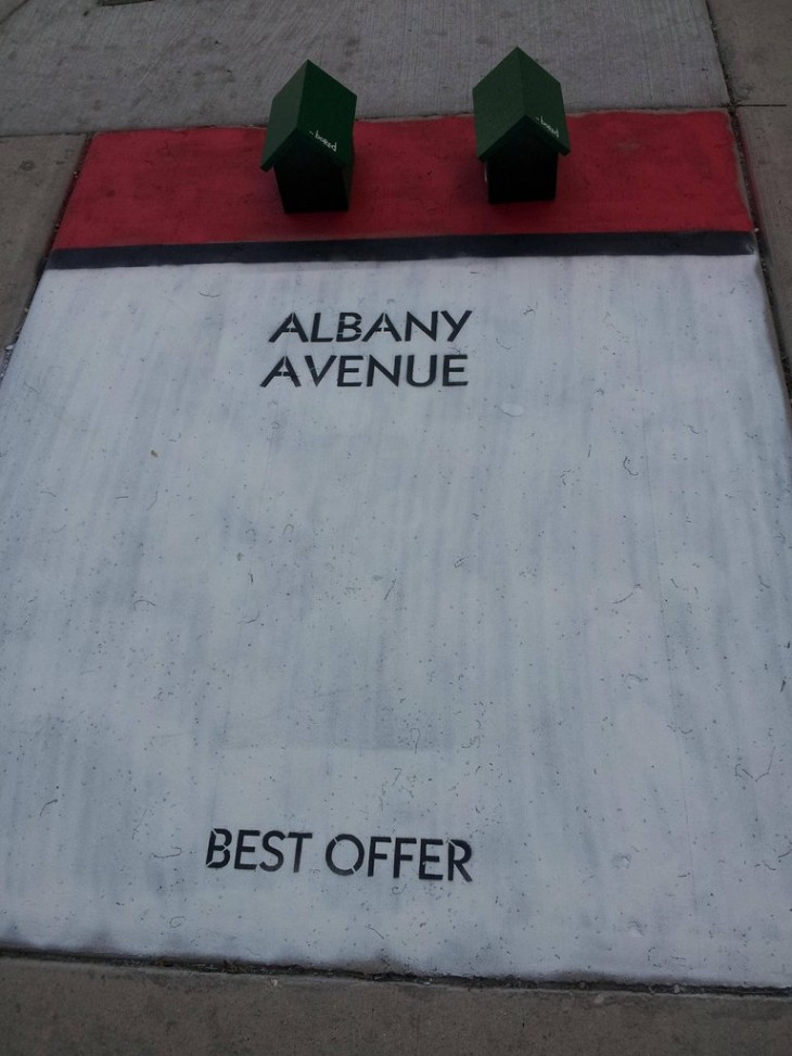
A future blog post will cover the subject of levity but we here at ALCHEMY studio feel that this often an underused tool in our collective experience tool box. The first scale example some readers may have seen in Chicago is by the artist or artists named Bored.  Here are some examples cited by Nate Berg of the Atlantic, several people on Reddit. Check out the messages on the cards!


We would love to see more so please send us links to pics if you have some.

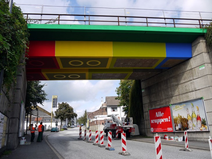
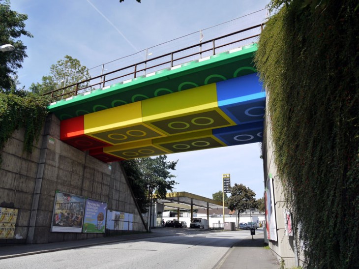
A second is the “lego” work don by Megx. Here using a little paint and imagination a bridge in Wuppertal, Germany is transformed.


Both of these examples suggest also that museums and cultural institutions could possibly extend both brand, experience and a small bit of perhaps a lighthearted aspect of their mission (play, science is cool, arts all around us, etc.) by engaging in imaginative ways with the city canvas.

Posted in: Experiences and Museums

Tags: , , ,

Leave a comment

Inspiration – Vacationing in a design office

Weekend inspiration for the summer. Let’s go camping in a creative/design office! What might that be like? Here you go:


Film  directed by Jerónimo Rocha, shot at Behance.

OK so perhaps our holidays really do mean we need to let work go. Or perhaps our work spaces offer places to get away at the alchemy that occurs at the very edges of our desks. Happy weekend!


Posted in: Alchemy Today

Tags: ,

Leave a comment

UNESTs – UNexpected Encounters with Science and Technology

Recently a couple of things we have run across have energized us about cataloguing, designing, and thinking about a concept we are calling UNEST experiences. UNEST stands for UNexpected Encounters with Science and Technology.

Often some of the most powerful and engaging encounters with science and technology occur through experiences where you weren’t expecting to wrap you head around that.

In exhibition design, presenting the weird, the surprising, the unexpected creates an emotional as well as cognitive disconnect that can spark a memorable/learning/aha! moment.

Encountering such an experience in the regular everyday existence (outside of the “artificial” learning environment of a museum), for example in city or urban life, might in fact heighten the memorable/learning/aha! moment. These are what we are calling UNESTs. One wonders if encountering these might “raise the tide” of public engagement with science and technology. One reason, you don’t choose to go to these – rather they find you!  Because of this, UNESTs possibly reach members of the public who might never choose to visit a museum/science center about sci/tech subjects.

Here are some examples of UNESTs

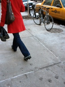
The first is a project by Maskull Lasserre called Outliers. Imagine finding animal footprints in places you least expected.


What might you think? Where might your inquiry take you? Twilight references? Loose zoo animals? By the way WOW! someone should adapt this for all year round fun at nature centers, zoos etc.


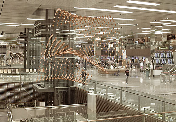
Another is the amazing Kinetic Rain sculpture by ART+COM at Terminal 1 of Changi Airport in Singapore.  Equations, models, nature, beauty all wrapped into one.


Once again, one can imagine conversations discussing how is this done to what it represents, to the beauty of it all. Something we don’t expect to have on a busy travel day going home or heading to a meeting.

Let’s all do our own UNESTs!

One wonders if our work in museum/science centers should  be taken as much as possible “out of the box” of the museum building.  It would be fun to do. Only question is finding the support to do so.


Posted in: Experiences and Museums

Tags: , ,

Leave a comment

Evolving Experiences

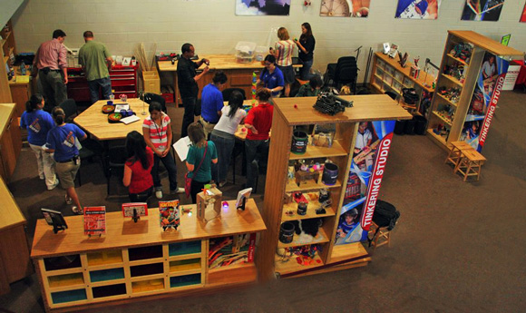
Tinkering Studio – Exploratorium 

In today’s designed world we are surrounded by or immersed in spaces and experiences that have been carefully thought out to the nth degree. An example that we are all familiar with are the “lands” and “kingdoms” one finds in the Disney parks or Universal theme park. In these instances often we enjoy these experiences as we look to be transported to a fictional world and are accepting of this conceit. It is a non-reality that is authentic.

But in our designed world we also find ourselves in real places – coffee shops, exhibitions, restaurants, stores that also attempt to set a place, a location, a time that are special – but often we are struck that these feel fake, inauthentic and we leave dissatisfied. Why?

These thoughts came to mind when recently Colin Raney IDEO commented at the SEGD conference in New York that:

Ever evolving experiences provide authenticity and engagement.

It struck a chord that this phrase may cover many of the most recent experience trends in science centers and museums as well as some of the most popular.

Take for example the rise of Tinkering or “Making” spaces – whether it be Maker’s Faire or Tinkering studio space in museums.  While certainly there are learning impacts that these spaces provide they also seem to be places that people enjoy and find “real.”  Certainly these are spaces whose outcome and experiences are always evolving and changing.

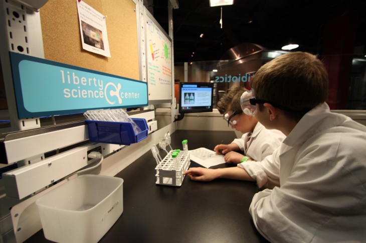
Lab spaces like those at the Science Museum of Minnesota or those that ALCHMEY studio has had experience with at Liberty Science Center and the Tech Museum

Infection Connection Lab – Liberty Science Center

are also popular and once again these spaces change and evolve and have the ability to evolve and adapt.

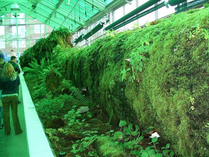
There are other spaces such as these that include merging social media/exhibit spaces and art/science galleries like the Science Gallery in Dublin that come to mind as spaces or experiences that evolve. Additionally spaces that engage the natural world and its constantly changing nature also evolve over time. Parks, sculpture gardens and pieces such as the Neukom Vivarium at the Seattle Museum of Art’s Olympic Sculpture Park.

are examples.

Neukom Vivarium - Olympic Sculpture Park

This leaves some open questions that are worth exploring

-          Can we study and evaluate what experiences are deemed more “authentic.” What makes them so?

-          Do they attract more engagement? Do they have more impact?

-          How about creating a “measurement” of how much an experience can evolve?

If you are interested in joining with ALCHEMY studio in exploring these let us know. Meanwhile we would love to hear of examples you feel match this idea.

Posted in: Experiences and Museums

Tags: , ,

3 Responses