environment

Outside/Breaking the Rules Fun

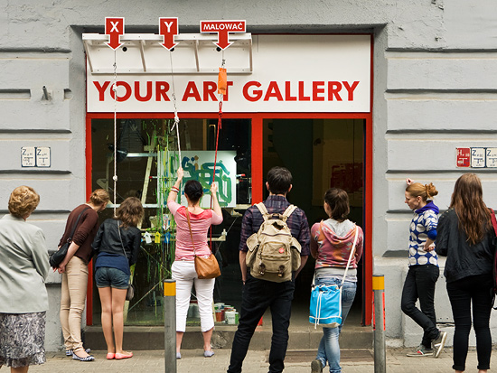
So, summer has arrived here on the northern part of our planet, and this week’s inspiration focuses on experiences that “break the rules. ’’ Here, we explore ideas that allow participants to step outside their normal “roles” or be part of activities not normally open to public participation. The summer connection is that, at times, these activities take us outdoors. First, let’s look at breaking new ground in the participant’s role. Instant Art Career is a  new piece at the Katowice Street Art Festival by the artists niklas roy and  kati hyyppä
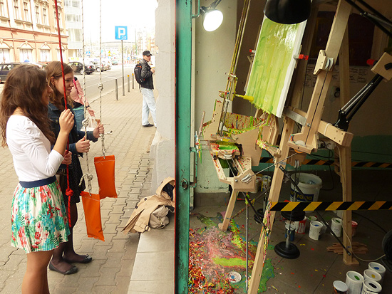
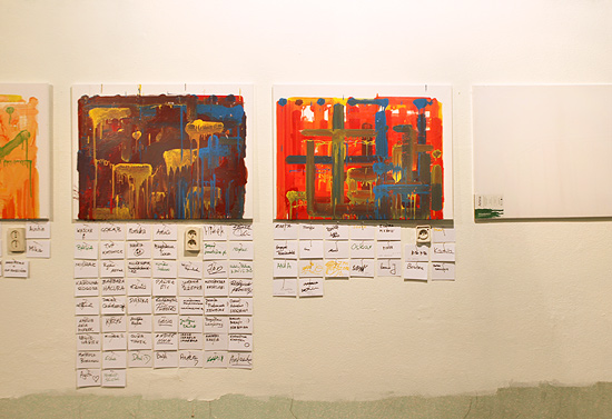
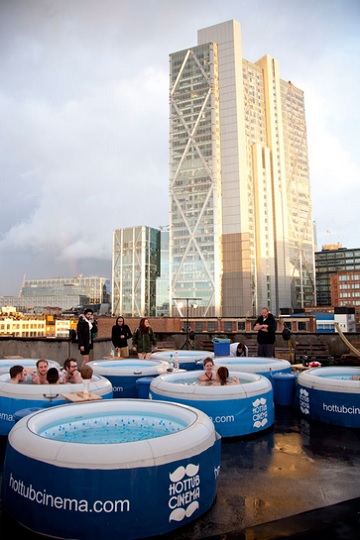
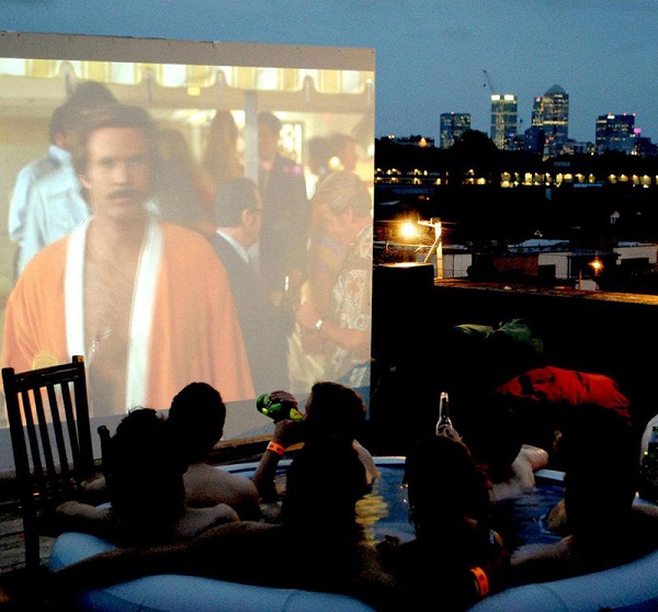
                                                                                                                In this experience, participants stand outside and create a painting using a series of ropes with pulleys attached to a CNC machine. This set-up allows the movement of the ropes and pulleys to define  colors and paint locations. As the website shows, many of these works are created by multiple participants. The second experience challenges our location expectations. While not a typical museum, the new  Hot Tub Cinema looks like a lot of fun!            
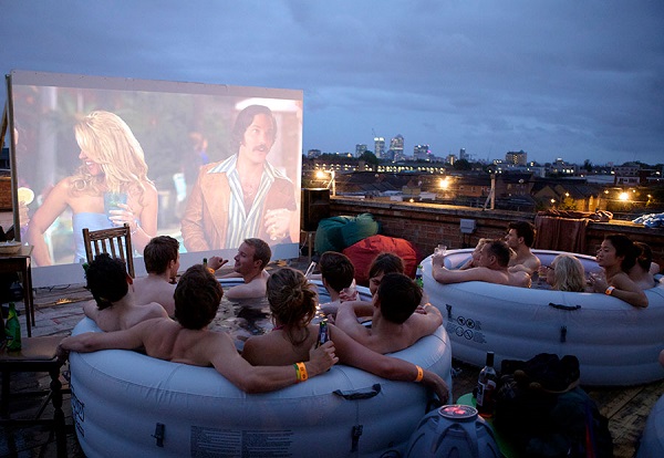


This is an unexpected opportunity to share the experience of watching a film and becoming part of a public party. Looking at the pictures, it’s hard not to want to just “dive” (pardon the pun) into these events. These very engaging examples point to some interesting tools we should keep in our quivers as we design experiences:

-        “Breaking the rules” is inherently engaging, whether it be something not normally done publically or as a group, or where we take on roles

-        Outdoor experiences offer opportunities for group participation and for creating experiences that are greater than the sum of their parts

So, might we take the idea of an instant hot tub party and create an instant science party? Or might we adapt the creative role-play of the painting activity to a science experience? How can you envision using these ideas? Let’s all go outside and break some rules!
Posted in: Experiences and Museums

Tags: ,

Leave a comment

seeking infinity

Here at the studio we still remember playing as a kid inside a store’s changing room where the mirrors on the left and the right were on hinges. This allowed us to turn them to face each other and we could step between them and see ourselves disappear into what seemed like infinity.

We as humans seem to have an affinity to peer into infinity.

Thinking about this the incredible appeal of peering into the infinite is one that is filled with mystery, the unknown, a world beyond our own. It taps into the human desire to explore and understand.

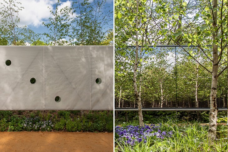
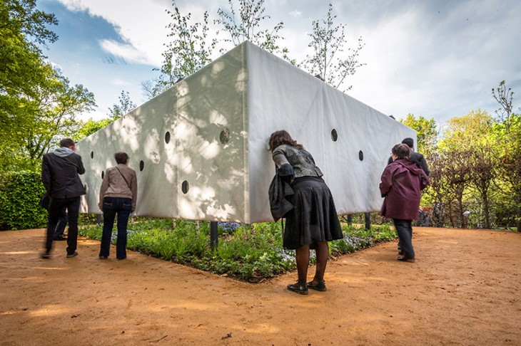
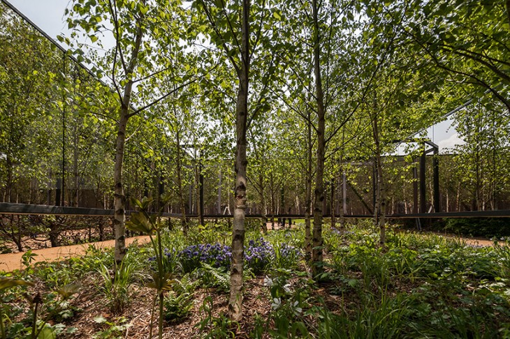
Several recent installations allows us to explore this both as the participant and the observer. As observer one can explore the infinite with “Outside In” a work for the 22nd International Garden Festival of Chaumont Sur Loire, France created by architects Meir Lobaton corona and Ulli Heckmann.


This work allows us to look into an infinite garden. It would seem that in this piece the longing of wanting to explore the space might be even more pronounced since one is actually outside and “just outside” too.

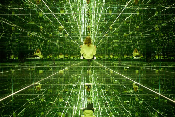
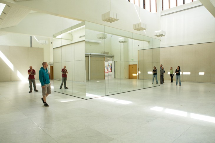
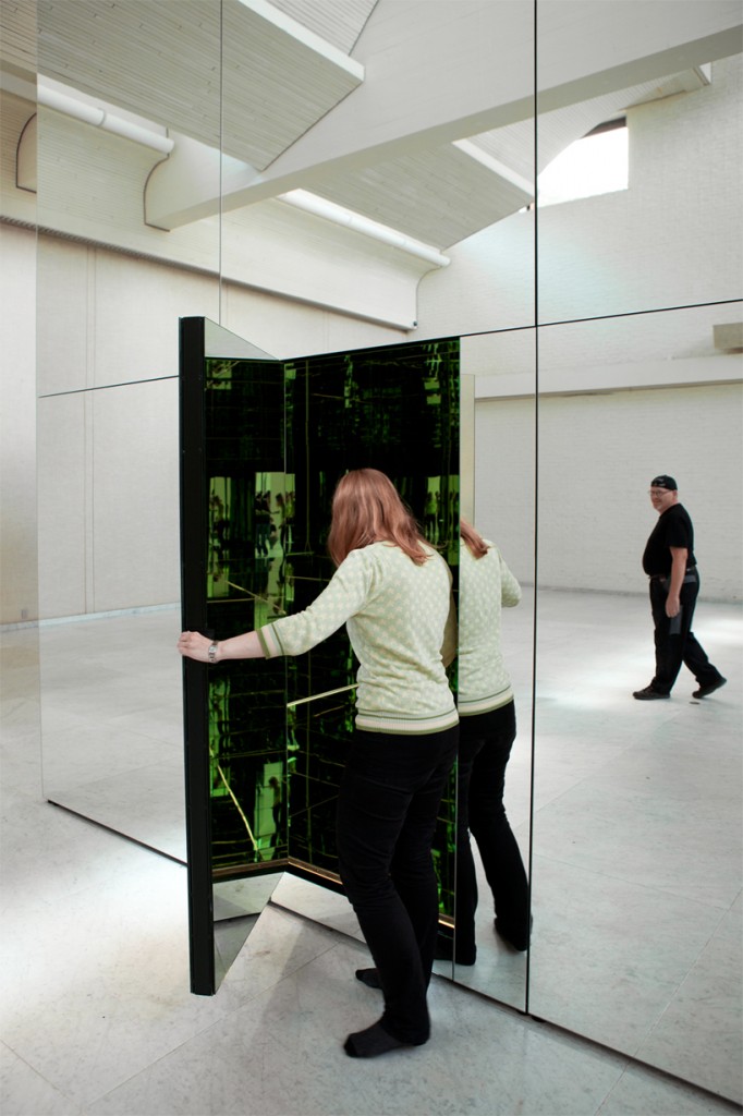
The second experience is “The Phoenix Is Closer Than It Appears” created by Thilo Frank. In this piece the observer is at the core (literally) and part of the infinity.

The work actually has two points of view. Here installed at the Museum of Modern Art, Aalborg, Denmark, the outside blends perfectly into the space creating an almost hidden installation.

The second way in which it works is to enter inside where you find yourself at the center of infinity where you are invited to swing.

Here at the studio we are struck by the way these seem to tap into some primal desire of humans to look into infinity and the emotions that evoke. The playfulness, mystery, seeking understanding, are all very powerful.

In creating exhibition design as much as we look for education learning impacts tied to curriculum in today’s modern museum thinking – we strongly urge that we should set emotions such as these at the core of what we are designing as well.  While there may in fact need to be more didactic exhibits, paired with experiences that touch these emotional goals, an exhibition can create a much more memorable and impactful outcome. Much like the simple experiences of that infinity we found in the store’s changing room.


Posted in: Experiences and Museums

Tags: , , , ,

1 Response

Engaging Spaces

One of the aspects of exhibition design that we enjoy doing is not only creating engaging exhibit experiences but also creating engaging experience spaces.

What is wonderful is when the space that the exhibits are in is an exhibit itself.

We’ve recently run across two recent installations that capture that feeling and would work well in several institutions we can think of or for several topics we have explored as exhibitions.

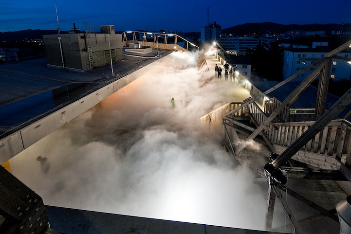
The first is Cloud Parking by Fujiko Nakaya

This piece done in Linz, Austria allowed experiencers to get the view of feeling of walking amongst the clouds that might fill the sky. The installation uses high pressure pumps and fog nozzles.  What a special experience this might be to have as part of an institution from a aviation museum, children’s museum to an exhibition on weather, birds or even dreaming.

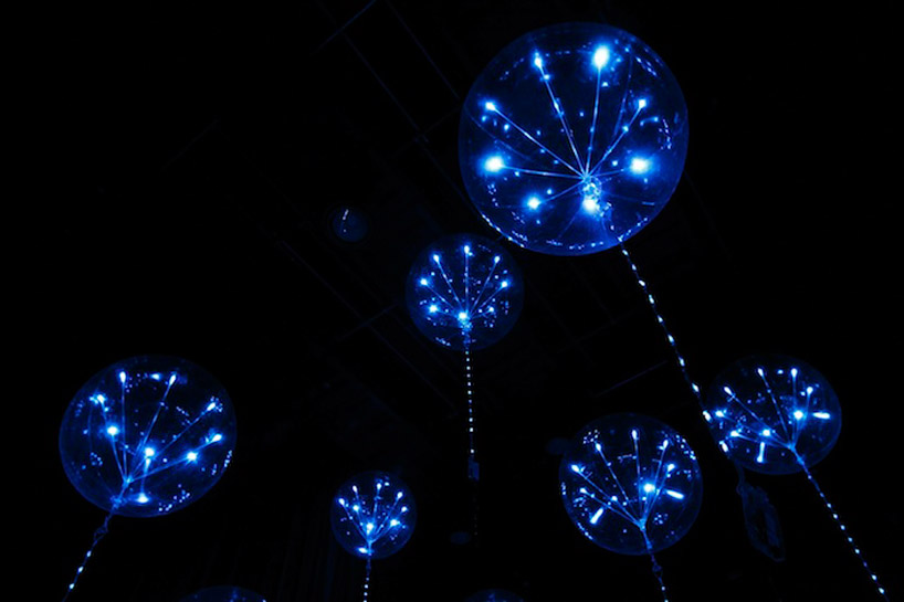
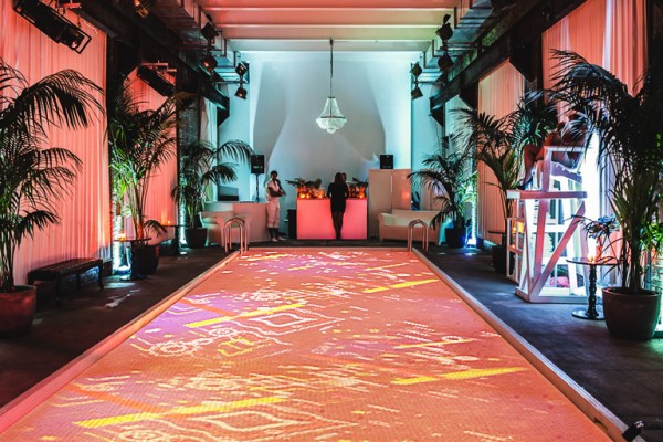
The second piece is “fluff” an interactive lighting system from the Japanese design studio tangent.


This interactive lighting display made from balloons (1.1 meters in diameter) and LEDs changes its appearance according to sound and video displays. What immediately came to mind was to use this to create the feeling of being beneath the waves surrounded by “jellies” or as an evocative space to discuss the idea of different forms of life such as what might evolve on a gas giant.

Wouldn’t it be wonderful if our field’s exhibition spaces would focus as much on this type of inspiration as they often do on curricula or  education.


Posted in: Experiences and Museums

Tags: , , , ,

1 Response

reshaping our planet

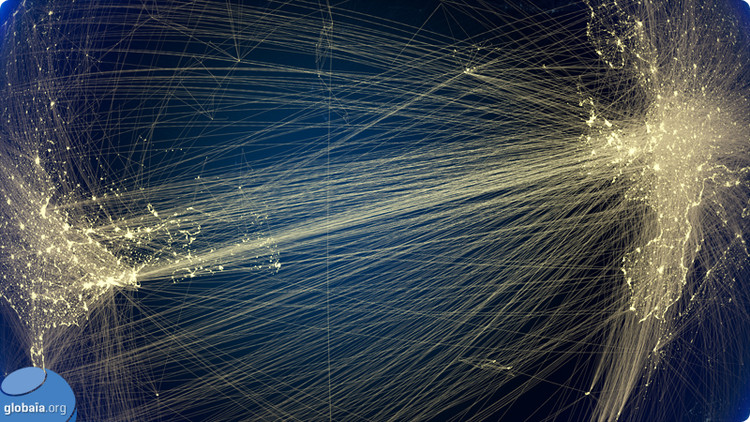
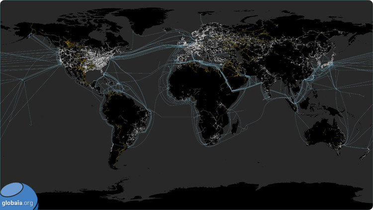
One of the projects we are working on here at the studio is a film that will explore engineering and the amazing achievements we can as a species succeed at, as well as the challenges that we face from what we do and the solutions engineering may provide. As part of our work we are always on the look for great ways to visualize what we now call the Anthropocene epoch. The geologic age of human influence. Here is a dramatic one  ’Welcome to the Anthropocene’

This is the work of Globaia, a organization that attempts to educate people on understanding the modern world and the issues our environment and planet faces. Here are some stills

An image dramatically showing how our civilization networks (transportaion, power, cities)  fade into the norther wilds of Canada.


The transportation, power and cities of Europe and Asia


Flight between North America and Europe


A map of energy: pipelines are orange, power lines are white, underwater cables are blue


These images present the yin and yang of our civilization.


The way we are becoming a networked planet and species and at the same time how we  are impacting every single square mile of the planet. Too often the conversations that seem to revolve around the issues we face are one sided. Rather we look at these amazing images and see on one hand the amazing achievement of how we can connect ourselves both physically and electronically sharing information and materials, building and creating incredible works. We also see the issues and impacts that this endeavor makes on our planet and realize that the price we are paying is at times too much for our world to sustain. Only together with our ingenuity and innovation can we improve on what will always be an eternal dilemma.

Feel free to send us any links that you know of or come across that depict the two sides of the coin that these images show.

Posted in: Experiences and Museums

Tags: , , , ,

7 Responses

3D Projections

Amazing 3D projection projects – Moving from informational to expression.

In the museum and experience context, the idea of projection to convey information  is a common occurrence.  Here at the studio we are looking to explore how the projection itself  - not the content of the projection – can be used to excite, awe, and engage the public in ways maybe no one thought it could. You might say these are “engagement screens.”

On side of the scale, where the projection is “complete” but the screen invites interactivity, is this novel and cool “water” projection by art studio Red Paper Heart.

Wow made us want to dive right in.

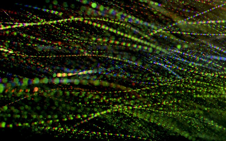
On the opposite side of the spectrum, the screen’s inability to express the complete image is the beauty and allure of this experiment that Brian Mafftt did during the recent “Nemo” winter storm. Funny, in reality it also uses “water” like the above example – just in a different form.


In fact, you can tell it’s a DLP projector by the red, green and blue “sparkles” – a wonderful way of showing how a projection image is composed of these colors. You can see some of his still images here.


Now, of course, we have seen images projected on fog and images made of water, but there is something compelling about both of these and the fact that the “screen” itself can be the power of a projected experience versus the image projected. Obviously, a powerful experience would be to marry both of them. If you have other examples or ideas, please feel free to share them here.

Posted in: Alchemy Today, Experiences and Museums

Tags: , , ,

Leave a comment

Fun with scale (part 3) – the city as a canvas

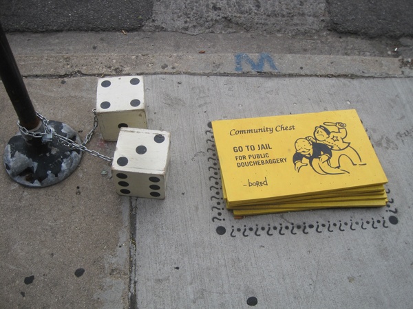
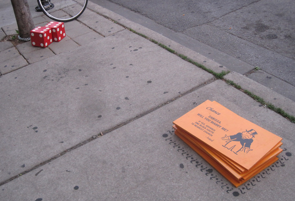
So over the past few weeks there has been another set of playing with scale that caught our eye and perhaps some of this blog’s readers since they may have seen them in person. The examples continue the theme:

The unexpected and almost whimsical use of scale attracts attention, inspires levity and whimsy, and can often bring a point home.

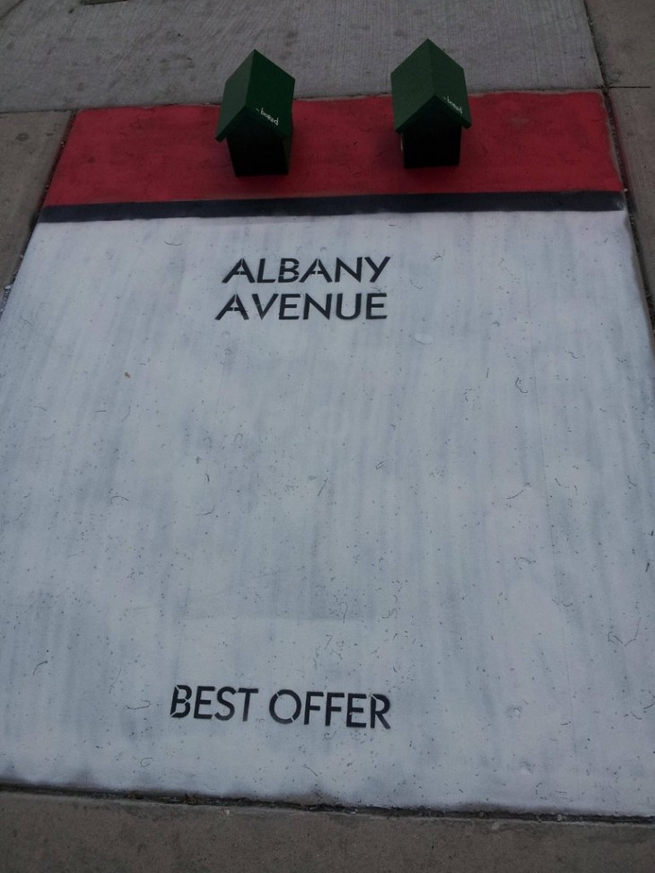
A future blog post will cover the subject of levity but we here at ALCHEMY studio feel that this often an underused tool in our collective experience tool box. The first scale example some readers may have seen in Chicago is by the artist or artists named Bored.  Here are some examples cited by Nate Berg of the Atlantic, several people on Reddit. Check out the messages on the cards!


We would love to see more so please send us links to pics if you have some.

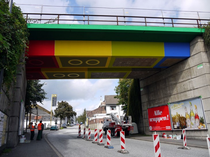
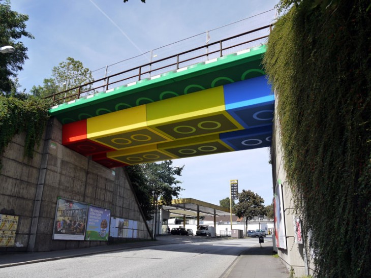
A second is the “lego” work don by Megx. Here using a little paint and imagination a bridge in Wuppertal, Germany is transformed.


Both of these examples suggest also that museums and cultural institutions could possibly extend both brand, experience and a small bit of perhaps a lighthearted aspect of their mission (play, science is cool, arts all around us, etc.) by engaging in imaginative ways with the city canvas.

Posted in: Experiences and Museums

Tags: , , ,

Leave a comment

Children’s Science Center


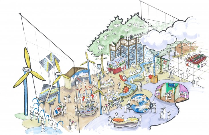
ALCHEMY studio has recently begun early schematic design and visioning for the Children’s Science Center in Virginia. A science center/children/s museum hybrid, ALCHEMY studio has begun to provide the first look at what the experience will be like. The illustration here is of the Earth/Energy/Sustainability zone for the institution.

Posted in: News

Tags: , ,

Leave a comment

Scale

Some recent encounters with several exhibits and experiences have been a reminder of the magic and impact that playing with scale can have on us and is a reminder that this is an important tool in the out “tool box” here at ALCHEMY studio and for other designers.

Scale forces us to reevaluate the importance of the object or the importance of ourselves. We can experience the “impossible.”

The purposes of this discussion refer to the idea of scale reference a parameter of an object’s size. By object we might mean the “artifact” that is the exhibit or we may mean the an environmental piece that sets a context for an exhibition

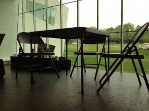
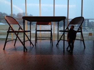
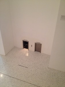
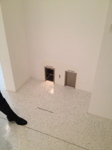
Here are two recent examples encountered at the Walker Art Center

Making something big:


Folding chair Robert Therrien

Photos: Wayne LaBar and Paul Schmelzer; Walker Art Center blog


Making something small


Maurizio Cattelan Untitled

Photos : Wayne LaBar


Mulling on this and thinking of other successful examples used by other museums such as the giant heart at the Franklin Institute, the images we see on in IMAX and giant screen films or on the small scale   the model railroads at the Carnegie Science Center, the Lego amusement worlds found over the globe it – what is it that attracts us to this and often makes these experiences memorable and extraordinary.  In addition, there are times when this fails. Numerous are the examples of large “walk through human bodies” that never seem to rise above a feeling of “fake” or “schlock.” Detail , quality and immersiveness are key

So some observation on successful uses of scale.

Scale…

  • Allows us to appreciate detail and form we normally can’t see or ignore
  • Allows us to explore places physically that are normally inaccessible
  • Allows us to reevaluate the importance of the object or the importance of ourselves
  • Allows us to experience the ” impossible”, the unusual, the imaginary
  • Allows us possibly to harken back to our childhood, as adults, and re-experience the discovery of scale

What other ideas come to mind about the power of these playful, thoughtful and imaginative uses of scale?

Posted in: Experiences and Museums

Tags: , , ,

Leave a comment