May 2013

Mobile Interactivity

Museum and science centers continue to explore and experiment with how to incorporate mobile devices into their experiences. One motivation is the incredible capacity of today’s modern smart phones – devices more powerful than the first computers put on a museum floor.

However, the field’s experimentation has focused primarily on the device as separate from the experiences in the exhibition environment. The devise is an add-on to the experience itself.

What if the only way to interact with an exhibit was with a mobile device?

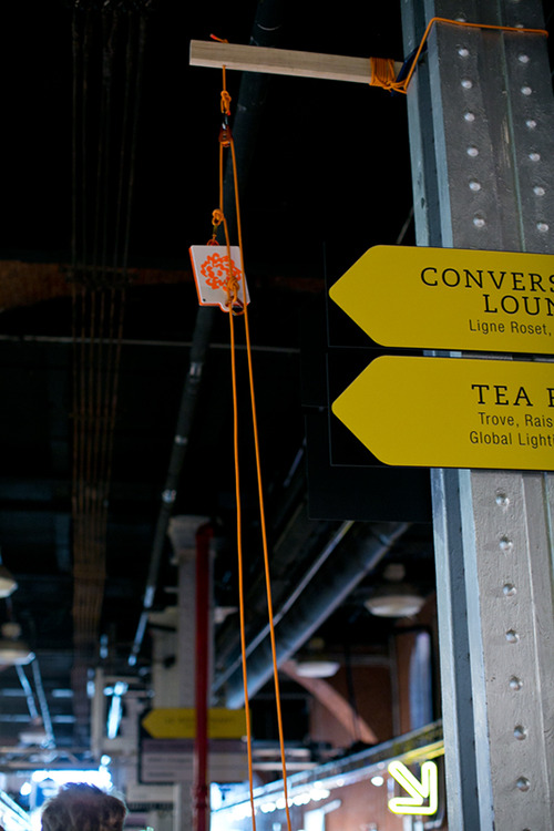
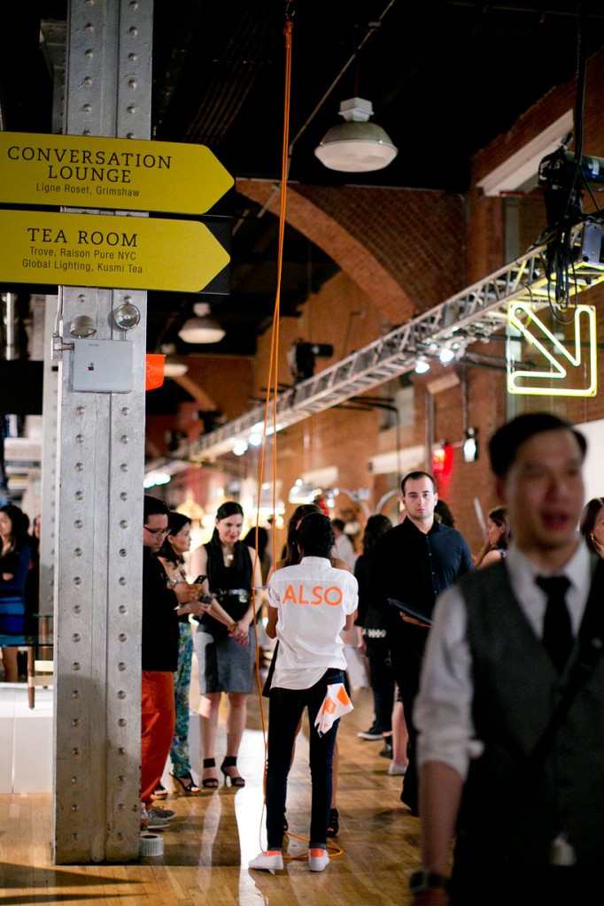
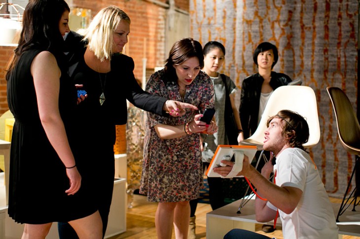
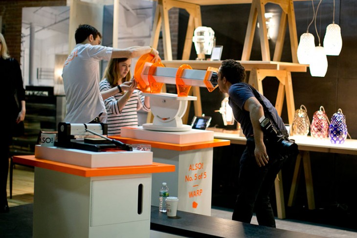
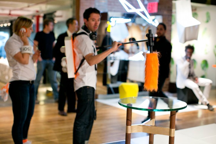
Here at the studio we are fascinated with several experiences that were on display at the “ALSO” exhibition. “ALSO” was an exhibition created by first year students of the School of VISUAL ARTS’ MFA Products of Design program.

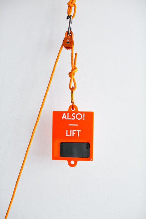
The first experience that caught our eye was the one named LIFT


Here, you put your phone system in a hoist that lifts it high above the exhibit floor and then back down – capturing video the whole time. The visitor thus gets their own “bird’s eye” view of the exhibition, with this experience offering a different perspective and creating personal memories for each visitor.


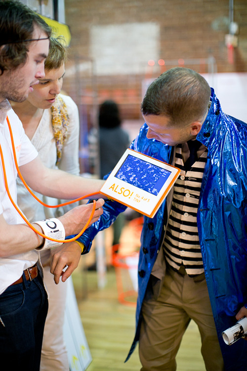
The second intriguing experience was TINY.


Here, a portable video magnifier was attached to an iPad, thus allowing visitors to explore the micro-world around them. Imagine offering a magnifier that visitors can attach to their tablet and use to explore an entire museum!

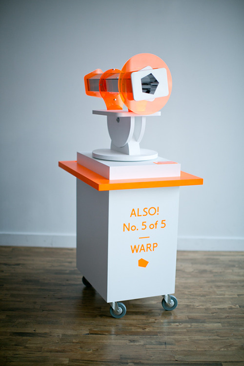
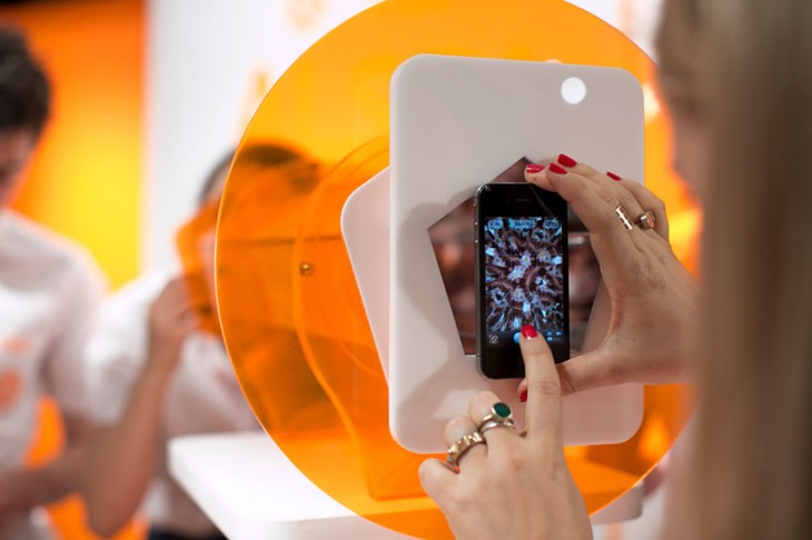
The third was WARP


Here, visitors could use their mobile device’s camera to record an image from a two-sided kaleidoscope. This exhibit points to the idea of embedding video or image opportunities directly into an experience.

Each of these shows a different creative approach to incorporating mobile devices into museum environments.

Rather than depend on an app, look to make the phone an integral part of the exhibit “structure,” an integral part of the main experience.

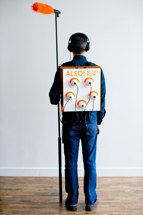
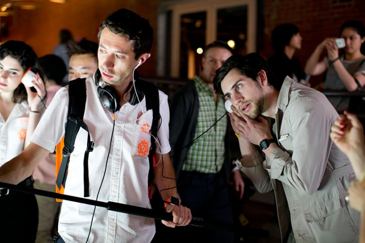
The importance of structure and the message it portrays was also evident in another exhibit included, called BOOM.


Here, using a boom microphone, you dramatically get the stories of objects. This experience harkens back to the sound bottles we discussed in an earlier post and the idea of physical metaphor.

We salute the great ideas these students presented. We look forward to seeing more!


Posted in: Experiences and Museums, Uncategorized

Tags: , , , ,

Leave a comment

seeking infinity

Here at the studio we still remember playing as a kid inside a store’s changing room where the mirrors on the left and the right were on hinges. This allowed us to turn them to face each other and we could step between them and see ourselves disappear into what seemed like infinity.

We as humans seem to have an affinity to peer into infinity.

Thinking about this the incredible appeal of peering into the infinite is one that is filled with mystery, the unknown, a world beyond our own. It taps into the human desire to explore and understand.

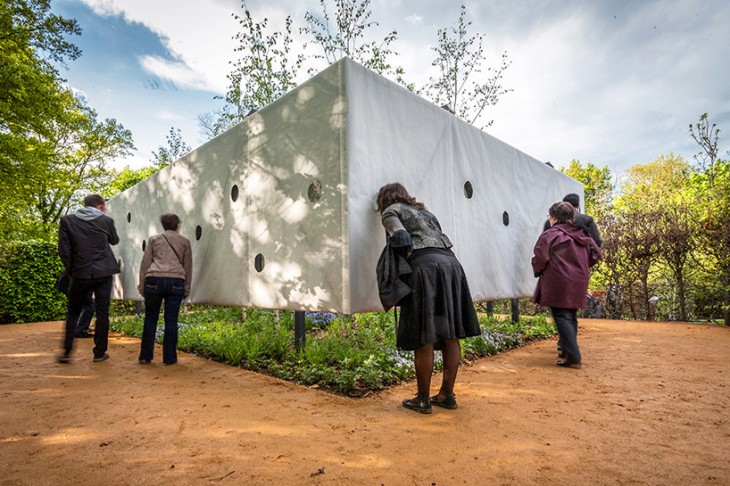
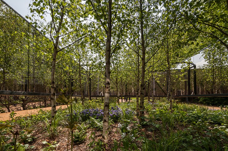
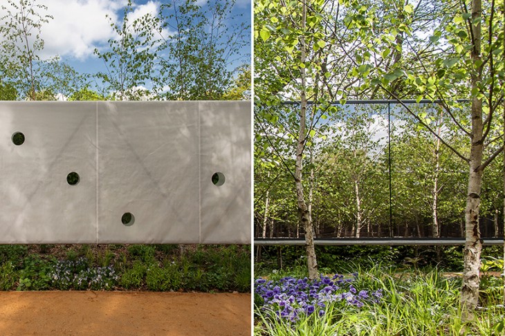
Several recent installations allows us to explore this both as the participant and the observer. As observer one can explore the infinite with “Outside In” a work for the 22nd International Garden Festival of Chaumont Sur Loire, France created by architects Meir Lobaton corona and Ulli Heckmann.


This work allows us to look into an infinite garden. It would seem that in this piece the longing of wanting to explore the space might be even more pronounced since one is actually outside and “just outside” too.

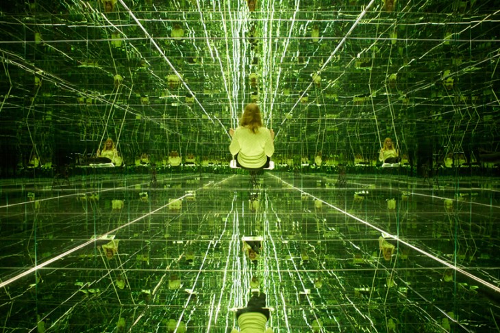
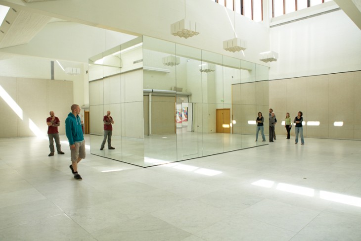
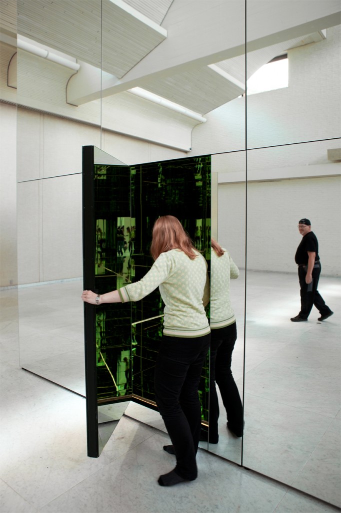
The second experience is “The Phoenix Is Closer Than It Appears” created by Thilo Frank. In this piece the observer is at the core (literally) and part of the infinity.

The work actually has two points of view. Here installed at the Museum of Modern Art, Aalborg, Denmark, the outside blends perfectly into the space creating an almost hidden installation.

The second way in which it works is to enter inside where you find yourself at the center of infinity where you are invited to swing.

Here at the studio we are struck by the way these seem to tap into some primal desire of humans to look into infinity and the emotions that evoke. The playfulness, mystery, seeking understanding, are all very powerful.

In creating exhibition design as much as we look for education learning impacts tied to curriculum in today’s modern museum thinking – we strongly urge that we should set emotions such as these at the core of what we are designing as well.  While there may in fact need to be more didactic exhibits, paired with experiences that touch these emotional goals, an exhibition can create a much more memorable and impactful outcome. Much like the simple experiences of that infinity we found in the store’s changing room.


Posted in: Experiences and Museums

Tags: , , , ,

1 Response

don’t forget! – inspiration for the road AAM 13

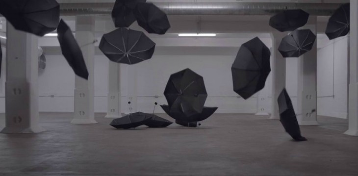
So here in the Unites States, ALCHEMY studio and many of our colleagues in museums, science centers, designers, fabricators, and media producers are headed to the American Alliance of Museums annual conference in Baltimore. So this week’s inspiration is just a little flight of fancy as we pack our bags and as always don’t forget to pack an umbrella. You never know!   See you there! (booth 411)


Posted in: Experiences and Museums

Leave a comment

digital water

So, a few days ago, we posted the new interface/augmented reality project by Fujitsu Laboratories. This offers some interesting ideas for integrating augmented reality into museum exhibition environments. Now we have a new one to take a look at.

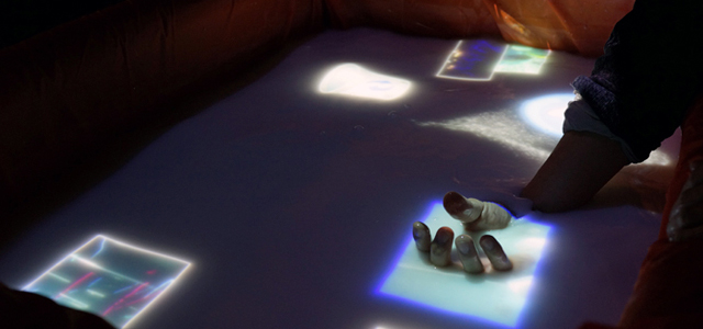
Here is another new digital interface that offers more fascinating ways to interact with digital information. AquaTop turns a pool of water into an interactive, three-dimensional digital interface surface.


AquaTop is a projection system that uses something like bath salts to create a white water screen surface. (Most likely, other substances could work as well.) The other components include a sensor system (in this case, Kinect), a projector, lighting control, and interactive programming. The system won the Grand Prize at Laval Virtual this year.

There is something intuitive and pleasing about the physicality of water and the common digital “touch” interface. Makes one wonder what other actions we might develop if we projected on water more often.

One particularly fascinating thing about AquaTop is that it directly and visually demonstrates multiple points of interface – for example, by showing visible markers when someone touches the surface with multiple fingers – from under the surface! We’re also intrigued about using other sensor systems and how we might manipulate things like waves or other physical water phenomena. We can also imagine some truly creative and fun ways to incorporate this technology into a water play area or other water related exhibit.

AquaTop has some similar attirbutes to the posting we had about 3d projections. You can check out that earlier post here. 

What ideas do you have? We’d love to hear what you’re imagining.

A shout-out to Louise Julie Bertrand who pointed us to this project – thank you.

Posted in: Experiences and Museums

Tags: , , , ,

Leave a comment

Engaging Spaces

One of the aspects of exhibition design that we enjoy doing is not only creating engaging exhibit experiences but also creating engaging experience spaces.

What is wonderful is when the space that the exhibits are in is an exhibit itself.

We’ve recently run across two recent installations that capture that feeling and would work well in several institutions we can think of or for several topics we have explored as exhibitions.

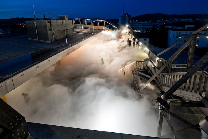
The first is Cloud Parking by Fujiko Nakaya

This piece done in Linz, Austria allowed experiencers to get the view of feeling of walking amongst the clouds that might fill the sky. The installation uses high pressure pumps and fog nozzles.  What a special experience this might be to have as part of an institution from a aviation museum, children’s museum to an exhibition on weather, birds or even dreaming.

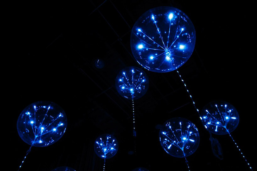
The second piece is “fluff” an interactive lighting system from the Japanese design studio tangent.


This interactive lighting display made from balloons (1.1 meters in diameter) and LEDs changes its appearance according to sound and video displays. What immediately came to mind was to use this to create the feeling of being beneath the waves surrounded by “jellies” or as an evocative space to discuss the idea of different forms of life such as what might evolve on a gas giant.

Wouldn’t it be wonderful if our field’s exhibition spaces would focus as much on this type of inspiration as they often do on curricula or  education.


Posted in: Experiences and Museums

Tags: , , , ,

1 Response