environment

Light Explorations

So, after a mid-summer blog break, we’re back to our “weekly” inspirations about ideas we’ve come across that make us think about experiences, museums and the like. This week, we’ve encountered two interesting pieces that explore ideas we have mentioned before – reflection and light.

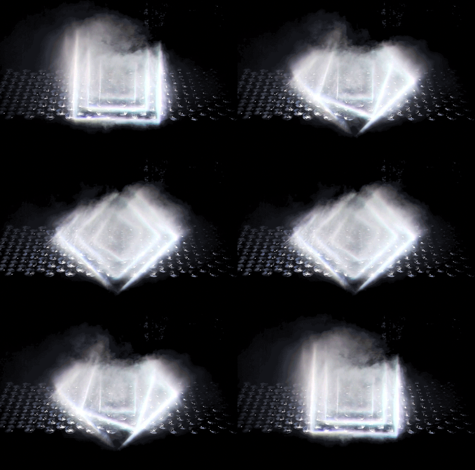
The first is Light Barrier by kimchi and chips a South Korean design studio.


Using principles of reflection, projection, and some carefully crafted light beams along with scanning technology, they create a mesmerizing three-dimensional display. What’s interesting to us is two-fold. First, it shoes how powerful three-dimensional display can be without having the “resolution” that we normally associate with “display” in the museum setting. Certainly, there are aspects of content, text and other display elements that could utilize this same power.

Secondly, as clearly evident in the work, there are many mathematical and natural science phenomena on display in the work as it is. Certainly, this could be a powerful way to engage visitors with this content.


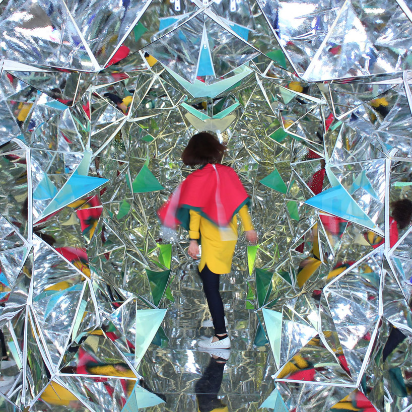
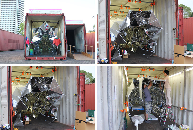
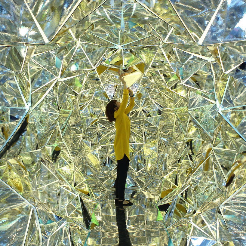
The second item we ran across plays directly with some of our other blog posts about reflection. Take a look at “wink” by Masakazu Sherine and Saya Miyazaki from Japan. It’s a walk-in kaleidoscope!


A fascinating part of this installation is that all of the panels are attached by zippers, making it almost infinitely changeable to the visitor – a kaleidoscope that changes while you are in it. This piece creates an almost magical space. It would be easy to see the same concept in an art or a children’s museum.

Where could you imagine installing these playful experiences? How would you adapt them to support something you’ve been thinking about or working on?

Posted in: Experiences and Museums

Tags: , , , , ,

Leave a comment

gold bug

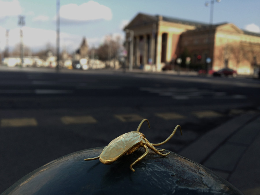
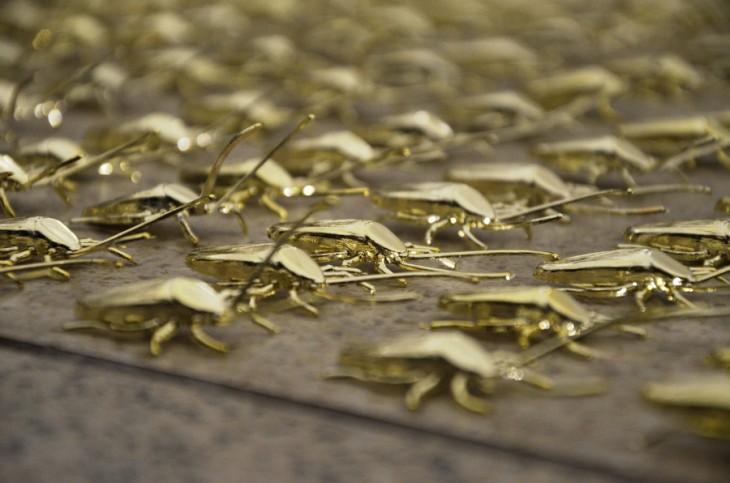
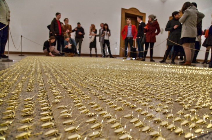
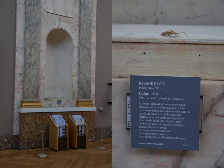
So, this week we wanted to highlight an artist and work that may not be new to many art museum readers but certainly might be new to some science and history museum people and probably also to many designers out there. The work is called The Golden Roach Project by the artist Miklos Kiss.


Miklos places these in museums around the world, as he states about roaches: “It is found anywhere in the World, considered everywhere as a pest and a source of infections, and exterminated anywhere possible. Opposite to this, the roaches in my creations go through multiple changes. Walking into the culture’s holy space, they turn to gold in the museums, which represent art, and this pushes the question of art. At this point the action is made classic and contemporary at the same time. The smuggling effect is “roachy” and reflects a contemporary approach, while in materials and workmanship it recalls of classic art pieces.”


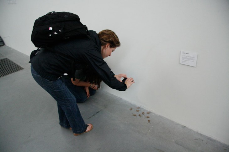
He encourages others to take these roaches or buy them, and while almost all are just gold-plated plastic, one is actually pure gold. In addition, people can post images of their roach in various places and, if the citation is tagged correctly, it can go up his website.

Miklos draws attention to how this idea of smuggling could also be considered in reverse – “This should bring the attention to a reverse situation, where an effective and valuable object will be smuggled in on the way in to the museum.”


Here at the studio, we are loving several aspects of this whole concept – making something precious by its material and where it’s places, the sort of “treasure” aspect of the one gold roach, and the interactivity with the viewers in a medium where physical interactivity is not often seen.

It makes us wonder how some of these concepts could be exported and adapted to have visitors in other types of museums create an interactive and dynamic social expression physically. How might this idea be adapted for a science center? A zoo?

What do you think? What does this concept inspire you to want to try?!


Posted in: Experiences and Museums

Tags: , , , , ,

Leave a comment

Musings Over a Belgium Pint: The Science Centre World Summit


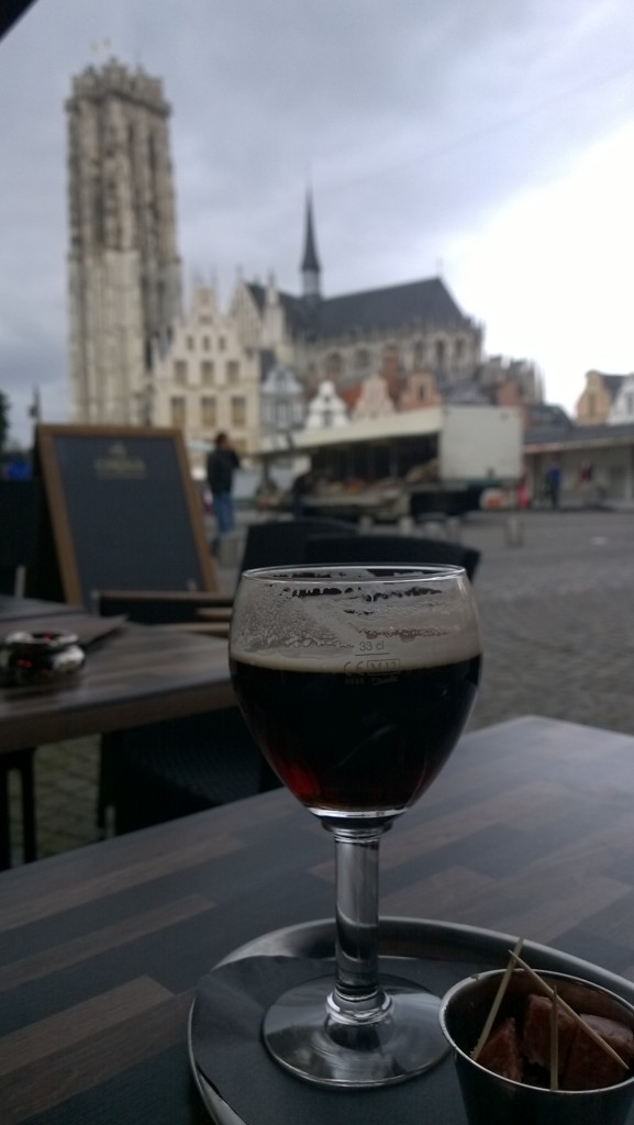
So, last week over 400 people attended the Science Centre World Summit in Mechlen, Belgium. The conference was hosted primarily by Technopolis with a pre-workshop and reception at the Natural History Museum of Belgium in Brussels. Both institutions did a wonderful job. ALCHEMY studio exhibited in the tradeshow (see the picture of the King of Belgium signing the Technopolis guest book in front of the ALCHEMY studio booth)
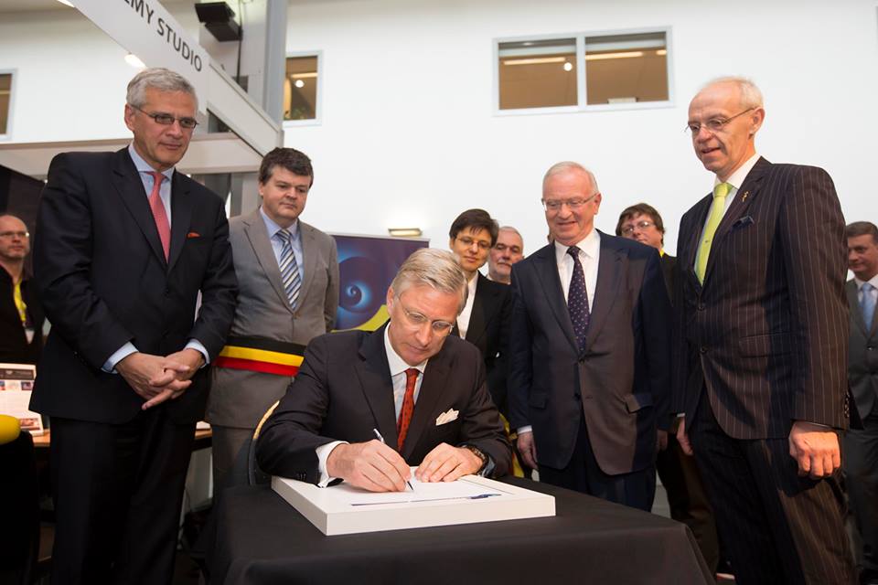
and participated in the CEO Forum before the conference as well as attended many sessions – along with drinking a lot of Belgian beer.

Over those beers, there was a lot of conversation, discussion and thinking on science centres and science museums. Here are a few of the interesting conversation threads we were part of or observed.


What Are We About?

The conference planners worked hard to bring in outside experts in the areas of active scientific research, technologists, media and forward-looking educators to engage with the attendees about the role and direction of science centers in the future. Ideas floated included that science centers need to become more involved in presenting actual research and engaging with technology as a part of (not a replacement for) more phenomenological experiences and break down the age personification that we are only for the young.


But Can We?

Joined with this discussion, though, is how will this pay the bills? While certain countries‘ governments might support their centers and thus free up resources to explore new modes/content or processes more easily, the organizations in some countries are heavily connected to earned revenue and/or directly connected to a learning curriculum. In these cases, focusing experiences on things such as the latest discovery and research such as the remnants of the big bang (research that was announced during the summit) might not bring in the audience or connect as easily with what schools want and need.


The Evolving State of Revenue

Meanwhile, in countries that have a history of philanthropic giving to institutions such as science centers, dramatic shifts are occurring. Younger funders are moving away from cultural gifts and moving toward social movements and efforts. Funders want to be far more hands on, at times wanting to be a part of the team. Meanwhile, organizations such as NSF in the United States are moving entirely to research support – removing a source of capital for just getting programming done.


Future Content

There was good discussion on topics and areas that might see more concentrations of programming. One is the area of data, big data, and what data can tell us. Increasingly, this will be information that the public will need to understand. Another discussion of coming focus is on the outdoors – meaning that, as we move into the future, we’ll need to shift more attention toward the connection we have with planet and the crises we seem to inevitably face in areas of food, energy, and climate change. This focus on the planet, its health, and human survival will only deepen.


Speciation

Finally with enlightening and varied philosophical approaches from the Wild Center in the Adirondacks in New York to the Continium – Discovery Centre in the Netherlands, it seems that science centers may be undergoing an evolution of “speciation” and fundamental changes that even more match the institutions to the communities they find themselves in. In our past, and to some extent in countries where science centers are merging, there has been a focus on just copying experiences and also duplicating operations and approaches. However, it’s clear that whether its changing opening hours in the winter, including culturally traditional non-Western approaches to science subjects, running community businesses, or having pubs and nightclubs within your institution, the direction is to becomes a more fully functional part of one’s community. BUT at the same time, this means that what a science center is may be dramatically different from one community to another.

Perhaps in the not so distant future there will no longer be a summit of “science centres” but rather a summit of science “community centres.”


Which of these trends rings true for you? What other forces do you see shaping the future of our field?
Posted in: Experiences and Museums, News

Tags: , , ,

2 Responses

Your world upside down

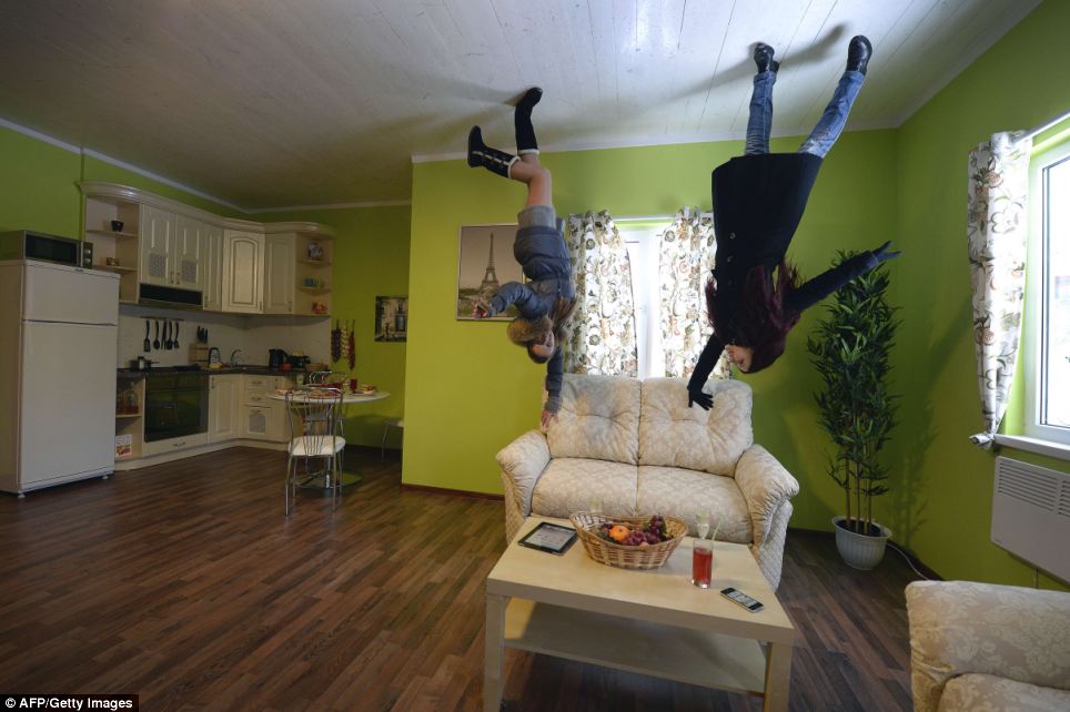
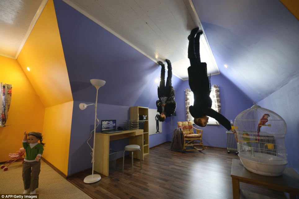
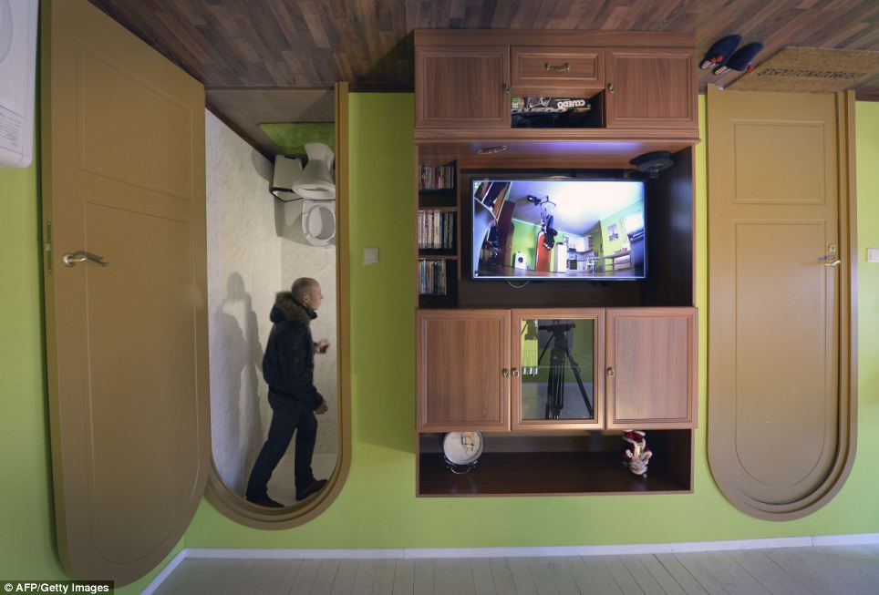
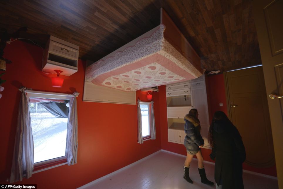
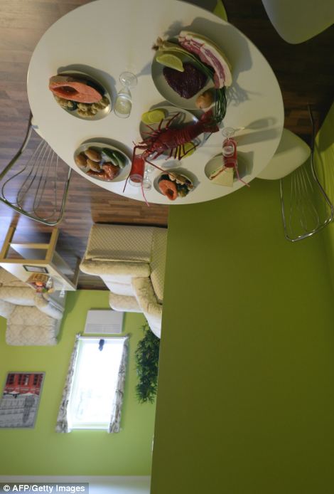
Ames Rooms” are found in many children’s museums and science centers. These spaces are physically distorted to create an optical illusion that makes people appear as giants on one side of the room or incredibly small on the other side of the room.

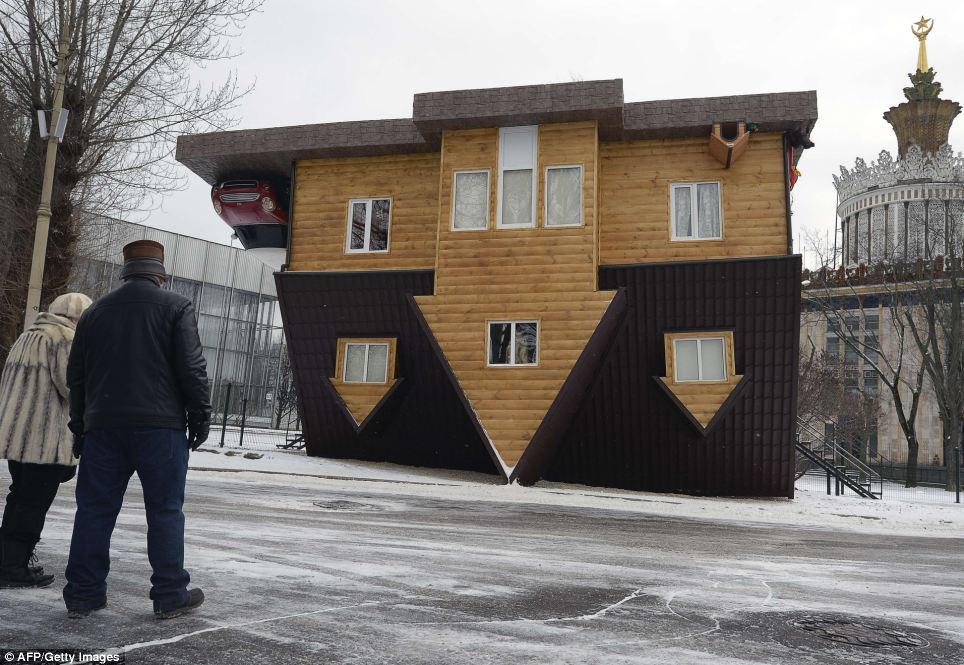
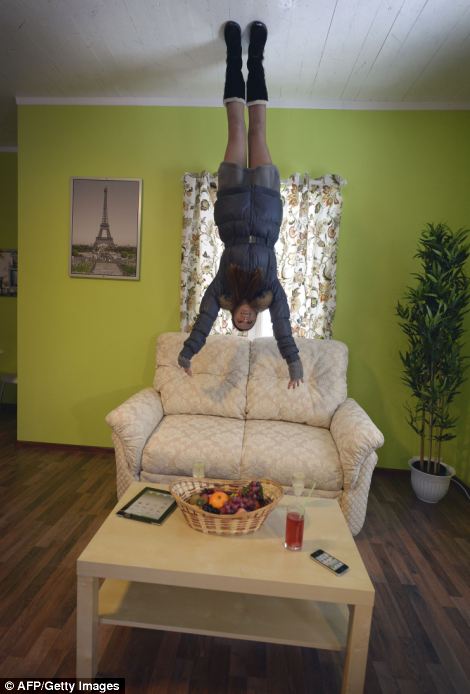
Well, while not an optical illusion but certainly as much fun, this tourist attraction at the VVT’s All-Russia Exhibition Center in Moscow piqued our interest and made us smile.


The experience is powerful and fun – and totally changes your perspective. Literally turning your world upside down is a great way to get people to observe and think differently.

As one begins to develop and design an exhibition, a strong design and development step is to do what this house does: take the subject and turn it on its head.

This way of thinking could suggest new and innovative ways to explore and present any subject.

Have you seen other “upside-down” worlds? What kinds of experiences have turned your world on its head?
Posted in: Experiences and Museums

Tags: , , ,

Leave a comment

immersive color and sound

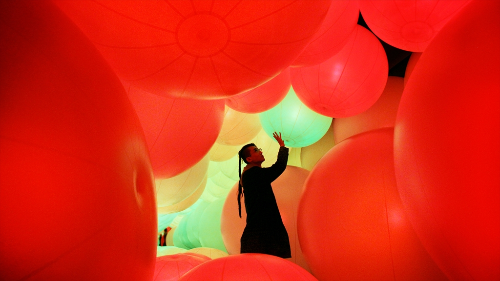
To start our new year, we became enthralled over the holidays with the latest installation by Team Lab called Distilling Senses: A Journey through Art and Technology in Asian Contemporary Art located at the Hong Kong Arts Centre.


In this world of giant orbs, the visitor’s touch changes the color, but the color also changes when the orbs run into something or are affected by the behavior of other spheres around it. Watching the video, the experience appears to be truly mesmerizing.

While a cynical person might describe this as just an over-scaled techno ball room, the experience creators wanted it to communicate how the web allows for interconnectivity and information dissemination. At the same time, a space like this could provide an experiential opportunity to engage with subjects where scale or location would make it impossible to visit.

What is certainly clear is how different and how totally inviting this experience is. It’s a great example of how both scale and immersiveness create a space that draws you in more than any “literal” interpretation of the internet. While, admittedly, it is not very interpretive, it could couple with more interpretive experiences and allow museums to be more impactful.

Over the holidays, did you run across anything mesmerizing?
 

Posted in: Experiences and Museums

Tags: , , ,

Leave a comment

museum opening and museum commentary

After the Thanksgiving break here in the United States, the studio is back at work, and one of the first things people were talking about was some of the inspiring as well as intriguing museum designs and museum commentary that people came across Here are two examples of what we’ve been talking about:

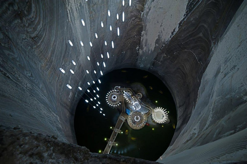
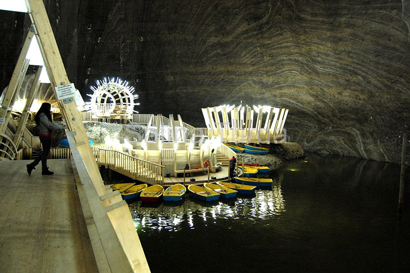
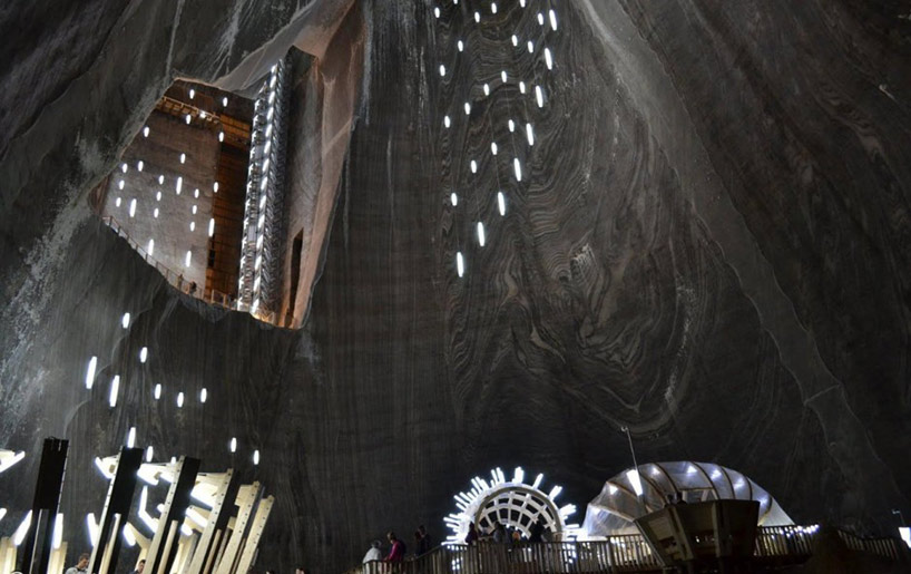
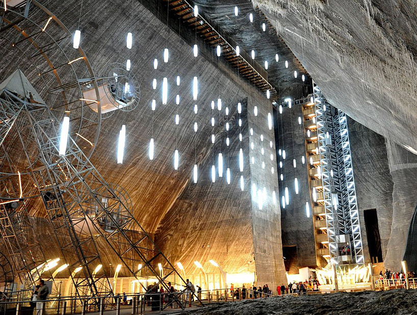
Opening in Romania is the Salina Turda, where in the town of Truda, the salt mine found there has been turned into the world’s largest salt mining history museum. Take a look at the amazing location and the journey offered for visitors:


As you will find, this is not only a museum but also has attraction elements both inside and out. In addition, the design of the space at the bottom of the mine is not conservative but rather takes a unique perspective that matches the space itself. It a great example of how exhibition design and space can, together, create a magical location – something to be considered for all projects that link exhibition design and architectural design.

The atmosphere of the space and the “environment” of the design can heighten or change visitors’ emotional state even before they get to the “content” or the mission of the exhibition.

In this case, it would seem impossible not to be affected before getting to the bottom.

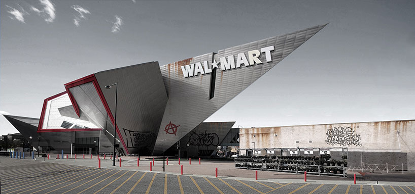
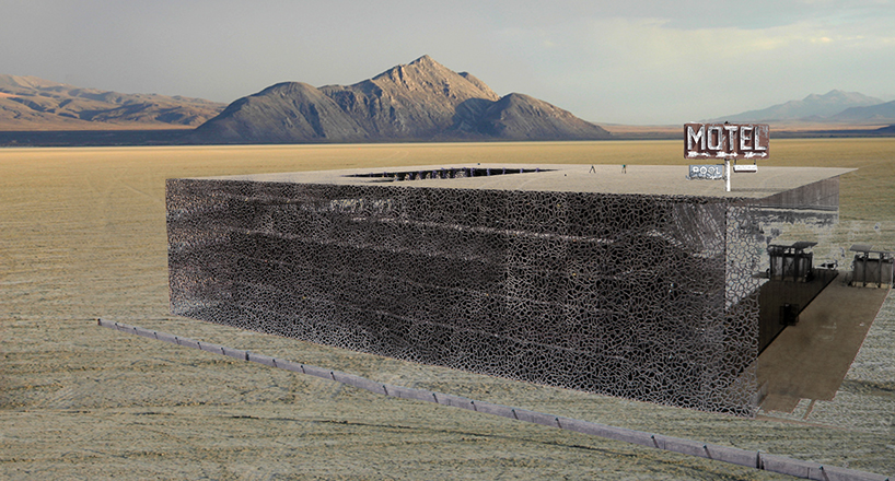
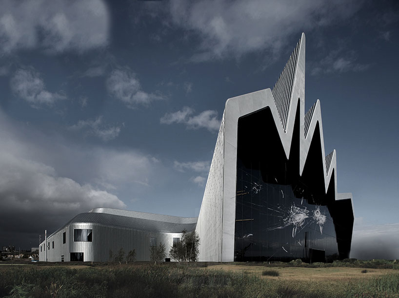
Meanwhile, we thought these “future visions” were very irreverent – and were possibly making a commentary about “starchitects.” Enjoy!


Denver Art Museum by Daniel Libeskind – as a a Walmart


MUCEM by Rudy Ricciotti – as a motel


Glasgow Riverside Museum of Transport by Zaha Hadid – abandoned, with nature taking over

What interesting museums have you seen lately? What new or provocative museum ideas are you thinking about? Let us know!

Posted in: Experiences and Museums

Tags: , ,

1 Response

losing the ocean for the waves

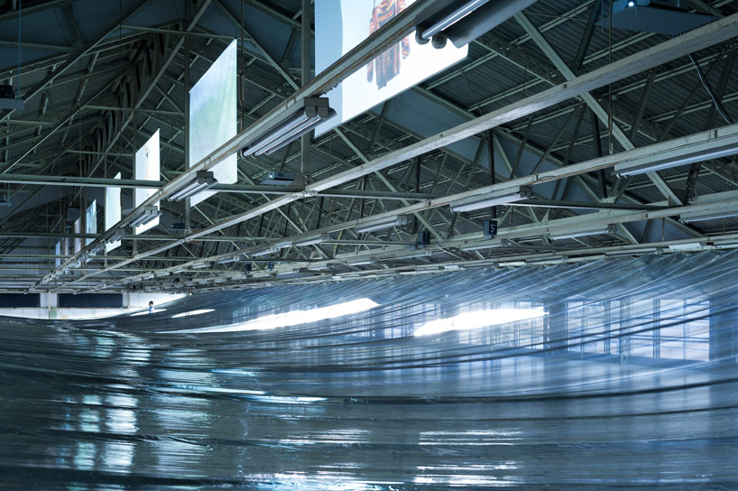
Last month an interesting installation opened for only a few days in Osaka Japan: My Thread – New Dutch Design on Films curated Eizo Okada .


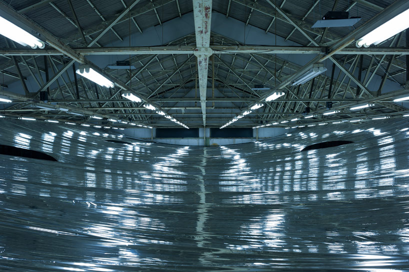
The interesting part of this exhibition was the work done by Hideyuki Nakayama, that created light and experience separation between the video screens displaying the work of several artists.

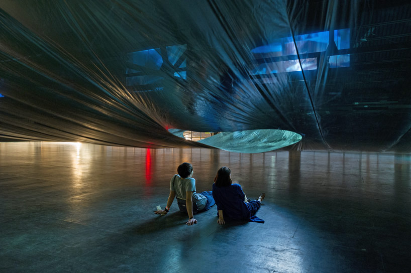
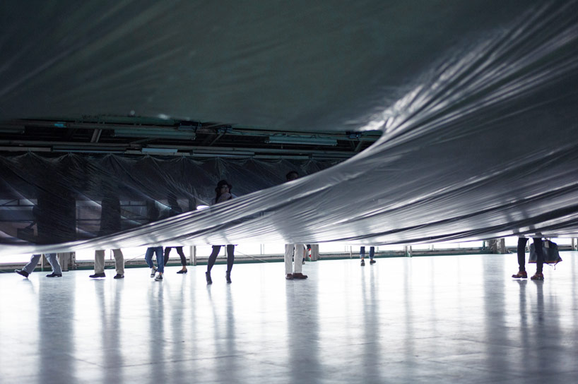
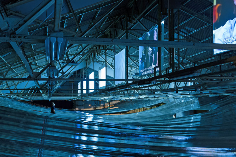
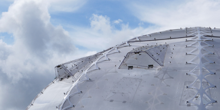
Hideyuki Nakayama adapted the metalized film used in emergency blankets to create a light, opaque, but air-porous layer between the screens and the floor below. Visitors are invited to walk beneath the layer and view the videos at designated spots between the layers.


What struck us was the almost eerie similarity of walking through or under a body of water.


Photos from the experience offer snapshots that reminded us a views “just under the surface,” to vistas across a calm body of water. How exciting it would be to encounter a series of experiences set into such a environment.

This made us ruminate on how often in experience design, museums lose sight of the power of such thinking.

Transforming the age-old adage about forest and trees to match our example above – too often we focus on the “waves” or individual experiences in an exhibition rather than the “ocean” that could be created. It is through experiencing the “ocean” that one can gain different and contextual insights into the nature of the “waves”.

In fact, other aspects of our popular culture – hit tv series, console games, and others – have moved toward creating the mega story with individual aspects that while standing alone create a larger, more powerful story.

Looking to future exhibition, it would be magical if we as a field could move from the waves to create more ocean experiences. How do you think this approach could enhance the museum experience?


Posted in: Experiences and Museums

Tags: , , ,

1 Response

tree as museum

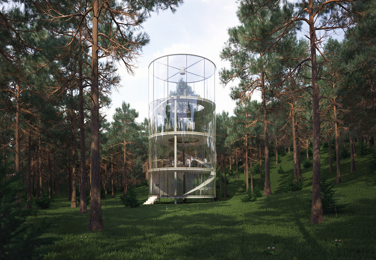
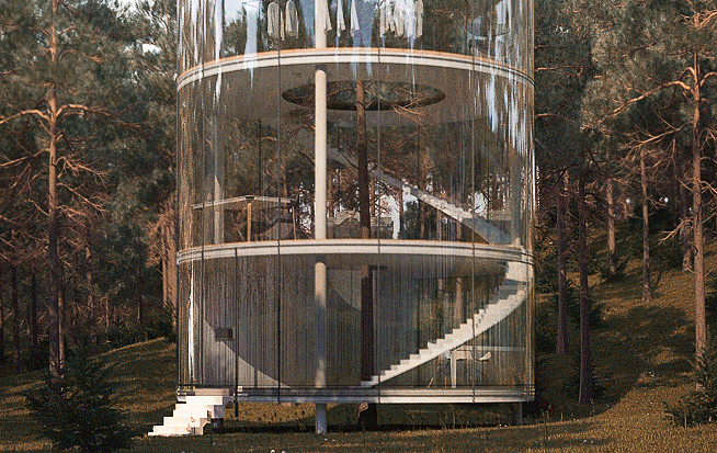
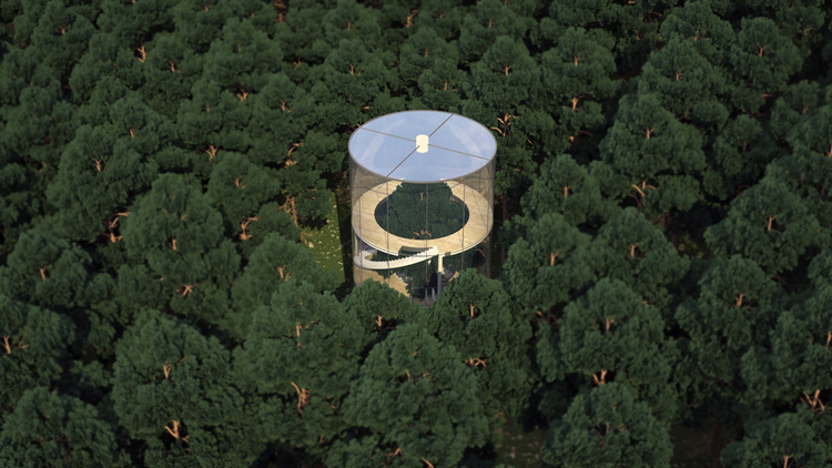
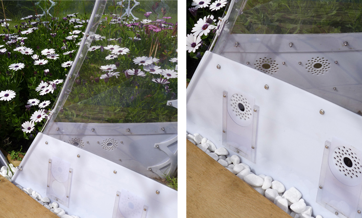
Here is a beautiful concept that certainly could spark ideas and thoughts for botanical gardens, nature centers, and even natural history centers: Tree in the House.


Tree in the House is an idea by almasov aibek of a.masco desgn. The idea of walking outside and then creating a structure to focus solely on one tree is very interesting. There are messages and metaphors that surround this idea, and an interpretive structure would include both science and art. (Pictures from Almasov Albek)

There is something very special about being in a collection and zooming in to one example.

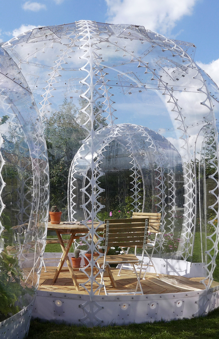
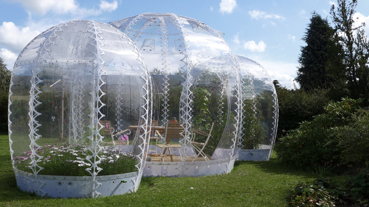
Meanwhile, another recent concept we’ve run across that brings structure to the outdoors is the “Invisible Garden House” by Simon Hjermind Jensen, principal of SHJworks.


These structures are heated by the sun and cooled by natural ventilation. What these might suggest are ways to create small, portable spaces for certain experiences out in a natural environment.

Both of these ideas offer playful and intriguing ways to interplay structure and the natural environment.

What similar examples have you seen? What new connections would you like to explore between nature and structure?


Posted in: Experiences and Museums

Tags: , , ,

Leave a comment

scale in the city

Over the past year, we have remarked about how the use of scale, done well, can make an experience special. This week we’ve run across three very inspiring and imaginative examples of large-scale experiences. Whether marketing campaigns, art installations, or just cultural documentation, these examples captured our imagination.

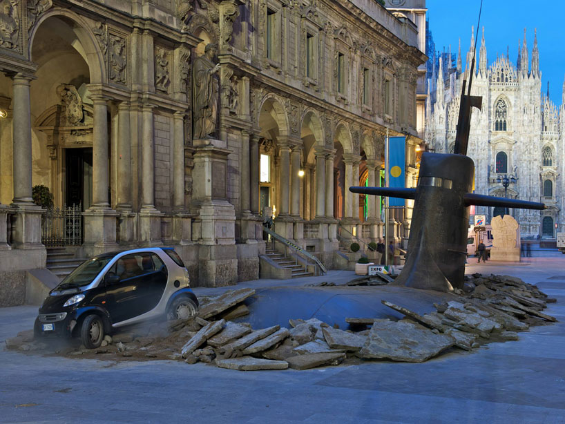
The first is the submarine that surfaced in the center of Milan


Talk about an experience! This was a marketing event by M&C saatchi Milano for the insurance group europ assistanve IT. Certainly, it suggests some interesting ideas for promoting a new exhibition or large-format film in the museum world, and it got us wondering about how one might stage this to bring a short term “content” experience into a city.

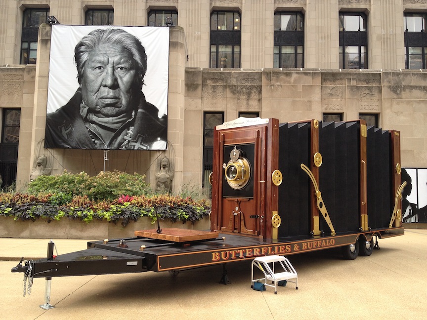
Here is a possible example. Speaking of large scale film, here is what might be “the largest film camera in the world.”


You might be able to see this in your local city/town. It is traveling around the country as part of the project ”Butterflies and Buffalo” by Dennis Manarchy. The project is to document and “preserve our nation’s (United States) dynamic cultural history”

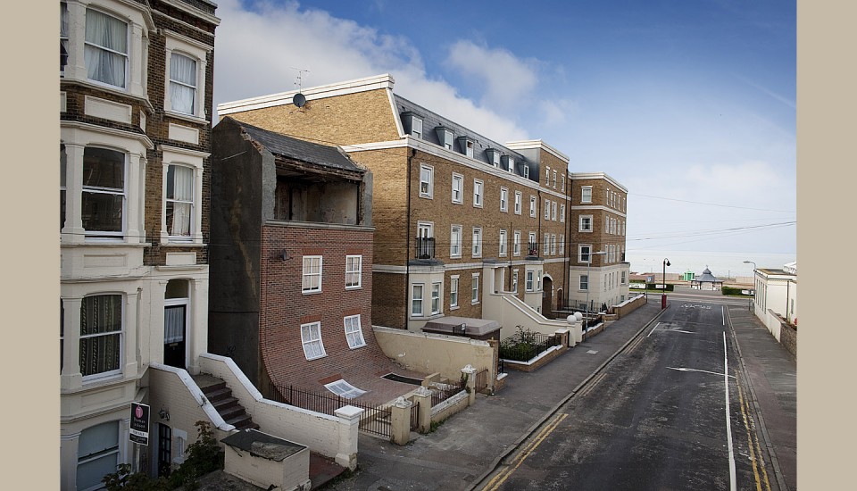
The last example shows how an abandoned building was transformed into an imaginative setting. Here is the project “from the knees of my nose to the belly of my toes.”


This house, with a sliding front, can be found in Margate and was done by Alex Chinneck, a British artist.

These projects are clear examples of how scale and the context in which the scale experience occurs can heighten the impact of the experience.

Our belief is that museums need to consider breaking down their walls to bring more of their experiences directly into the world beyond the building.

What do you think? What might you pull off in the middle of the city?

Posted in: Experiences and Museums

Tags: , , , , ,

Leave a comment

putting you in orbit

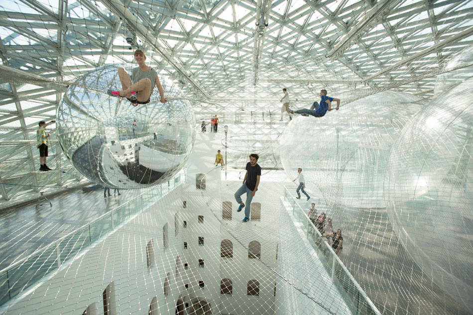
Earlier this year, we highlighted a project by Tomás Saraceno’s called On Space Time Foam. There we were excited about how this experience allows for perhaps the closest opportunity for visitors to feel what it might be like to be inside a piece of foam. In addition, we mentioned how, very often, in creating experiences about astronomy and space, the science museum/center field does not embrace the larger-scale experiences that might provide more emotional and visceral responses.

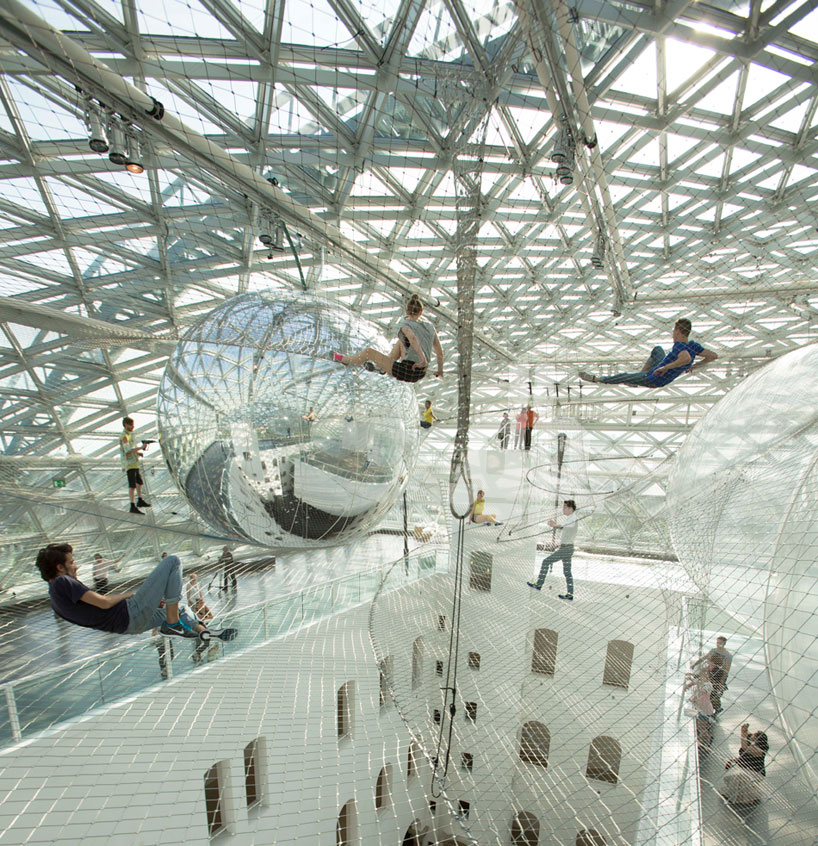
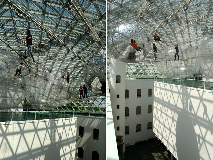
Well,Tomás has a new work that once again demonstrates this idea. Opening today at the K21 Ständhaus (kunstsammlung nordrhein-westfalen) in Düsseldorf is his new work “In Orbit.”


Just looking at these images sparks the idea of allowing brave visitors the chance to walk out in the piazza, over 60 feet in the air, and experience what it might be like to be immersed in some of those classic images from science fiction film where the view swoops by planets or orbs. In addition, Tomás mentions that one can detect other visitors by sensing vibrations that propagate through the netting.

One wonders if one could riff on this idea and actually make a model of the solar system that visitors could float above, allowing them to potentially “travel” between our planet and our nearest neighbors. Perhaps this is the closest many of us will get to fulfilling a dream we might have of going into space.

What ideas come to mind for you?

Posted in: Experiences and Museums

Tags: , , ,

2 Responses