engagement

Light Explorations

So, after a mid-summer blog break, we’re back to our “weekly” inspirations about ideas we’ve come across that make us think about experiences, museums and the like. This week, we’ve encountered two interesting pieces that explore ideas we have mentioned before – reflection and light.

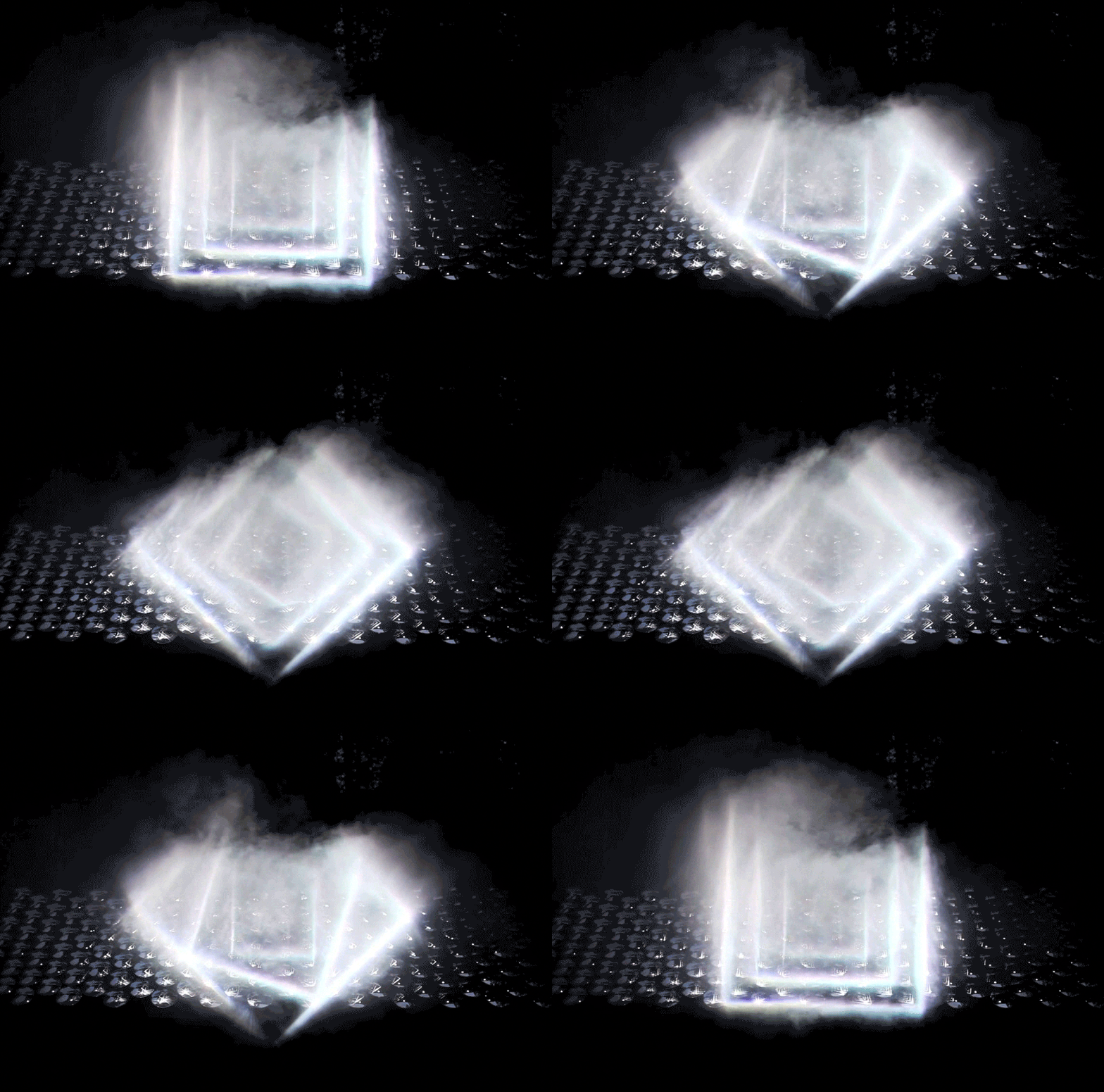
The first is Light Barrier by kimchi and chips a South Korean design studio.


Using principles of reflection, projection, and some carefully crafted light beams along with scanning technology, they create a mesmerizing three-dimensional display. What’s interesting to us is two-fold. First, it shoes how powerful three-dimensional display can be without having the “resolution” that we normally associate with “display” in the museum setting. Certainly, there are aspects of content, text and other display elements that could utilize this same power.

Secondly, as clearly evident in the work, there are many mathematical and natural science phenomena on display in the work as it is. Certainly, this could be a powerful way to engage visitors with this content.


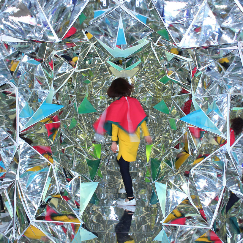
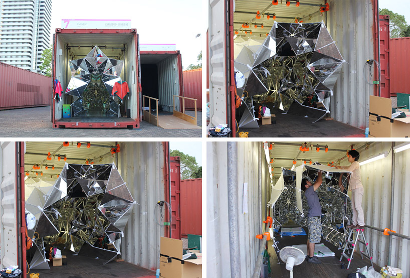
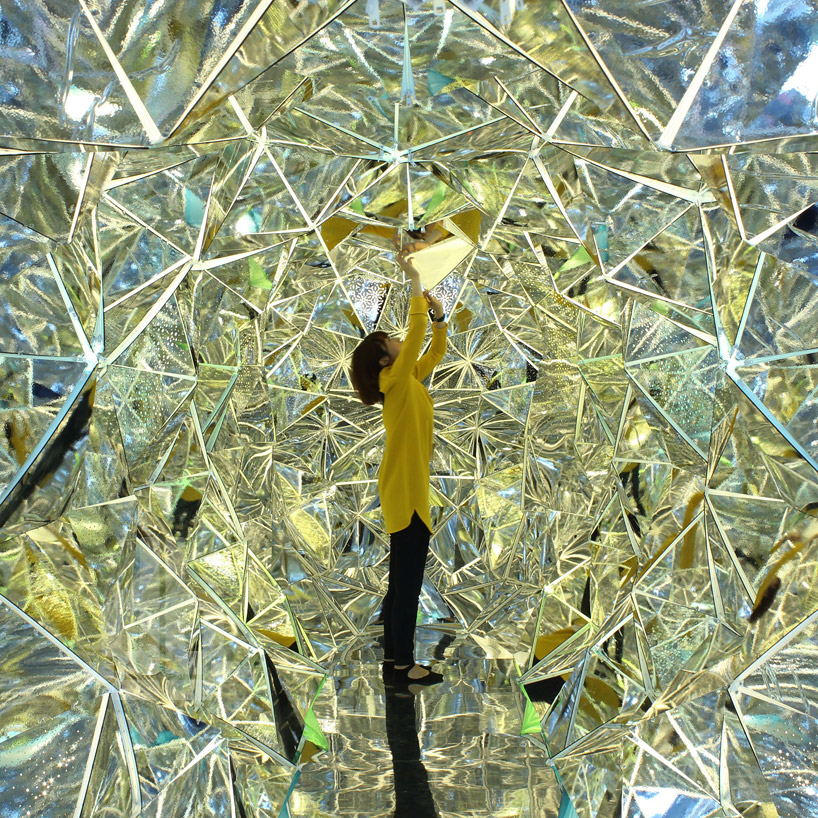
The second item we ran across plays directly with some of our other blog posts about reflection. Take a look at “wink” by Masakazu Sherine and Saya Miyazaki from Japan. It’s a walk-in kaleidoscope!


A fascinating part of this installation is that all of the panels are attached by zippers, making it almost infinitely changeable to the visitor – a kaleidoscope that changes while you are in it. This piece creates an almost magical space. It would be easy to see the same concept in an art or a children’s museum.

Where could you imagine installing these playful experiences? How would you adapt them to support something you’ve been thinking about or working on?
Posted in: Experiences and Museums

Tags: , , , , ,

Leave a comment

inspiration to start the summer

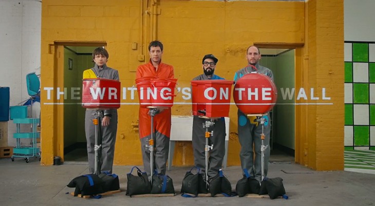
This week’s inspiration is fun, wonderful and an amazing example of optical illusions. Check out the new video from Ok Go. What a great inspiration to start the summer with.


Posted in: Experiences and Museums

Tags: , , ,

5 Responses

tools of engagement

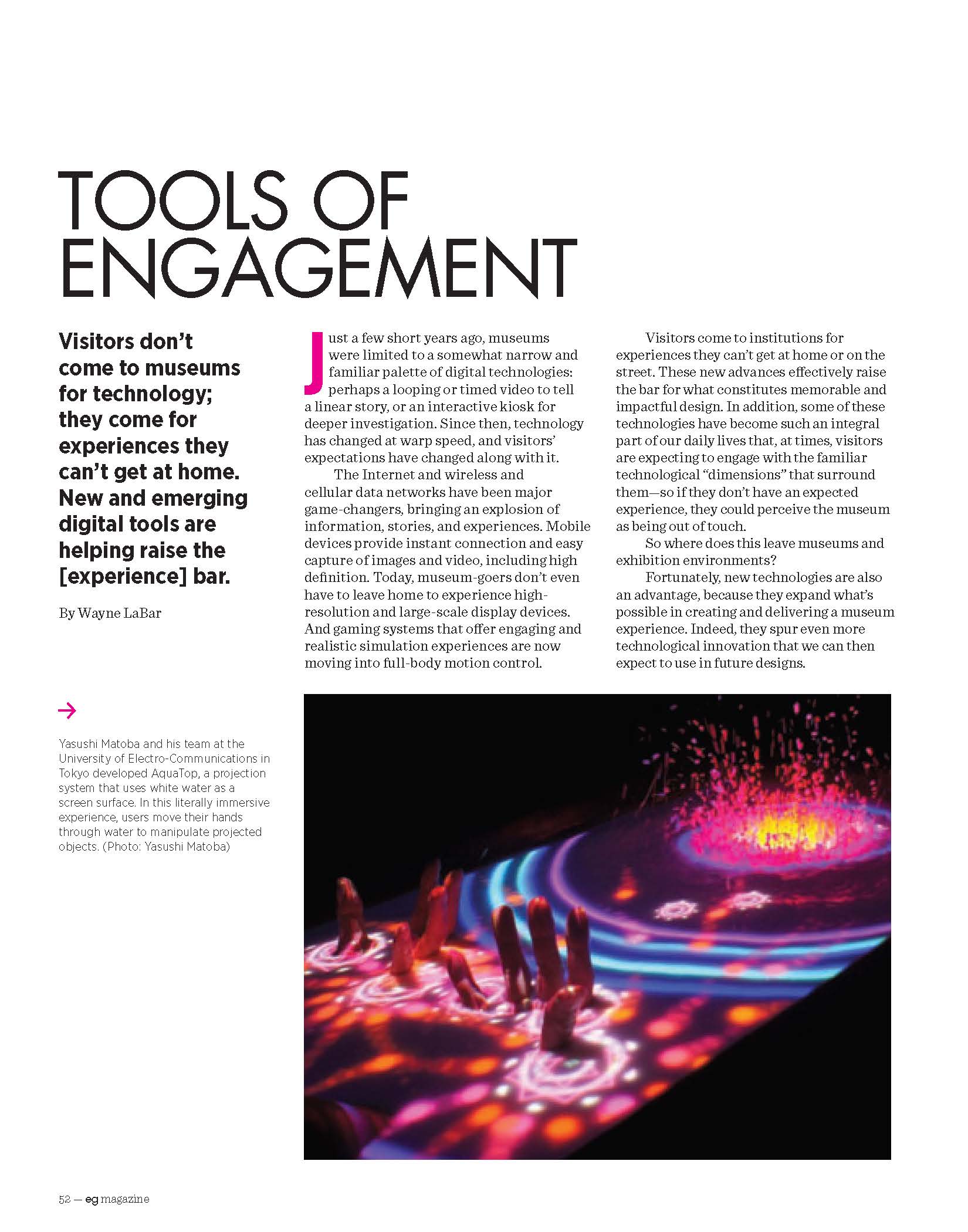
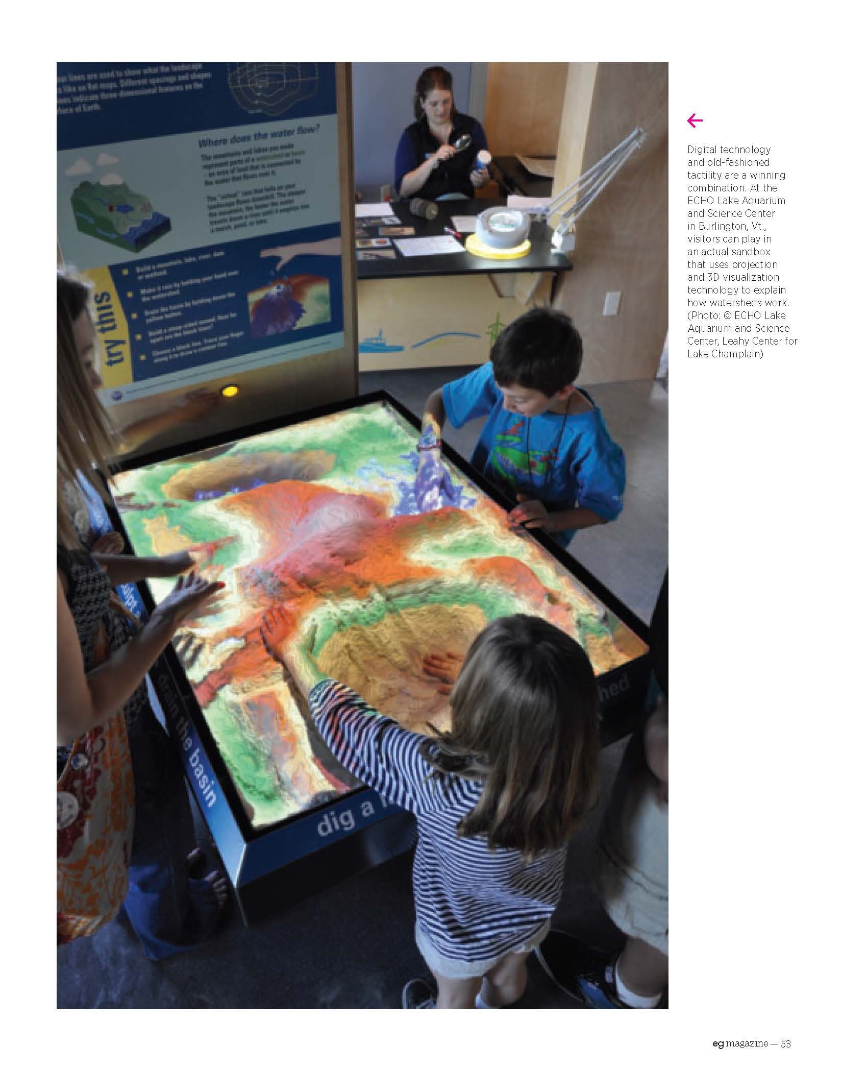
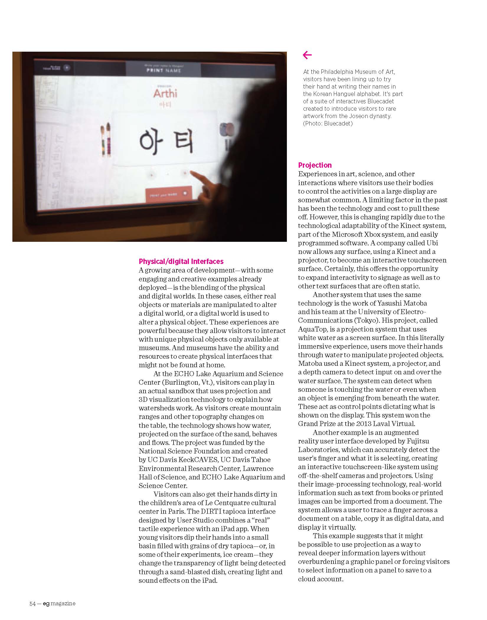
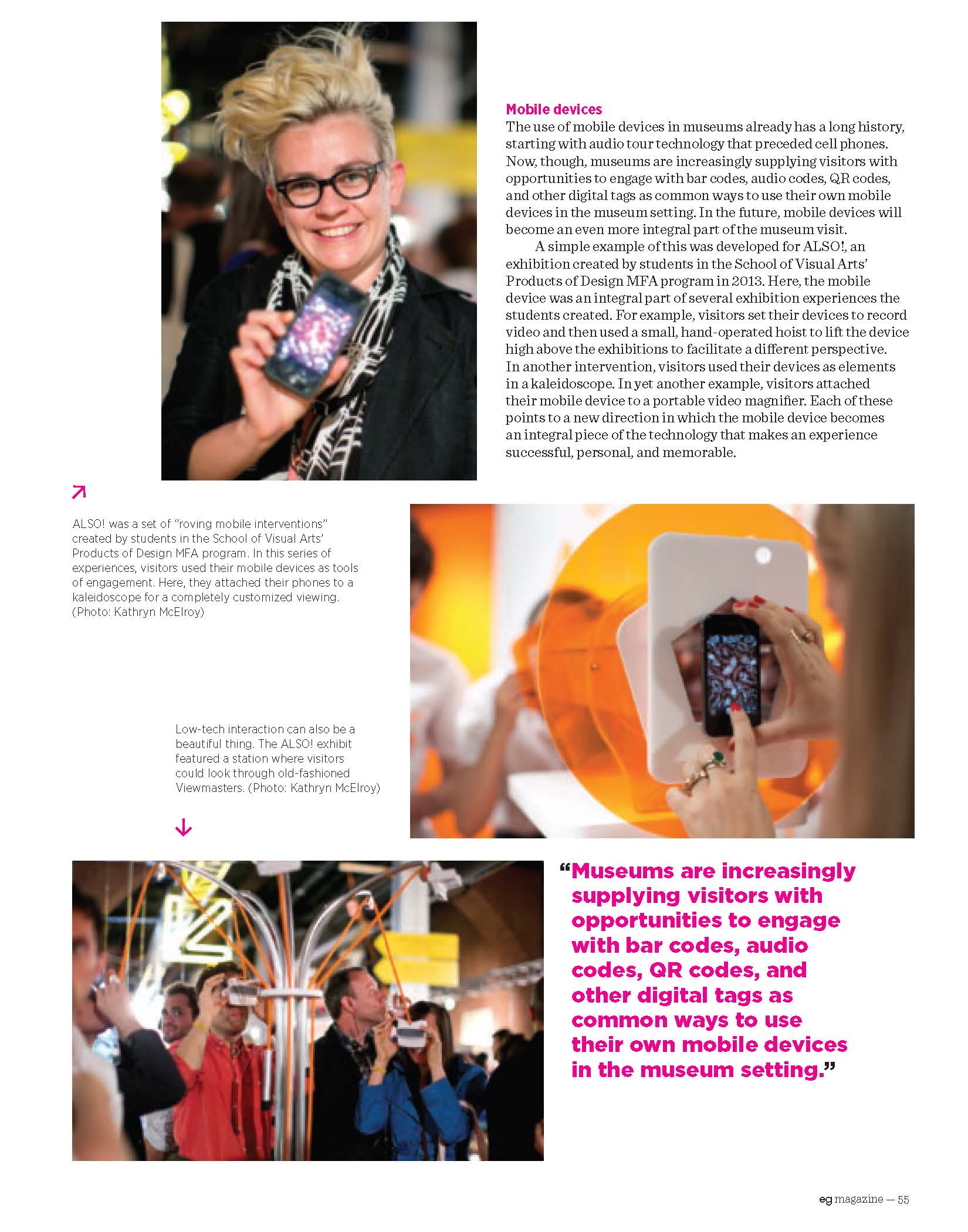
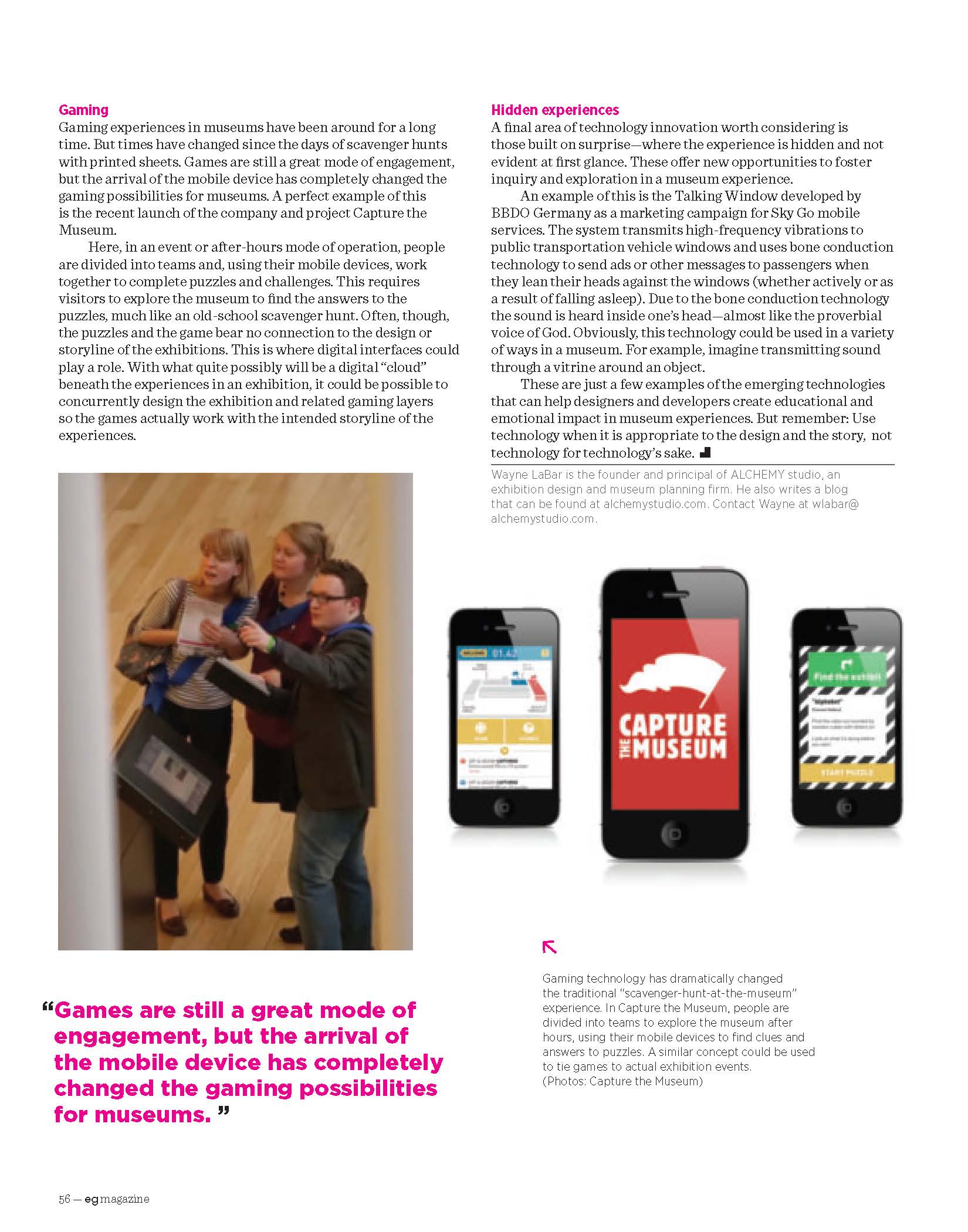
In the latest issue of  ed  the magazine for the Society of Experiential Graphic Design (SEGD), Wayne LaBar founder of ALCHEMY studio discusses the new technologies that are merging to engage people in experiences at museums. Below is a reprint of the article.

In addition if you are interested in exploring the subject further register for the SEGD Exhibition & Experience Design Workshop being held August 21 – 22 in Washington DC. Wayne and others will be speaking at it.

Enjoy!

Posted in: Alchemy Today, Experiences and Museums

Tags: , , , ,

Leave a comment

gold bug

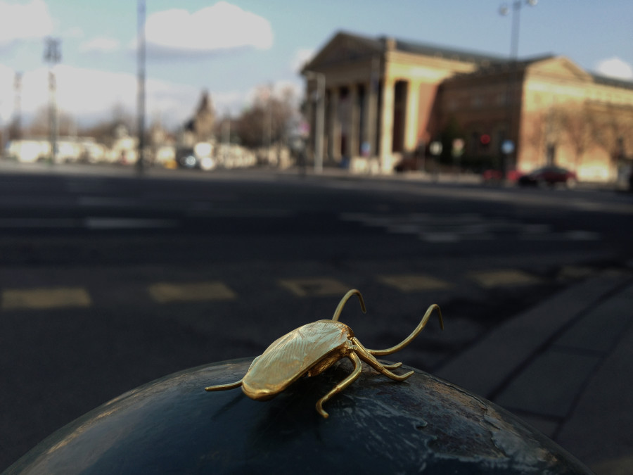
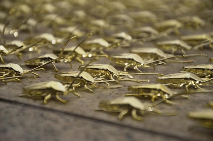
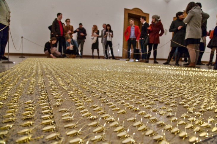
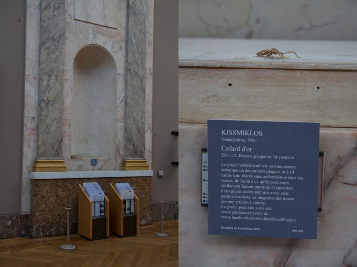
So, this week we wanted to highlight an artist and work that may not be new to many art museum readers but certainly might be new to some science and history museum people and probably also to many designers out there. The work is called The Golden Roach Project by the artist Miklos Kiss.


Miklos places these in museums around the world, as he states about roaches: “It is found anywhere in the World, considered everywhere as a pest and a source of infections, and exterminated anywhere possible. Opposite to this, the roaches in my creations go through multiple changes. Walking into the culture’s holy space, they turn to gold in the museums, which represent art, and this pushes the question of art. At this point the action is made classic and contemporary at the same time. The smuggling effect is “roachy” and reflects a contemporary approach, while in materials and workmanship it recalls of classic art pieces.”


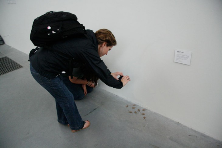
He encourages others to take these roaches or buy them, and while almost all are just gold-plated plastic, one is actually pure gold. In addition, people can post images of their roach in various places and, if the citation is tagged correctly, it can go up his website.

Miklos draws attention to how this idea of smuggling could also be considered in reverse – “This should bring the attention to a reverse situation, where an effective and valuable object will be smuggled in on the way in to the museum.”


Here at the studio, we are loving several aspects of this whole concept – making something precious by its material and where it’s places, the sort of “treasure” aspect of the one gold roach, and the interactivity with the viewers in a medium where physical interactivity is not often seen.

It makes us wonder how some of these concepts could be exported and adapted to have visitors in other types of museums create an interactive and dynamic social expression physically. How might this idea be adapted for a science center? A zoo?

What do you think? What does this concept inspire you to want to try?!


Posted in: Experiences and Museums

Tags: , , , , ,

Leave a comment

the dark side strikes back

So, as we have blogged about before, our friends in the marketing world often create experiences that inspire us here at the studio. At times these great ideas are even for museums. So this week we thought we would share three projects we found inspirational.

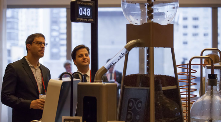
The first is an experience that can bring strangers together for conversation. Meet the Coffee Connector from the Economic Development Board of Singapore.


As you can see in the video, this requires two people to make cups of coffee. The interaction that leads to actually getting a cup of coffee puts users in a position to provide both a name and a subject to talk about. While it certainly affirms our studio’s belief that coffee is the center of the universe in the morning (martinis do that in evening – look for the Martini Connector next), this is a great model to potentially explore for a museum setting. It seems intriguing to create an activity where the payoff is not about the subject per se but instead is about people talking about the subject.

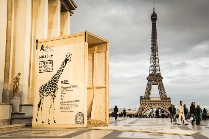
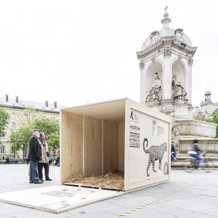
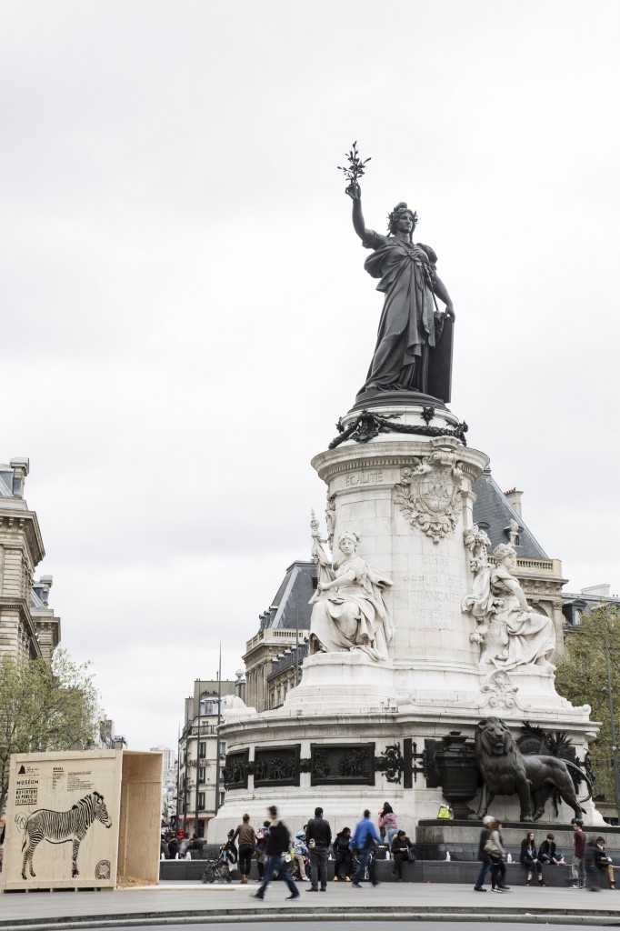
The second is the fun and evocative campaign for the Paris Zoological Park by Ubi Bene,


The idea of three-dimensional “artifacts” or leave-behinds is very interesting… and certainly this is an idea that could be reused for different subjects. Also, it allows for some great photo opportunities that extend the zoo’s impact.

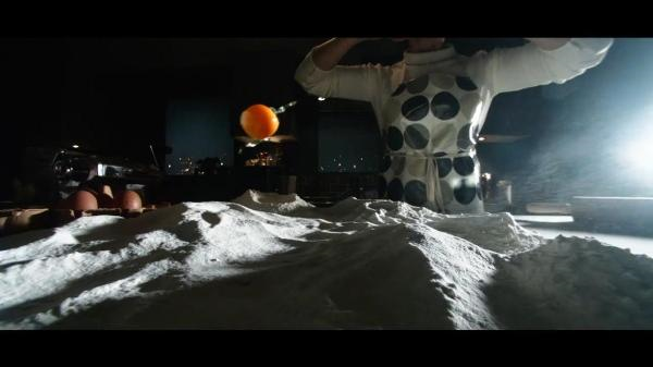
Finally, here’s something about a subject we here in study have worked on quite a bit. Take a look at how food and cooking can be transformed in a film. Film by Blink Productions and Wieden + Kennedy London


This just goes to show that many subjects could be made more interesting and more engaging when humor and theatrics are applied in ways that don’t detract or distract from the subject. Certainly a treatment like this might be a great way to introduce people to a subject before diving into more substantial content. This film did a wonderful job setting a mood.


What creative marketing and communications examples have you seen lately? How might those ideas help us create more memorable and engaging experiences for visitors?

Posted in: Experiences and Museums

Tags: , , , ,

Leave a comment

immersive color and sound

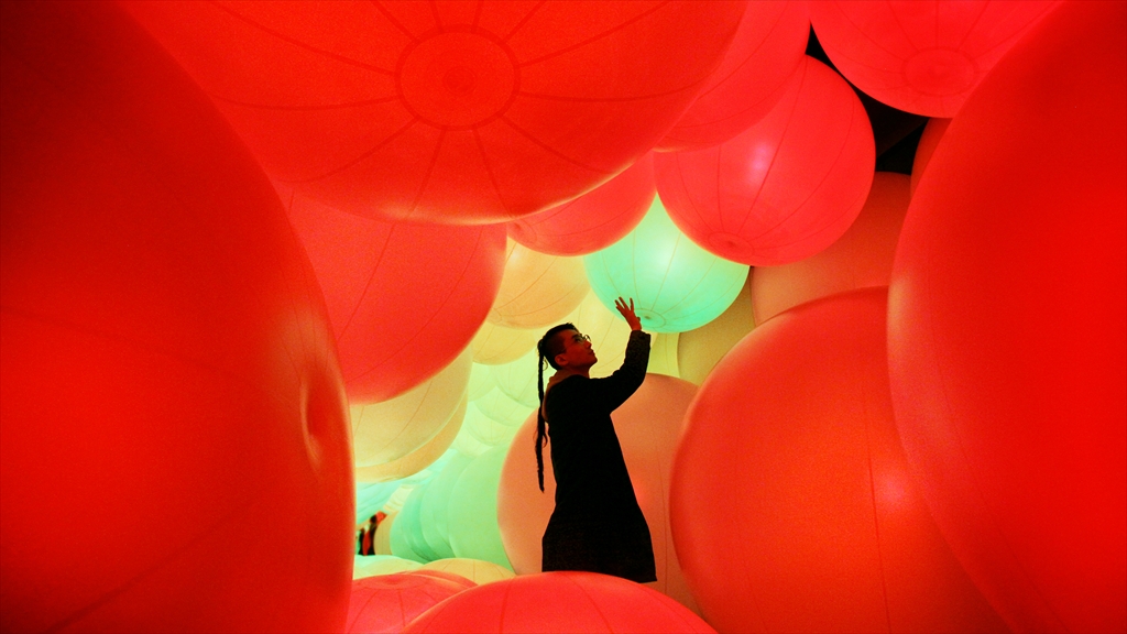
To start our new year, we became enthralled over the holidays with the latest installation by Team Lab called Distilling Senses: A Journey through Art and Technology in Asian Contemporary Art located at the Hong Kong Arts Centre.


In this world of giant orbs, the visitor’s touch changes the color, but the color also changes when the orbs run into something or are affected by the behavior of other spheres around it. Watching the video, the experience appears to be truly mesmerizing.

While a cynical person might describe this as just an over-scaled techno ball room, the experience creators wanted it to communicate how the web allows for interconnectivity and information dissemination. At the same time, a space like this could provide an experiential opportunity to engage with subjects where scale or location would make it impossible to visit.

What is certainly clear is how different and how totally inviting this experience is. It’s a great example of how both scale and immersiveness create a space that draws you in more than any “literal” interpretation of the internet. While, admittedly, it is not very interpretive, it could couple with more interpretive experiences and allow museums to be more impactful.

Over the holidays, did you run across anything mesmerizing?


Posted in: Experiences and Museums

Tags: , , ,

Leave a comment

losing the ocean for the waves

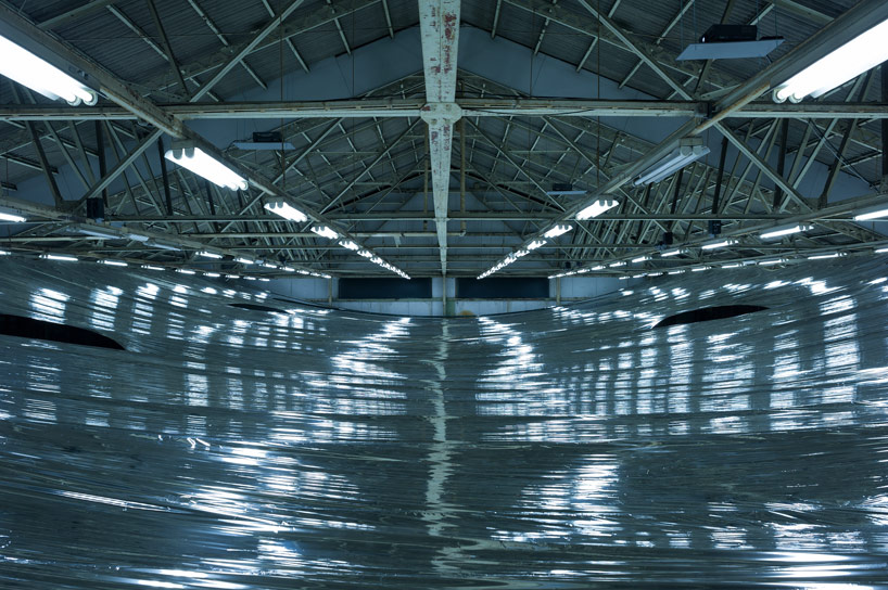
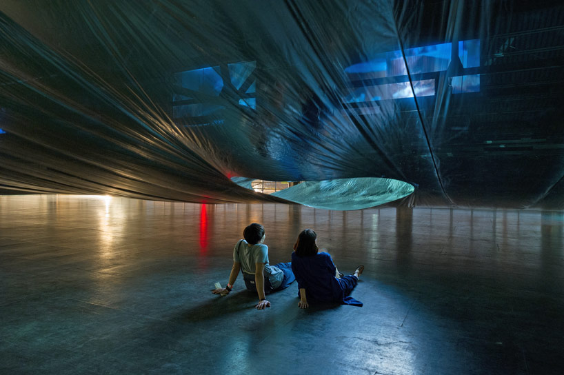
Last month an interesting installation opened for only a few days in Osaka Japan: My Thread – New Dutch Design on Films curated Eizo Okada .


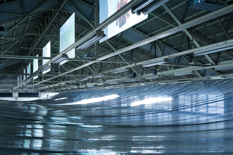
The interesting part of this exhibition was the work done by Hideyuki Nakayama, that created light and experience separation between the video screens displaying the work of several artists.

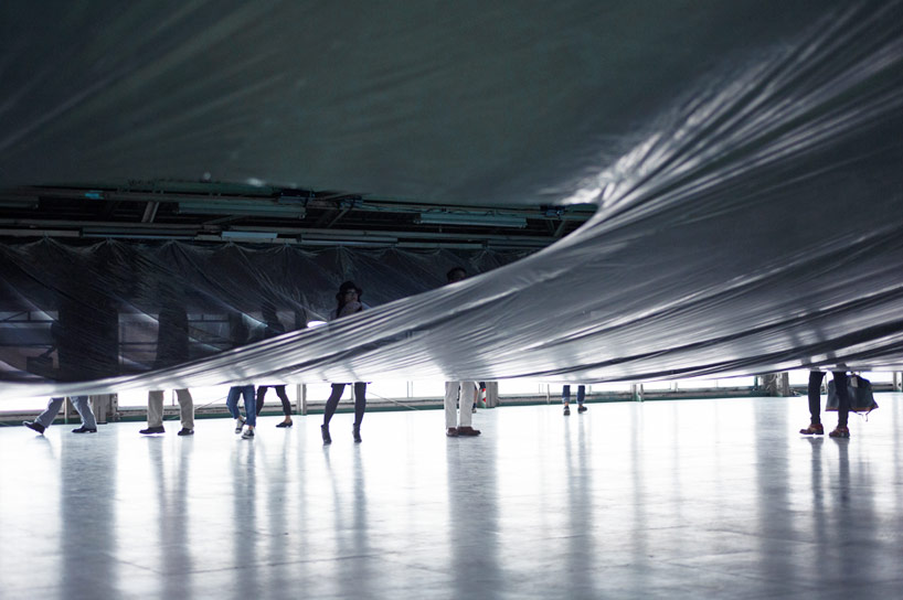
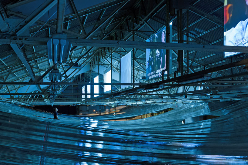
Hideyuki Nakayama adapted the metalized film used in emergency blankets to create a light, opaque, but air-porous layer between the screens and the floor below. Visitors are invited to walk beneath the layer and view the videos at designated spots between the layers.


What struck us was the almost eerie similarity of walking through or under a body of water.


Photos from the experience offer snapshots that reminded us a views “just under the surface,” to vistas across a calm body of water. How exciting it would be to encounter a series of experiences set into such a environment.

This made us ruminate on how often in experience design, museums lose sight of the power of such thinking.

Transforming the age-old adage about forest and trees to match our example above – too often we focus on the “waves” or individual experiences in an exhibition rather than the “ocean” that could be created. It is through experiencing the “ocean” that one can gain different and contextual insights into the nature of the “waves”.

In fact, other aspects of our popular culture – hit tv series, console games, and others – have moved toward creating the mega story with individual aspects that while standing alone create a larger, more powerful story.

Looking to future exhibition, it would be magical if we as a field could move from the waves to create more ocean experiences. How do you think this approach could enhance the museum experience?


Posted in: Experiences and Museums

Tags: , , ,

1 Response

Hidden Messages

One element of our exhibition field that is often forgotten as a potential interactive or spark for exploration and inquiry is two-dimension graphics. This is unfortunate, as graphics, when used in imaginative ways, can make for striking or inspirational ideas. Here are two examples.

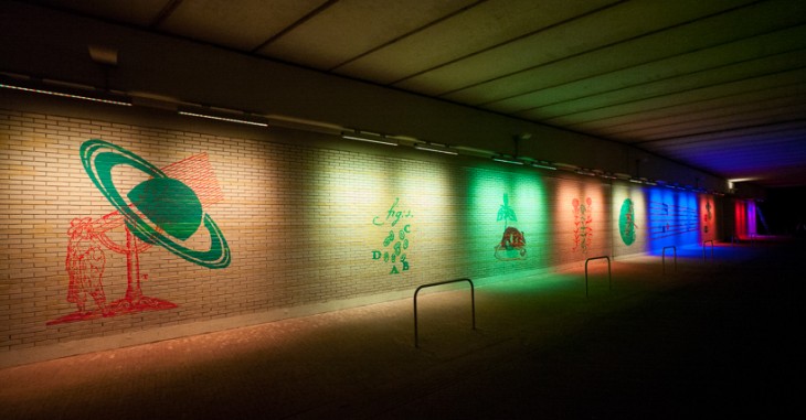
The first is a work by the artist Geert Mul called Exponential View.


This piece, which is in the Netherlands, reveals and makes visible a series of images related to the location of the tunnel, which is where the Dutch scientist and astronomer Christiaan Huygens lived. The fact that he proposed the wave theory of light makes it apropos that different wavelengths of light are used to create this experience. Certainly this idea could be used in smaller and more distributed ways.

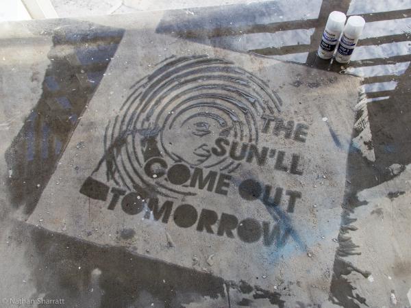
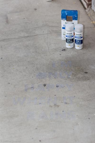
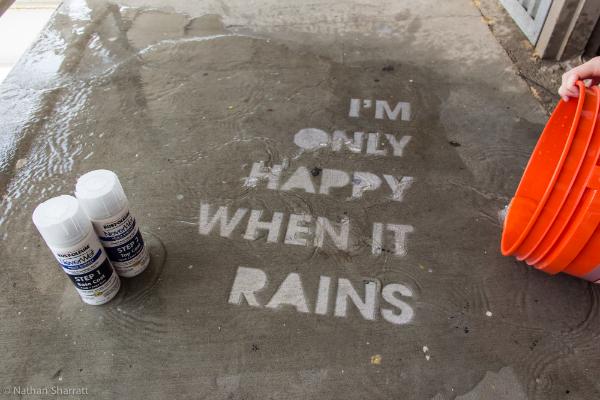
The second example comes from members of the Home Depot Community – Nathan Sharratt and Dana0814.


These images show some of the interesting effects that can be made by using NeverWet, a spray that repels water.

Imagine using this effect in a water table area or a fountain. All it would take is one visitor to discover the first hidden message and then use water to find others. (This, of course, might make a mess, but, wow, talk about inspiring exploration!)

These two examples show different ways graphics can be used to create engagement and inspire visitor exploration.

What interesting examples have you seen? What new ideas do you have for how technology can make graphics more interesting and memorable?

Posted in: Experiences and Museums

Tags: , , ,

Leave a comment

The Tapioca Interface – Physical and digital – part deux

Recently we blogged about the merging of the physical and digital worlds and how this phenomenon offers some very engaging and potentially stronger ways for exhibitions to use digital media to create more impactful experiences. Under the tag physical and digital, you can check out several blog entries that present some unique approaches to this physical/digital convergence.


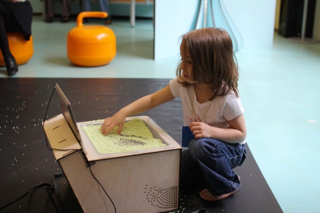
This week, we came across a new example of this design approach. Take a look at DIRTI for the iPad, created by Userstudio.


The testing pictured happend at La Maison des Petits. Using translucent material (including ice cream if you watch the second video!) and a simple web cam along with Raspberry Pi, you can create an effect that’s determined by your movements and changes in the material’s density and transparency.

This is a simple but elegant example of how a physical medium can be used to create and direct a physical link to a digital world.

Certainly, the key aspect of this experience is what the physical manipulation of the material actually corresponds to in the digital realm.

That said, this points to yet another example of elevating the impact of information and experience on a digital screen by closely correlating the interface and the medium.

While ice cream or tapioca may make for a creative music and color experience, here water (or maybe slime!) or some other substance might allow for an entirely different experience.

What ingredients would you want to use?

Posted in: Experiences and Museums

Tags: , , , , ,

Leave a comment

From the Dark Side

Please take our title light heartedly. Often in the museum world, sometimes in particular between staff departments, the marketing department is seen as the dark side of the “force” compared to the supposed content and educational driven exhibitions and educational departments. In reality when operating in tandem and in harmony they both lean on, learn from and include aspects of each’s field.

In that light here are some recent innovative marketing approaches that have some unique aspects that all good exhibits/exhibitions should have.

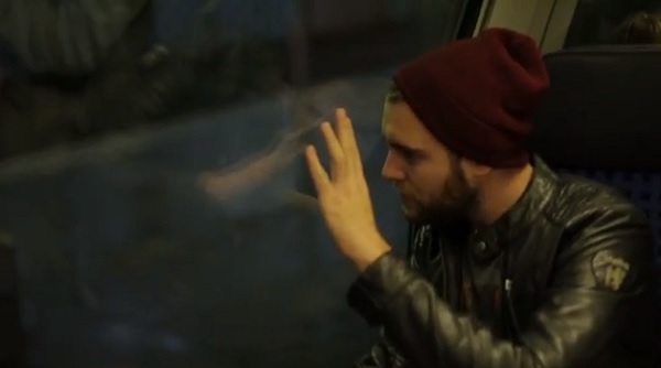
The first is the Talking Window done for Sky Go mobile services by BBDO Germany


In this example, high-frequency transmitted sound vibrates the window and then propagates and conducts through bone to stimulate a person’s hearing.

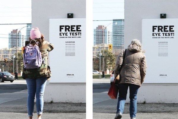
The second is the Hearing Eye Test by DraftFCB

Here, disguised as a free public eye test, is a hearing test. As you get closer, to ostensibly test your eyesight, you should hear an annoying sound. If you don’t, then you have a hearing problem!

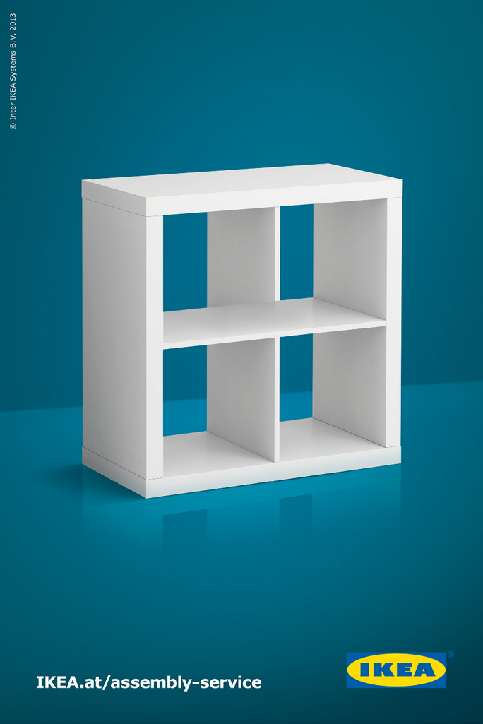
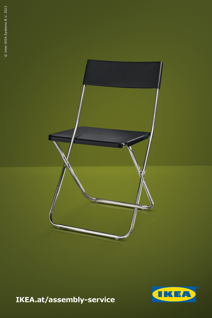
The final example are some Escher like advertising by DDB Tribal for Ikea


These play on the fascination we have with the impossible diagrams we are so familiar with.

While each of these has actual physical aspects that could be parlayed into actual exhibits, there are more fundamental features that make them powerful examples of playful interactivity.

They foster behaviors such as inquisitiveness, investigation, curiosity, observation, and a bit of playfulness. In addition, they result in surprise, engagement, interactivity, and, at times, contemplation, too.

These are the same characteristics that are essential to good experience development and design. So, there are lessons to be learned from these examples. Meanwhile, to our marketing compatriots in the museum field – how wonderful would it be if museum and science center marketing actually embodied and provoked the same behaviors we want to inspire in visitors through the museum experience itself? Then there would truly be no dark side.

What do you think? Please share other examples like these!

Posted in: Experiences and Museums

Tags: , ,

Leave a comment