July 2013

clandestine museum

The idea of museums that speak about what a museum is, what it means to collect, and how museums interpret the world is not a new idea. There are several out there – one, for example, is the Museum of Jurassic Technology. Here at ALCHEMY studio, we find these very thought-provoking… evoking reflections and offering inspiration about what we do as a field.

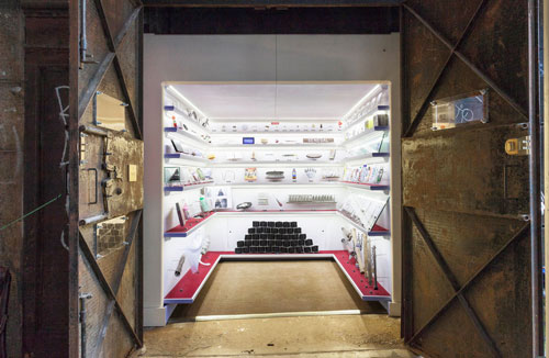
The latest is the secreted or hidden Museum.


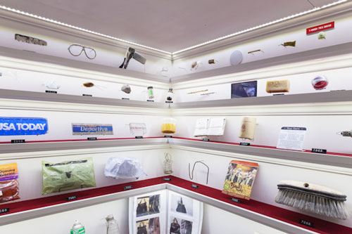
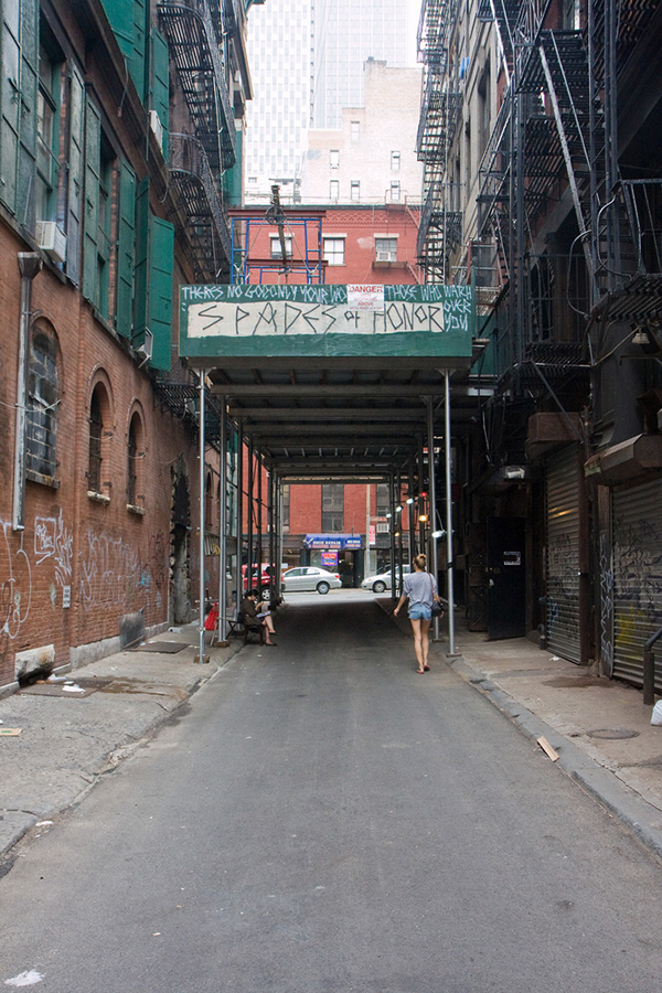
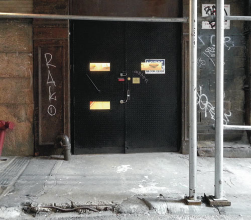
This experience is found in an abandoned freight elevator on Cortlandt Alley in New York City. As the museum’s web site states:

“Life exists around us, and the proof of our existence is both beautiful and absurd. Our footprint, which is often overlooked, dismissed, or ignored, is intriguing, and always worth exploring.”

In addition, there is no interpretation of the objects visible in the Museum. Rather, each object has a number code and you call a toll free number (888-763-8839), enter the object’s code, and receive information about the object.

So, here we have a fascinating example of a “hidden discovery” experience like the UNESTS we blogged about before. Imagine the impact of discovering this experience – a simple, perhaps extreme, instance of using mobile devices in a museum. Makes one wonder about trying this in a larger context.

Finally, an interesting take on bringing the museum to the neighborhood.

Today, their website says there will be a store and café this weekend. (Museum expansion!)

So, what “museum” might you create in an abandoned freight elevator? What other kinds of hidden museums would want to discover?
Posted in: Experiences and Museums

Tags: , ,

Leave a comment

The Tapioca Interface – Physical and digital – part deux

Recently we blogged about the merging of the physical and digital worlds and how this phenomenon offers some very engaging and potentially stronger ways for exhibitions to use digital media to create more impactful experiences. Under the tag physical and digital, you can check out several blog entries that present some unique approaches to this physical/digital convergence.


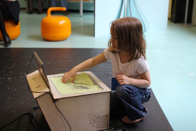
This week, we came across a new example of this design approach. Take a look at DIRTI for the iPad, created by Userstudio.


The testing pictured happend at La Maison des Petits. Using translucent material (including ice cream if you watch the second video!) and a simple web cam along with Raspberry Pi, you can create an effect that’s determined by your movements and changes in the material’s density and transparency.

This is a simple but elegant example of how a physical medium can be used to create and direct a physical link to a digital world.

Certainly, the key aspect of this experience is what the physical manipulation of the material actually corresponds to in the digital realm.

That said, this points to yet another example of elevating the impact of information and experience on a digital screen by closely correlating the interface and the medium.

While ice cream or tapioca may make for a creative music and color experience, here water (or maybe slime!) or some other substance might allow for an entirely different experience.

What ingredients would you want to use?

Posted in: Experiences and Museums

Tags: , , , , ,

Leave a comment

From the Dark Side

Please take our title light heartedly. Often in the museum world, sometimes in particular between staff departments, the marketing department is seen as the dark side of the “force” compared to the supposed content and educational driven exhibitions and educational departments. In reality when operating in tandem and in harmony they both lean on, learn from and include aspects of each’s field.

In that light here are some recent innovative marketing approaches that have some unique aspects that all good exhibits/exhibitions should have.

The first is the Talking Window done for Sky Go mobile services by BBDO Germany


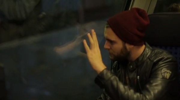
In this example, high-frequency transmitted sound vibrates the window and then propagates and conducts through bone to stimulate a person’s hearing.

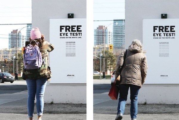
The second is the Hearing Eye Test by DraftFCB

Here, disguised as a free public eye test, is a hearing test. As you get closer, to ostensibly test your eyesight, you should hear an annoying sound. If you don’t, then you have a hearing problem!

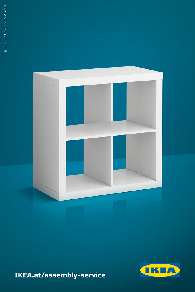
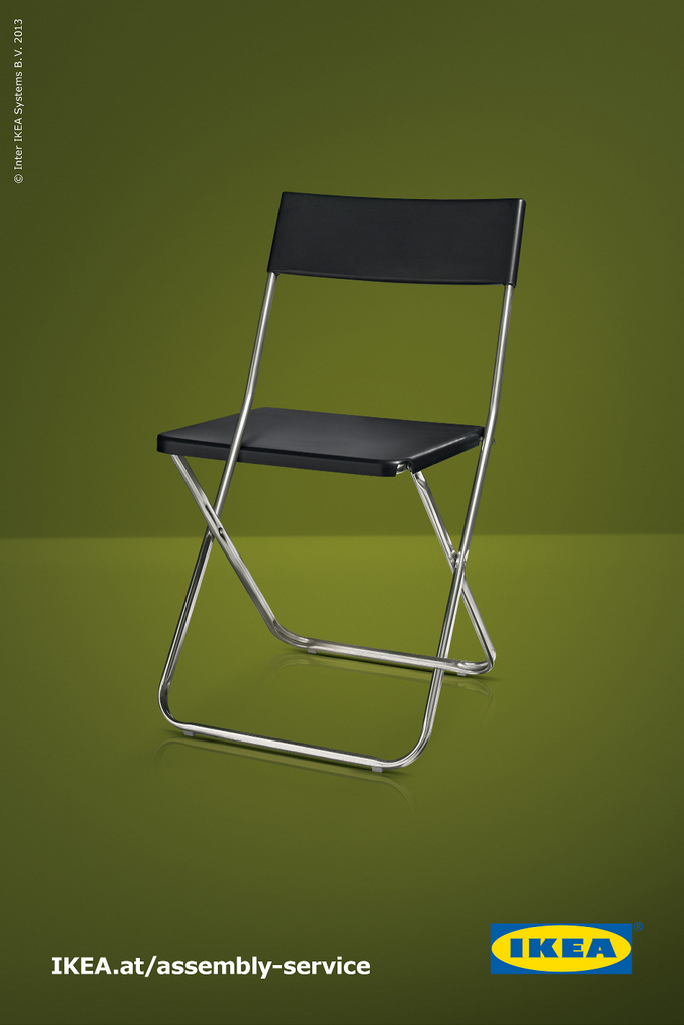
The final example are some Escher like advertising by DDB Tribal for Ikea


These play on the fascination we have with the impossible diagrams we are so familiar with.

While each of these has actual physical aspects that could be parlayed into actual exhibits, there are more fundamental features that make them powerful examples of playful interactivity.

They foster behaviors such as inquisitiveness, investigation, curiosity, observation, and a bit of playfulness. In addition, they result in surprise, engagement, interactivity, and, at times, contemplation, too.

These are the same characteristics that are essential to good experience development and design. So, there are lessons to be learned from these examples. Meanwhile, to our marketing compatriots in the museum field – how wonderful would it be if museum and science center marketing actually embodied and provoked the same behaviors we want to inspire in visitors through the museum experience itself? Then there would truly be no dark side.

What do you think? Please share other examples like these!

Posted in: Experiences and Museums

Tags: , ,

Leave a comment

Wonderful Illusion

With this being a holiday week here in the US this week’s inspiration takes on a whimsical and playful turn.

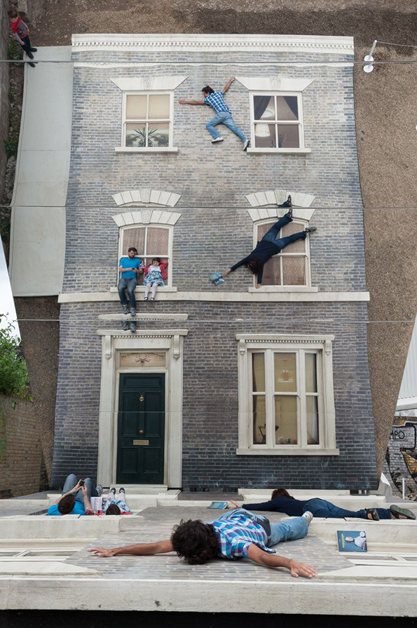
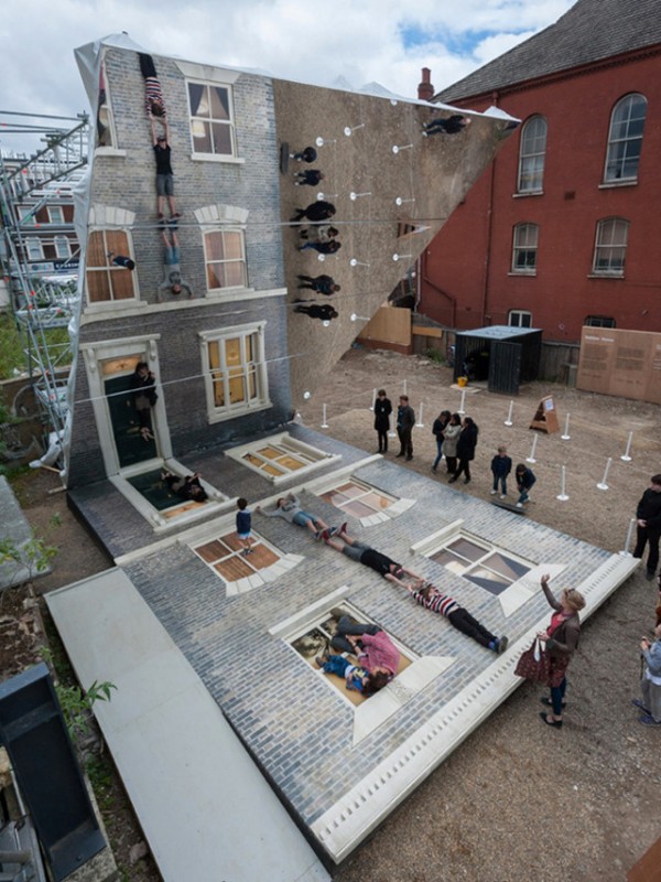
We recently ran across this wonderful illusion experience that would be at home “as is” in so many places we have worked with. This is the Dalston House by Leandro Erlich done for the Barbican.


The shear elegance of the concept is amazing. Certainly the basic idea of this experience could be replicated for so many other “environments” and could be themed in ways that reflect different content.

But one of the key points of this experience is its “instagram” moment. (Perhaps in some bygone area we might call it a “Kodak” moment or “Polaroid” moment – by the way, when did a bygone era mean in our lifetime J )  Certainly used in theme park design but at times not used enough in exhibition design is creating a viewpoint, a moment where visitors can memorialize their experience. This beautiful example is a wonderful reminder of this.

In today’s digital photo, anytime world, creating these moments are a powerful experience on many levels.

Share with us where you see these in exhibitions you visit.

Posted in: Experiences and Museums

Tags: , ,

Leave a comment