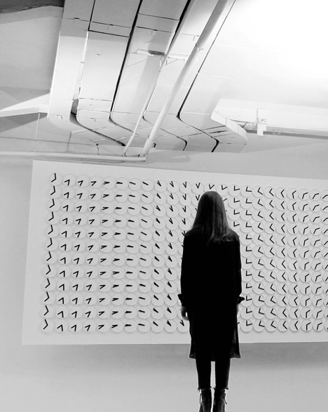
Some of the exhibits that have always seemed to suck us into mesmerizing states of fascination have actually been interactive (and at times non-interactive) large-scale wall experiences. Recently, we have become aware of two that should get your brain turning and will no doubt “spin off” countless ideas. (Pardon the pun, which you’ll understand when you see these.) The first is a work by the design group called Humans Since 1982. This is called “A Million Times.”
Made with clocks (a subtle time-related experience, connected in this way to the melting piece Calamidad Cósmica), this piece can create messages and depict complex patterns and fields, suggesting many ideas for riffing and evoking many related ideas and aspects. A system like this could be responsive to viewers or to objects such as magnets or other more technological EM transmitters (i.e. cell phones anyone?). This could be a beautiful way to engage people in some complex ideas. On its onw it’s a beautiful, evocative piece.
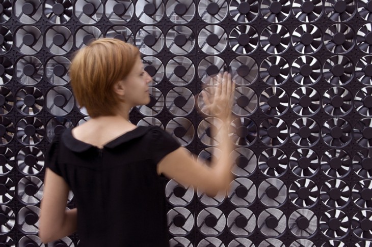
Another piece we ran across was the experience “Flow 5.0” by Daan Roosegaarde a Dutch artist.
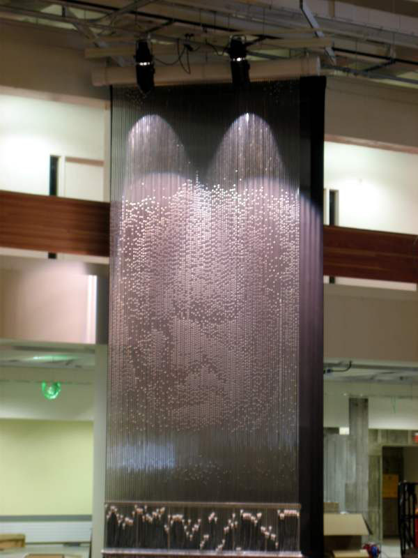
Here, what interests us is that fact that this interactive piece is different than, say, “Pipe Dream” by Bruce Shapiro 
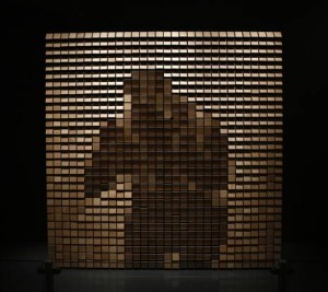
or the work of Daniel Rozin (like this at the Perot Museum). 
“Flow 5.0” actually sends something physical back to the viewer – moving air. This could open up other ideas about what else could touch the viewer/user that they might explore or appreciate.
Certainly, with both the physical and visual interactive and non-interactive wall experiences, there is ample material and inspiration to evoke some truly immersive and memorable museum visits, not to mention make many buildings more engaging.
Let us know about more if you run across them. What ideas do these spin off?


2 Comments
These examples are very inspirational.Thank you very much for sharing them.
The array of clocks, “A million times”, is fantastic. At a macro level the patterns can evoke everything from magnetic fields to mazes to no doubt images. And at level of a single element, it’s the two hands of a clock. Beautiful, probably not that expensive to implement, and worthy of being seen in every city. Kudos to the designers.
Re the array of fans, we worked briefly with a Calgary-based artist who was pursuing a “wind pixel” display. Her idea, and I have no idea if it was realized, was to use compressed air and electrically-controlled solenoid valves to create a 10×10 array of on/off (1-bit) wind “pixels” (wixels?). Ideally you’d be able to stand in front of this and feel the pattern. Our company, EDM, had done some work on using compressed air in a museum/exhibit context, hence the potential for collaboration. I’d like to experience this tactile yet invisible interactive. The above implementation is as much about the aesthetic of the spinning fan as the movement of air. Interesting nonetheless. Thanks for posting.