exhibit design

the coming interactive surface revolution

With its capacity to detect a user’s movements, the Microsoft Kinect system stands ready to change how the museum and themed entertainment field might consider where an interactive experience occurs and what the interactive medium might be. As shown recently here in our blog over two months ago, water can serve as an interface location. In fact, recently this same story again surfaced across the web – for example here and here.

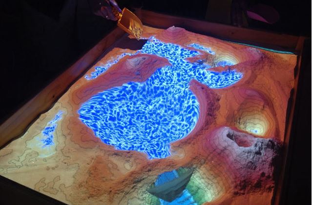
Certainly, the next step is developing more sophisticated augmented reality experiences based on this ability. While the water example shows some rudimentary possibilities, an application (came out last year) that certainly could have potential impacts – educationally and otherwise – is shown here. In this one sand is sand to as our medium and simulate water and water flow.


A further refined version is being worked on or is finished through the work Oliver Kreylos of UC, Davis, the Tahoe Environmental Research Center (at UC, Davis), and the Lawrence Hall of Science (at UC, Berkeley) for ECHO Lake Aquarium and Science Center in Burlington, Vermont. Here is video of that piece.


Thinking back on past projects where we wanted to create a physical interactive six or seven years ago about watersheds and drainage, had this been around, we might have jumped on it.

But this technology, along with things such as our posting two weeks ago on motion tracking systems and cameras/projection, means that as we think about exhibitions, there is a vast opportunity to add an additional digital dimension if necessary. This applies even to some our most tried-and-true interactive examples.

Take a gravity well. When we will see the first one where, as the ball travels down the well, the acceleration figures, the projected path, or force vectors are projected on the surface of the gravity well itself?  How about projection on an erosion table? The list of possibilities is endless. Additionally, all of this digital information can be saved, taken home, shared on personal devices, and distributed through the cloud. We are just beginning to explore how this could change the ways physical interactives can link together with our lives outside of the walls of a museum.

But there are dangers, and at times we don’t want this extra layer.  It might detract from the innate beauty, simplicity, or emotional and learning impacts of the physical interactive.

The key will be figuring out when to add this ability and when to leave the physical reality of a phenomenon alone.

We here at the studio can already imagine the debates and conversations that will erupt as we move forward with these evolving abilities. Those are going to be some good conversations around the conference bar! Meanwhile until then we remain on the lookout for new examples. Do you know of any? What do you think of the coming revolution?
Posted in: Experiences and Museums

Tags: , , , ,

2 Responses

The Tapioca Interface – Physical and digital – part deux

Recently we blogged about the merging of the physical and digital worlds and how this phenomenon offers some very engaging and potentially stronger ways for exhibitions to use digital media to create more impactful experiences. Under the tag physical and digital, you can check out several blog entries that present some unique approaches to this physical/digital convergence.


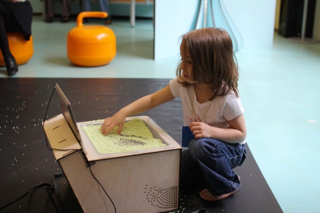
This week, we came across a new example of this design approach. Take a look at DIRTI for the iPad, created by Userstudio.


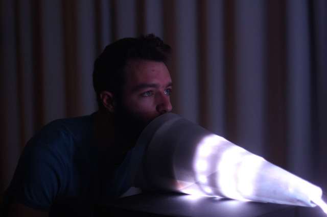
The testing pictured happend at La Maison des Petits. Using translucent material (including ice cream if you watch the second video!) and a simple web cam along with Raspberry Pi, you can create an effect that’s determined by your movements and changes in the material’s density and transparency.

This is a simple but elegant example of how a physical medium can be used to create and direct a physical link to a digital world.

Certainly, the key aspect of this experience is what the physical manipulation of the material actually corresponds to in the digital realm.

That said, this points to yet another example of elevating the impact of information and experience on a digital screen by closely correlating the interface and the medium.

While ice cream or tapioca may make for a creative music and color experience, here water (or maybe slime!) or some other substance might allow for an entirely different experience.

What ingredients would you want to use?

Posted in: Experiences and Museums

Tags: , , , , ,

Leave a comment

From the Dark Side

Please take our title light heartedly. Often in the museum world, sometimes in particular between staff departments, the marketing department is seen as the dark side of the “force” compared to the supposed content and educational driven exhibitions and educational departments. In reality when operating in tandem and in harmony they both lean on, learn from and include aspects of each’s field.

In that light here are some recent innovative marketing approaches that have some unique aspects that all good exhibits/exhibitions should have.

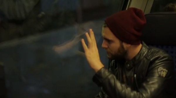
The first is the Talking Window done for Sky Go mobile services by BBDO Germany


In this example, high-frequency transmitted sound vibrates the window and then propagates and conducts through bone to stimulate a person’s hearing.

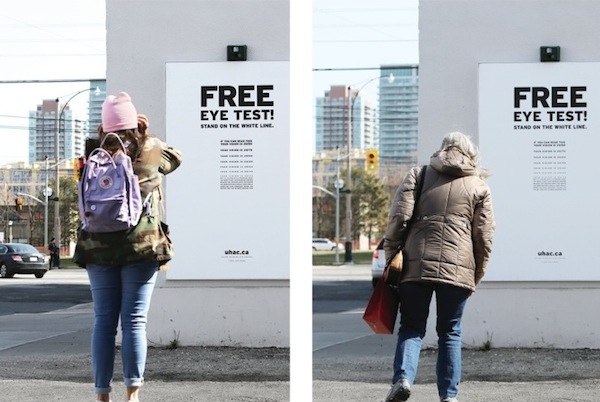
The second is the Hearing Eye Test by DraftFCB

Here, disguised as a free public eye test, is a hearing test. As you get closer, to ostensibly test your eyesight, you should hear an annoying sound. If you don’t, then you have a hearing problem!

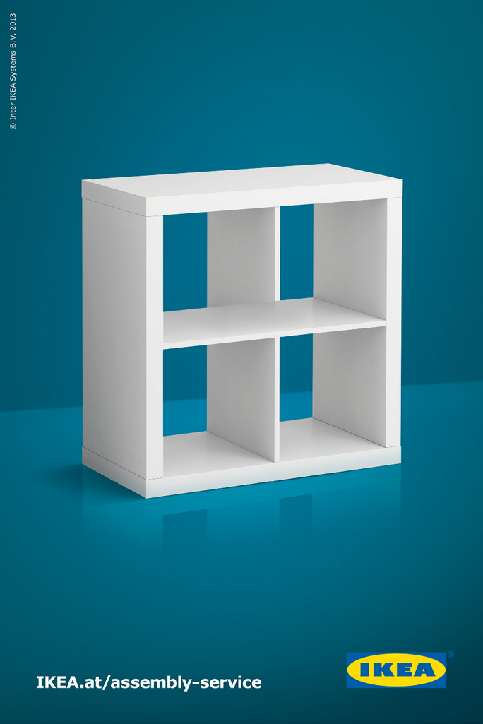
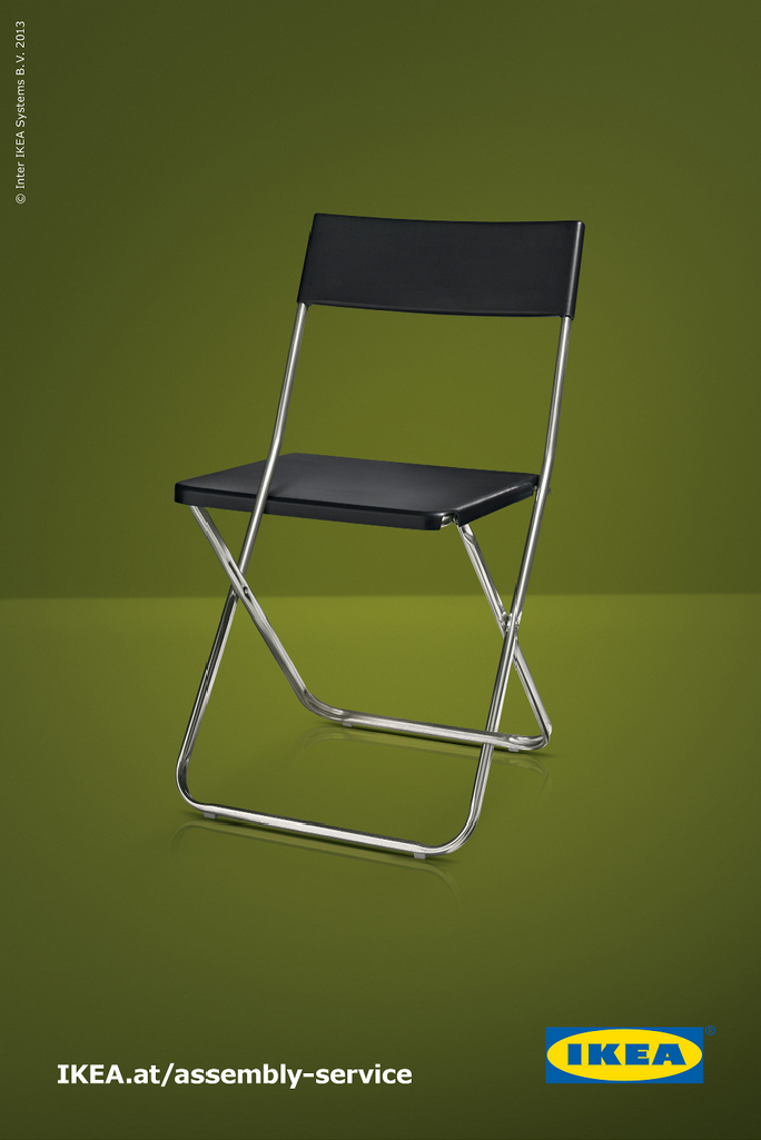
The final example are some Escher like advertising by DDB Tribal for Ikea


These play on the fascination we have with the impossible diagrams we are so familiar with.

While each of these has actual physical aspects that could be parlayed into actual exhibits, there are more fundamental features that make them powerful examples of playful interactivity.

They foster behaviors such as inquisitiveness, investigation, curiosity, observation, and a bit of playfulness. In addition, they result in surprise, engagement, interactivity, and, at times, contemplation, too.

These are the same characteristics that are essential to good experience development and design. So, there are lessons to be learned from these examples. Meanwhile, to our marketing compatriots in the museum field – how wonderful would it be if museum and science center marketing actually embodied and provoked the same behaviors we want to inspire in visitors through the museum experience itself? Then there would truly be no dark side.

What do you think? Please share other examples like these!

Posted in: Experiences and Museums

Tags: , ,

Leave a comment

Wonderful Illusion

With this being a holiday week here in the US this week’s inspiration takes on a whimsical and playful turn.

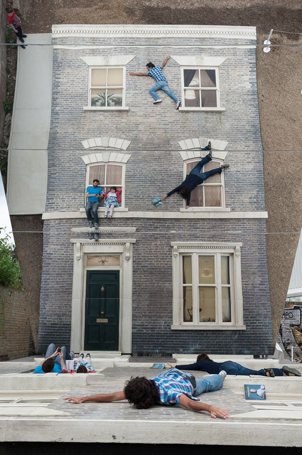
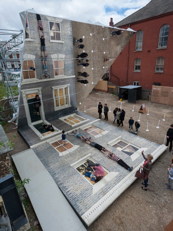
We recently ran across this wonderful illusion experience that would be at home “as is” in so many places we have worked with. This is the Dalston House by Leandro Erlich done for the Barbican.


The shear elegance of the concept is amazing. Certainly the basic idea of this experience could be replicated for so many other “environments” and could be themed in ways that reflect different content.

But one of the key points of this experience is its “instagram” moment. (Perhaps in some bygone area we might call it a “Kodak” moment or “Polaroid” moment – by the way, when did a bygone era mean in our lifetime J )  Certainly used in theme park design but at times not used enough in exhibition design is creating a viewpoint, a moment where visitors can memorialize their experience. This beautiful example is a wonderful reminder of this.

In today’s digital photo, anytime world, creating these moments are a powerful experience on many levels.

Share with us where you see these in exhibitions you visit.

Posted in: Experiences and Museums

Tags: , ,

Leave a comment

Physical and the digital – inspiration while in Europe at the ECSITE 13 conference

So, a thread that, here at the studio, we believe is ripe for an explosion of innovation in both design and experience is

how we bring together the physical and digital worlds.

Many of our former blogs postings focus on this interplay. Since many of us who are part of the studio have science, design or engineering degrees, it makes some sense that we’d be intrigued by connections between the physical and the digital and how those connections might apply to a variety of future projects. Here are two new examples:

The first is Murmur created by Chevalvert2RoqsPolygraphik and Splank.


What is interesting here is the physical connection between the visitor’s sound and the representation on the screen. The literalness and physicality of this connection create a strong response between the experience and the digital display. Additionally, visitors manipulate a digital display of information via a physical interface that is not one of the expected devices normally used (screen, mouse, keyboard, knob etc.).

.

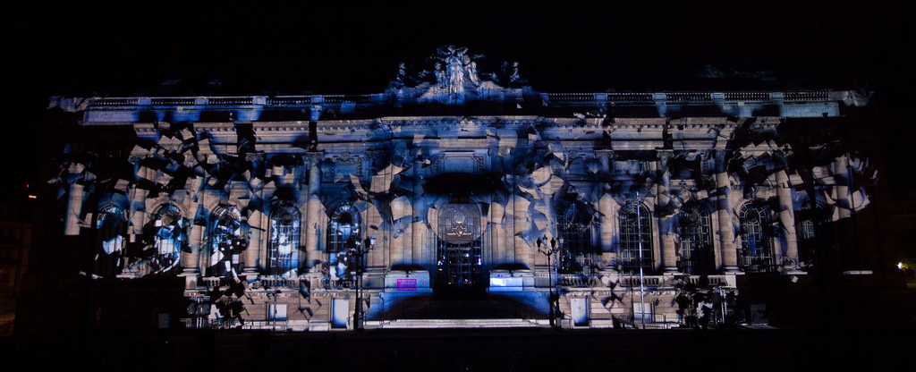
This week’s second inspiration piece is the projection on the Museum of Art and History in Geneva created by Onionlab. This production is called Evolució


While projecting on a building is not new, what this projection does is actually use the surface, the museum, as the star of the show. The physical world makes the projection “sing.” Too often in exhibition design attention is paid only to the digital content being projected. Perhaps, instead, we should start from the other way around:

“Here we have a special physical object. How could a projection added to it create something new and transformative?”

What do you think? Where have you seen interesting interplay between the physical and digital worlds?


Posted in: Experiences and Museums

Tags: , , ,

2 Responses

Mobile Interactivity

Museum and science centers continue to explore and experiment with how to incorporate mobile devices into their experiences. One motivation is the incredible capacity of today’s modern smart phones – devices more powerful than the first computers put on a museum floor.

However, the field’s experimentation has focused primarily on the device as separate from the experiences in the exhibition environment. The devise is an add-on to the experience itself.

What if the only way to interact with an exhibit was with a mobile device?

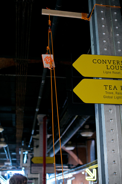
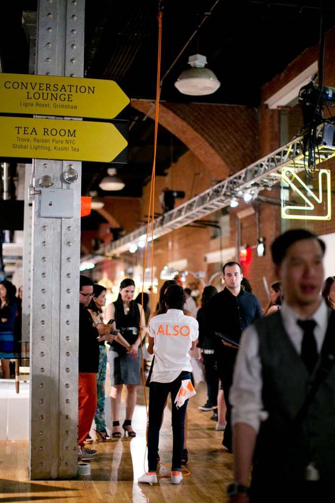
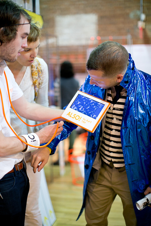
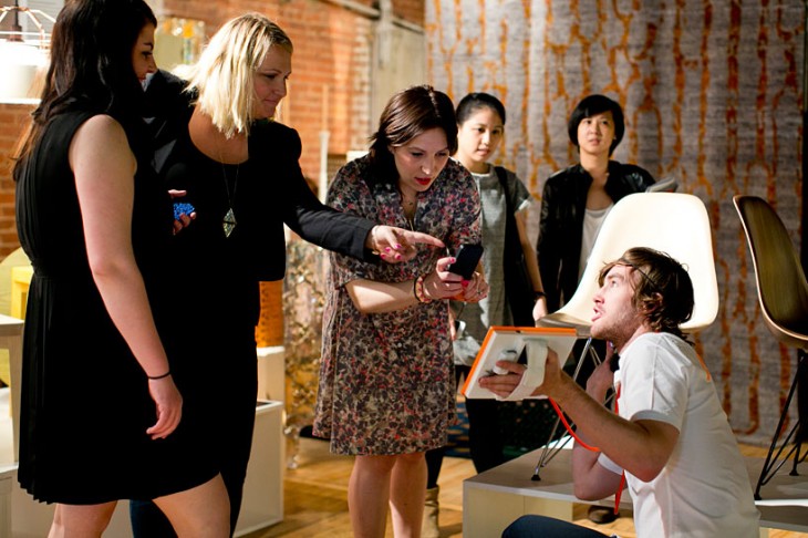
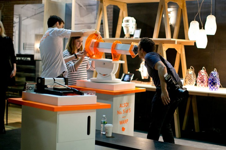
Here at the studio we are fascinated with several experiences that were on display at the “ALSO” exhibition. “ALSO” was an exhibition created by first year students of the School of VISUAL ARTS’ MFA Products of Design program.

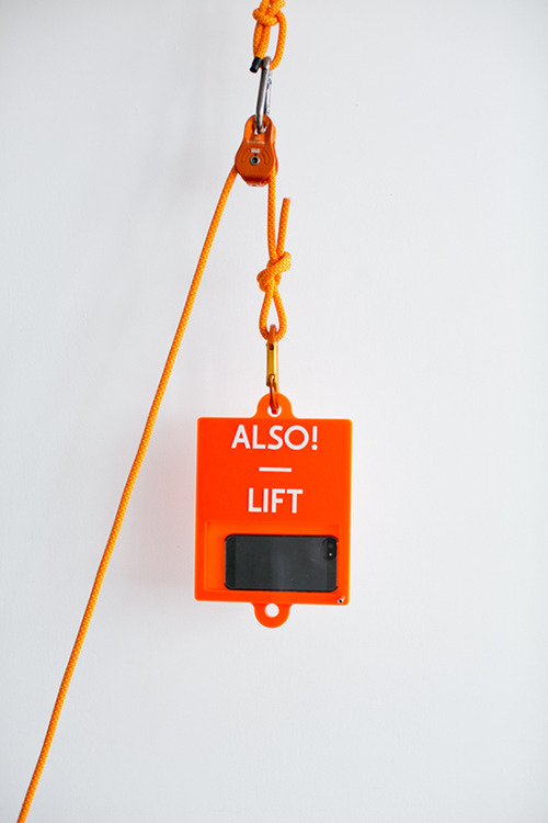
The first experience that caught our eye was the one named LIFT


Here, you put your phone system in a hoist that lifts it high above the exhibit floor and then back down – capturing video the whole time. The visitor thus gets their own “bird’s eye” view of the exhibition, with this experience offering a different perspective and creating personal memories for each visitor.


The second intriguing experience was TINY.


Here, a portable video magnifier was attached to an iPad, thus allowing visitors to explore the micro-world around them. Imagine offering a magnifier that visitors can attach to their tablet and use to explore an entire museum!

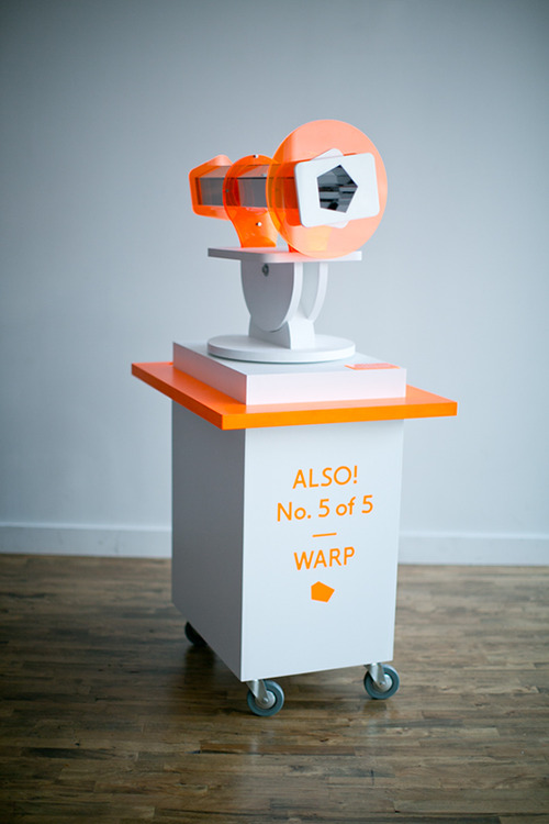
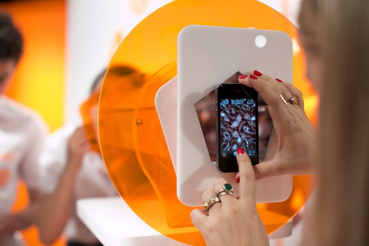
The third was WARP


Here, visitors could use their mobile device’s camera to record an image from a two-sided kaleidoscope. This exhibit points to the idea of embedding video or image opportunities directly into an experience.

Each of these shows a different creative approach to incorporating mobile devices into museum environments.

Rather than depend on an app, look to make the phone an integral part of the exhibit “structure,” an integral part of the main experience.

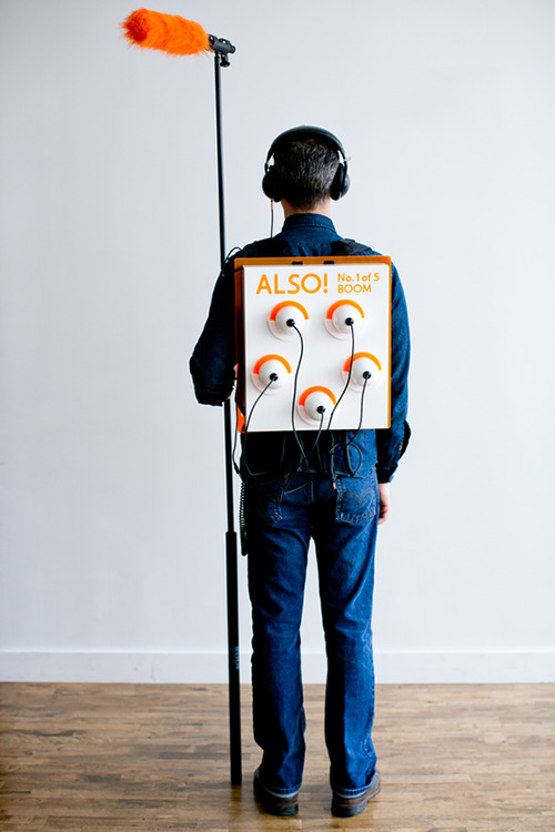
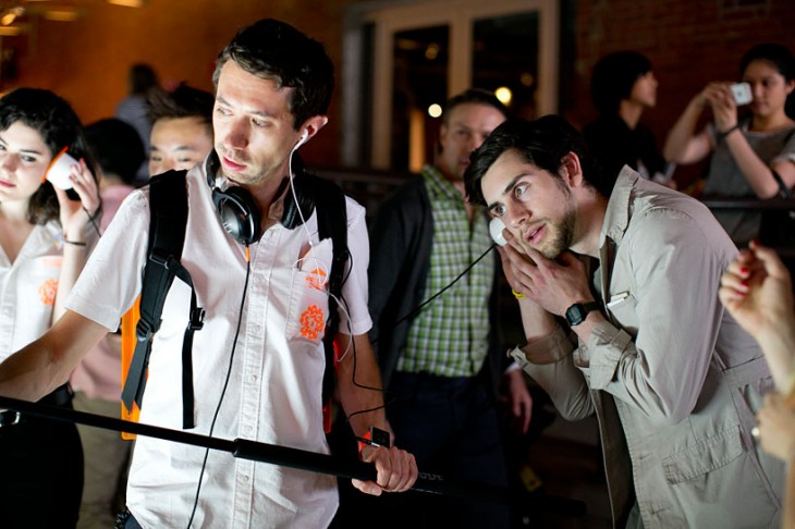
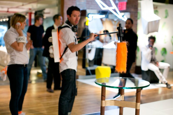
The importance of structure and the message it portrays was also evident in another exhibit included, called BOOM.


Here, using a boom microphone, you dramatically get the stories of objects. This experience harkens back to the sound bottles we discussed in an earlier post and the idea of physical metaphor.

We salute the great ideas these students presented. We look forward to seeing more!


Posted in: Experiences and Museums, Uncategorized

Tags: , , , ,

Leave a comment

seeking infinity

Here at the studio we still remember playing as a kid inside a store’s changing room where the mirrors on the left and the right were on hinges. This allowed us to turn them to face each other and we could step between them and see ourselves disappear into what seemed like infinity.

We as humans seem to have an affinity to peer into infinity.

Thinking about this the incredible appeal of peering into the infinite is one that is filled with mystery, the unknown, a world beyond our own. It taps into the human desire to explore and understand.

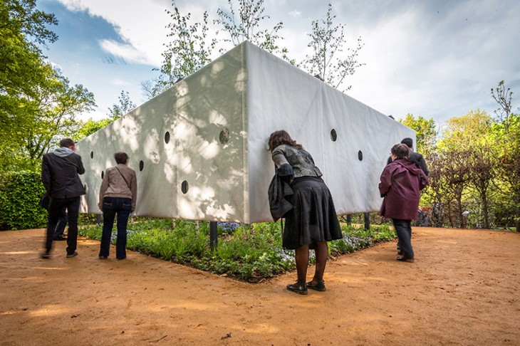
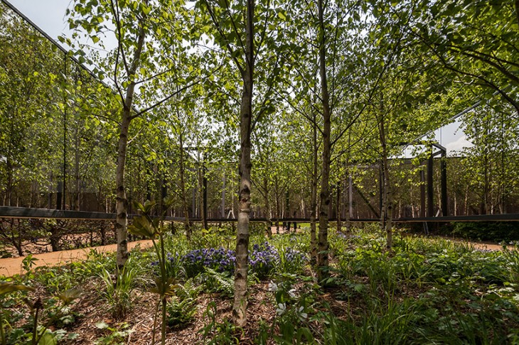
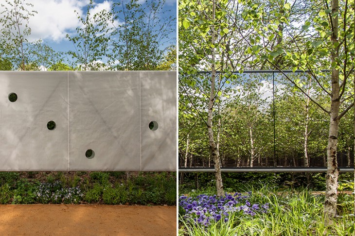
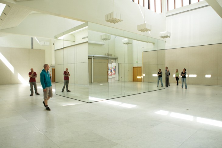
Several recent installations allows us to explore this both as the participant and the observer. As observer one can explore the infinite with “Outside In” a work for the 22nd International Garden Festival of Chaumont Sur Loire, France created by architects Meir Lobaton corona and Ulli Heckmann.


This work allows us to look into an infinite garden. It would seem that in this piece the longing of wanting to explore the space might be even more pronounced since one is actually outside and “just outside” too.

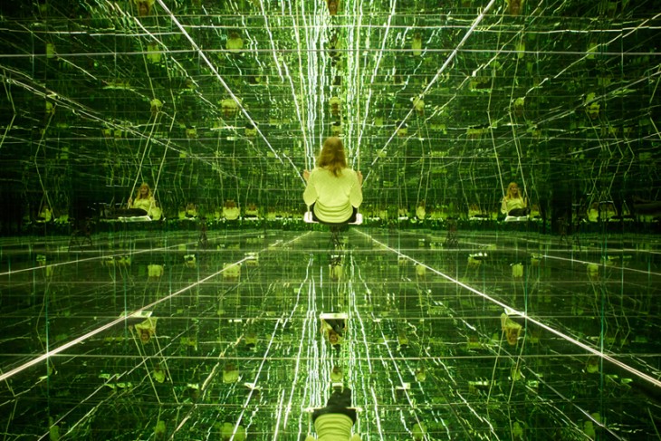
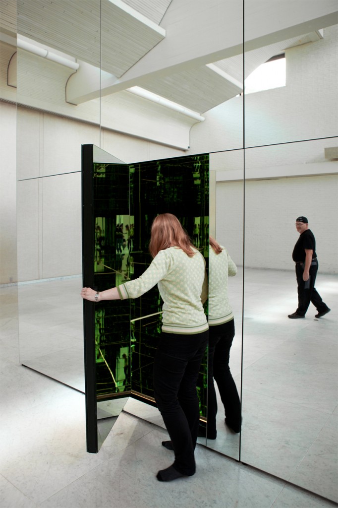
The second experience is “The Phoenix Is Closer Than It Appears” created by Thilo Frank. In this piece the observer is at the core (literally) and part of the infinity.

The work actually has two points of view. Here installed at the Museum of Modern Art, Aalborg, Denmark, the outside blends perfectly into the space creating an almost hidden installation.

The second way in which it works is to enter inside where you find yourself at the center of infinity where you are invited to swing.

Here at the studio we are struck by the way these seem to tap into some primal desire of humans to look into infinity and the emotions that evoke. The playfulness, mystery, seeking understanding, are all very powerful.

In creating exhibition design as much as we look for education learning impacts tied to curriculum in today’s modern museum thinking – we strongly urge that we should set emotions such as these at the core of what we are designing as well.  While there may in fact need to be more didactic exhibits, paired with experiences that touch these emotional goals, an exhibition can create a much more memorable and impactful outcome. Much like the simple experiences of that infinity we found in the store’s changing room.


Posted in: Experiences and Museums

Tags: , , , ,

1 Response

digital water

So, a few days ago, we posted the new interface/augmented reality project by Fujitsu Laboratories. This offers some interesting ideas for integrating augmented reality into museum exhibition environments. Now we have a new one to take a look at.

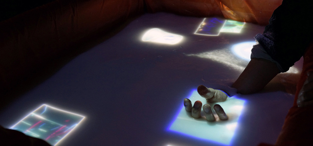
Here is another new digital interface that offers more fascinating ways to interact with digital information. AquaTop turns a pool of water into an interactive, three-dimensional digital interface surface.


AquaTop is a projection system that uses something like bath salts to create a white water screen surface. (Most likely, other substances could work as well.) The other components include a sensor system (in this case, Kinect), a projector, lighting control, and interactive programming. The system won the Grand Prize at Laval Virtual this year.

There is something intuitive and pleasing about the physicality of water and the common digital “touch” interface. Makes one wonder what other actions we might develop if we projected on water more often.

One particularly fascinating thing about AquaTop is that it directly and visually demonstrates multiple points of interface – for example, by showing visible markers when someone touches the surface with multiple fingers – from under the surface! We’re also intrigued about using other sensor systems and how we might manipulate things like waves or other physical water phenomena. We can also imagine some truly creative and fun ways to incorporate this technology into a water play area or other water related exhibit.

AquaTop has some similar attirbutes to the posting we had about 3d projections. You can check out that earlier post here. 

What ideas do you have? We’d love to hear what you’re imagining.

A shout-out to Louise Julie Bertrand who pointed us to this project – thank you.

Posted in: Experiences and Museums

Tags: , , , ,

Leave a comment

Engaging Spaces

One of the aspects of exhibition design that we enjoy doing is not only creating engaging exhibit experiences but also creating engaging experience spaces.

What is wonderful is when the space that the exhibits are in is an exhibit itself.

We’ve recently run across two recent installations that capture that feeling and would work well in several institutions we can think of or for several topics we have explored as exhibitions.

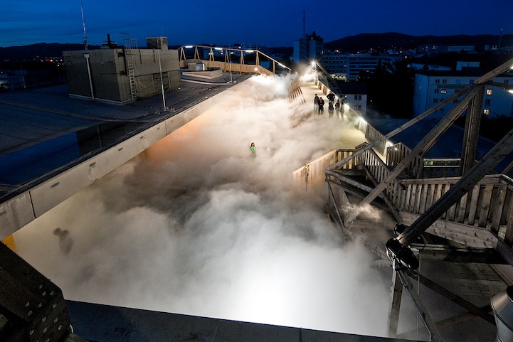
The first is Cloud Parking by Fujiko Nakaya

This piece done in Linz, Austria allowed experiencers to get the view of feeling of walking amongst the clouds that might fill the sky. The installation uses high pressure pumps and fog nozzles.  What a special experience this might be to have as part of an institution from a aviation museum, children’s museum to an exhibition on weather, birds or even dreaming.

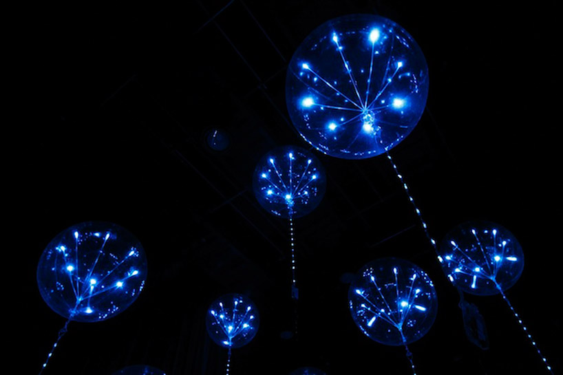
The second piece is “fluff” an interactive lighting system from the Japanese design studio tangent.


This interactive lighting display made from balloons (1.1 meters in diameter) and LEDs changes its appearance according to sound and video displays. What immediately came to mind was to use this to create the feeling of being beneath the waves surrounded by “jellies” or as an evocative space to discuss the idea of different forms of life such as what might evolve on a gas giant.

Wouldn’t it be wonderful if our field’s exhibition spaces would focus as much on this type of inspiration as they often do on curricula or  education.


Posted in: Experiences and Museums

Tags: , , , ,

1 Response

Non digital but digital interface

As technologies develop, the interaction and interplay between the physical world and the digital world become more enmeshed. Certainly, this is an area of continual development and exploration in exhibition design – in particular in dealing with what has traditionally been 2D graphics. Recently there has been a proliferation of moving away from physically printed panels to providing digital touch panels that take advantage of what the digital medium can provide.

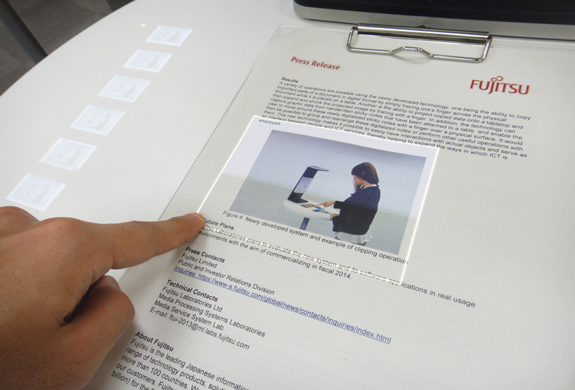
A twist that suggests a different approach, or one that offers interesting differences, is the new system generated by Fujitsu Laboratories , which is an augmented reality user interface.

How this might be used in an exhibit/exhibition medium is a fascinating thought. Rather than incorporating a light-emitting screen, one could still create physical graphics that have a hidden overlay of depth or could be sampled to a “digital scrapbook” without the need for any screen. In addition, the idea of other printed material, of physically built material, or even artifacts having direct interplay with such a system is exciting to contemplate. From a design perspective,

what is nice about this approach is the clarity and simplicity of the interface and the design, as well as the invisibility of the technology with the physical object.

Finally, it also turns around the whole augmented reality approach. Rather than the added information requiring viewing on a digital device, it instead becomes part of the very physical object one is manipulating.

Posted in: Experiences and Museums

Tags: , , ,

2 Responses