exhibit design

museum opening and museum commentary

After the Thanksgiving break here in the United States, the studio is back at work, and one of the first things people were talking about was some of the inspiring as well as intriguing museum designs and museum commentary that people came across Here are two examples of what we’ve been talking about:

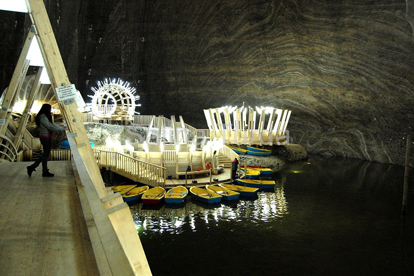
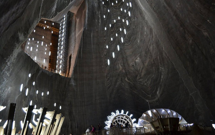
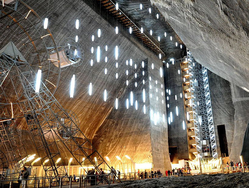
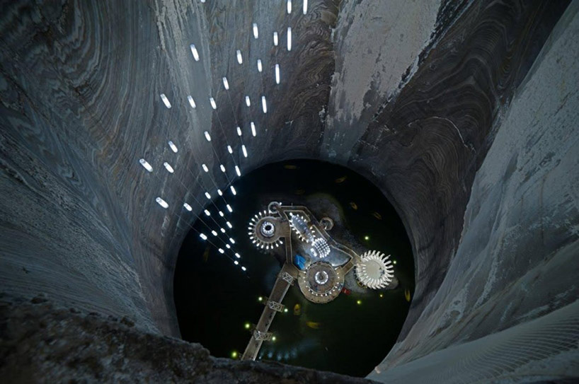
Opening in Romania is the Salina Turda, where in the town of Truda, the salt mine found there has been turned into the world’s largest salt mining history museum. Take a look at the amazing location and the journey offered for visitors:


As you will find, this is not only a museum but also has attraction elements both inside and out. In addition, the design of the space at the bottom of the mine is not conservative but rather takes a unique perspective that matches the space itself. It a great example of how exhibition design and space can, together, create a magical location – something to be considered for all projects that link exhibition design and architectural design.

The atmosphere of the space and the “environment” of the design can heighten or change visitors’ emotional state even before they get to the “content” or the mission of the exhibition.

In this case, it would seem impossible not to be affected before getting to the bottom.

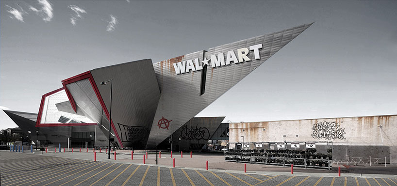
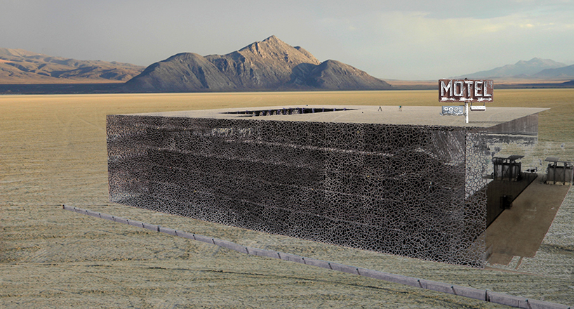
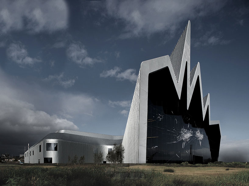
Meanwhile, we thought these “future visions” were very irreverent – and were possibly making a commentary about “starchitects.” Enjoy!


Denver Art Museum by Daniel Libeskind – as a a Walmart


MUCEM by Rudy Ricciotti – as a motel


Glasgow Riverside Museum of Transport by Zaha Hadid – abandoned, with nature taking over

What interesting museums have you seen lately? What new or provocative museum ideas are you thinking about? Let us know!

Posted in: Experiences and Museums

Tags: , ,

1 Response

new real time data

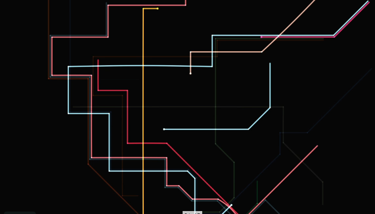
One of the areas that we believe artist and exhibit designers will continue to explore is the world of using real-time data to provide an understating or awareness of our world today – right now! We previously looked at some earlier examples here in this blog, here. Recently, we’ve run across some new examples to enjoy and consider. The first is http://www.mta.me/ by Alexander Chen.


Here is video from the site:


This experience turns the New York Subway map into a musical instrument which varies depending on when you launch the website because it takes data directly from current subway movements.

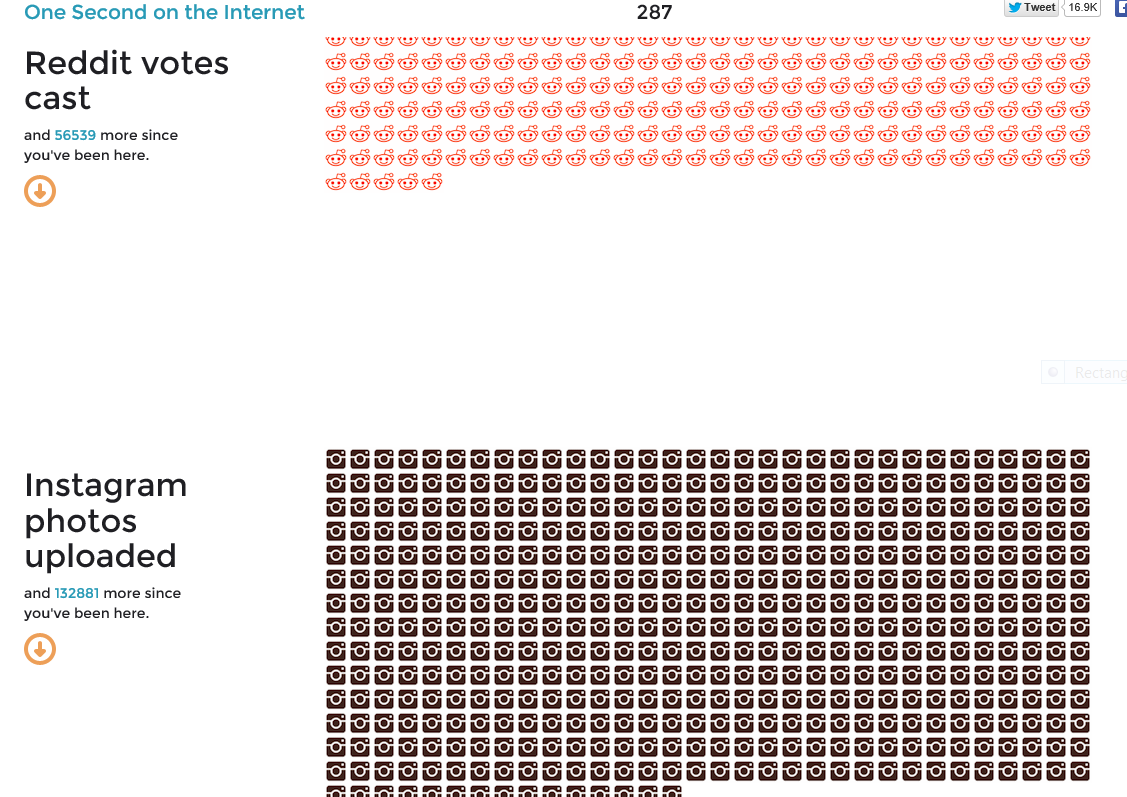
The second example is the web site http://onesecond.designly.com/ , designed by designly.com.


We believe that the fascination with understanding the current state of the world, whether it be straightforward or through an artistic expression such as music, relates to a key aspect that museums often struggle with:

How to make a visitor’s next visit truly different from the last time they visited.

One way to respond to this challenge is to explore how to celebrate and present, in both engaging and three-dimensional ways, the once-in-a-lifetime experience that is this very second on the timeline.

What interesting examples of real-time data have you seen? What would you like to see?! Share your ideas here.

Posted in: Experiences and Museums

Tags: , , ,

Leave a comment

Eerie “Life”

In the museum field, the world of science centers and those of zoos, aquariums and in part natural history museums have crossed content areas in a variety ways – but rarely in the robotic world. Ok, perhaps in the area of animatronic dinosaurs, but not truly in the “robotic” world.

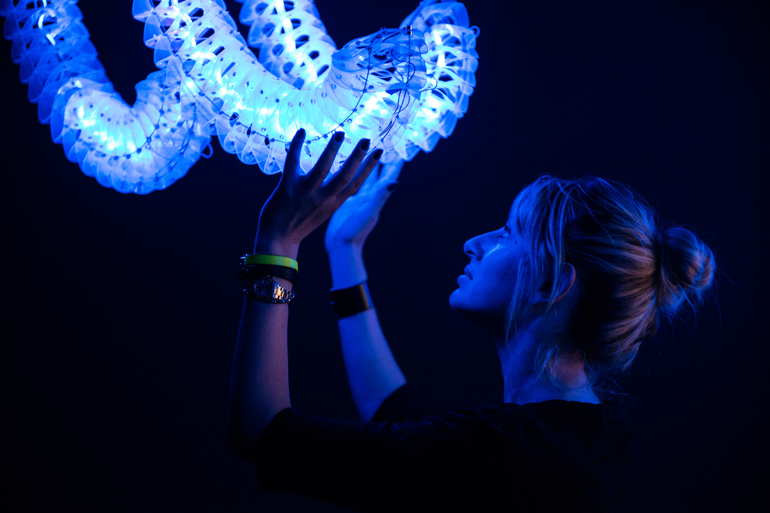
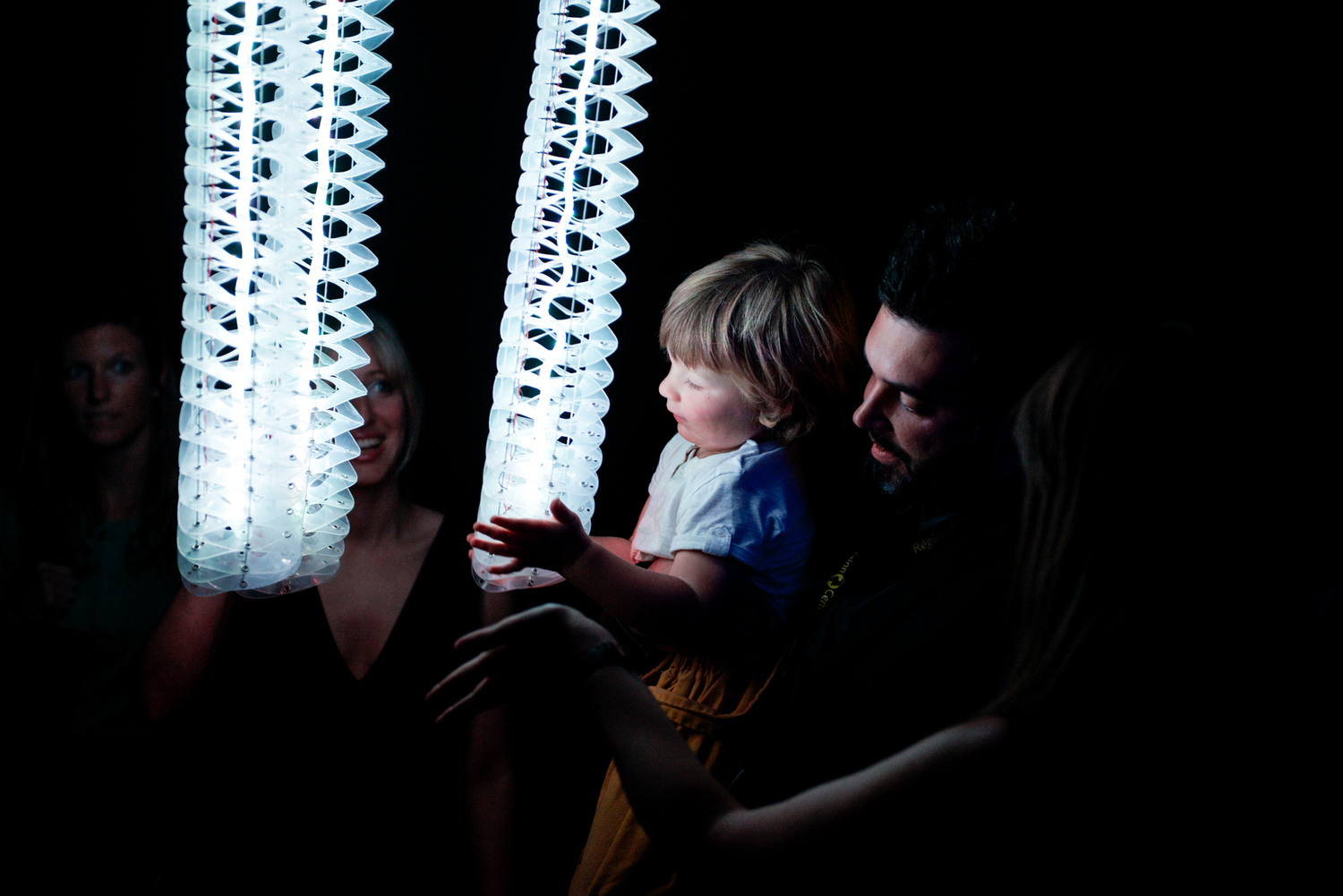
With The Petting Zoo, by the Minimaforms studio, this could change.


Using Kinect (yet another exciting use of this technology) and data scanning, these “life forms” react and change their behaviors as people interact with structures, changing according to the number of people and their apparent interest in the “creatures.” More details about the project can be found on the Minimaform web site.

While this simulation of a living creature might be seen to easily fit into the context of the science center, here at ALCHEMY studio, we are taken with the idea of how an installation like this or other robotic simulations could be used by zoos and aquariums.

Imagine a zoo or aquarium using interactions like these along with its live collection to discuss the characteristics of living things and how humans are exploring creating artificial life.

As our created world blends increasingly with the natural world, there will be other opportunities for institutions to cross boundaries in what they invite visitors to explore through public programming.

In fact, it might even be possible with a similar project to model behavior you are seeing from the live collection – allowing for visitors to experiment with and test aspects of animal behavior.

What have you seen that matches this idea? How might you imagine using robotic life to support new and interesting experiences?

Posted in: Experiences and Museums

Tags: , , ,

1 Response

SWOT Analysis for Institutions Who Follow the Maker/Tinkering Experience Trend

SWOT (Strengths, Weaknesses, Opportunities and Threats) Analysis for Institutions Who Follow the Maker/Tinkering Experience Trend

The analysis below was created by the 200+ audience and session instigators at the ASTC 2013 Conference Session, “Interactive, Touch Tables, Maker Spaces: Trends, Fads, What’s Next?” While we hope to put this on the CAISE website we are cross posting it here.


The session instigators were as follows:

  • Wayne LaBar – ALCHEMY studio (session leader)
  • Kirsten Ellenbogen – Great Lakes Science Center
  • Hooley McLaughlin – Ontario Science Center
  • Dana Schloss – TELUS Spark
  • Eric Siegel – New York Hall of Science

By way of background, here is a definition of “SWOT analysis” from Wikipedia:

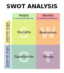
SWOT analysis (alternatively SWOT Matrix) is a structured planning method used to evaluate the Strengths, Weaknesses, Opportunities, and Threats involved in a project or in a business venture. A SWOT analysis can be carried out for a product, place, industry or person. It involves specifying the objective of the business venture or project and identifying the internal and external factors that are favorable and unfavorable to achieving that objective. The technique is credited to Albert Humphrey, who led a convention at the Stanford Research Institute (now SRI International) in the 1960s and 1970s using data from Fortune 500 companies. The degree to which the internal environment of the firm matches with the external environment is expressed by the concept of strategic fit.

Setting the objective should be done after the SWOT analysis has been performed. This would allow achievable goals or objectives to be set for the organization.

  • Strengths: characteristics of the business or project that give it an advantage over others
  • Weaknesses: characteristics that place the team at a disadvantage relative to others
  • Opportunities: elements the project could exploit to its advantage
  • Threats: elements in the environment that could cause trouble for the business or project
The recent ASTC session drew a large crowd and sparked a lot of follow-up discussions. Since the SWOT analysis was done live via computer during the session, participants had immediate access, and many expressed the feeling that it would be great to share this more broadly with the science center community. Both participants and instigators felt that reflecting upon and analyzing our practice was useful and that science centers ought to do more of this type of thinking. A summary/review of the session can be found on the ASTC blog at http://www.astc.org/blog/2013/10/21/interactive-touch-tables-maker-spaces-trends-fads-whats-next/


One insight that comes out of the analysis is that, while there are certainly unique aspects to the Making/Tinkering movement, this exercise brought up some “universal” themes as well – good words of analytic wisdom applicable to any strong, impactful experience.

Of course, a possible conflating factor for any “conclusions” one might draw is the self-selection of the group for this particular conference session. We didn’t cross-correlate responses with participants’ museum affiliation, situational context, current programming, or prior experience with Maker/Tinkering spaces. Perhaps there will future opportunities to frame and explore the issues brought up during the discussion.

Without further ado… the SWOT analysis:


OPPORTUNITY

  • Funders love it
  • Get to partner with awesome people who are also known to the public
  • Bring in new audiences
  • Outcomes have personal connection
  • Leverage established festivals and event
  • NGSS are full of modeling – ISE is scared to death of this – but abstract representation etc. is strong in maker
  • Media love it
  • Unique opportunity to engage adults
  • It gets people to spend time thinking about something – move this to internal
  • Very easy to communicate
  • Lots of rhetoric around this – even Obama loves it – Silicon Valley believes it needs to create people who have the skills that maker spaces create
  • Opportunity to reuse materials
  • Really helps to build community – not just learning community but also gives people a brand to collect under – brings external communities together
  • Ties into the formal education sector
  • Opportunity to build on others ideas
  • People get it
  • Brings in outside expertise


THREATS

  • People may do it without learning how
  • It’s overblown in the media and diluted
  • If it doesn’t fit your mission it can unintentionally change what people think of you
  • Science Centers are not uniquely positioned to do this
  • I can do this at the children’s museum, why is at a science center?
  • A lot of people don’t get it
  • It can be very wasteful of resources
  • Can alienate existing maker communities
  • External funders love it but it may not align with your mission – takes money from other important directions – their vision of making may not be the same as yours
  • Are we increasing inequality because only some people can afford coming to the science center?
  • You have to buy 3D printers
  • Environmental waste
  • Time waste – move this to internal – museum visitor time is precious – we try to create thoughtful things that they may never get to if they are caught up in maker space
  • Because the maker movement feels so new we are still developing a shared understanding – end up being unfocused
  • People feel that they can’t do it
  • Liability
  • Expectation by longtime visitors does not match this new effort


STRENGTHS

  • Allow you to bridge gap between education and exhibits
  • Comfortable space for strangers to interact
  • Most science centers bring in 7-14 year olds – a missing group
  • Build internal staff capacity – draw out the internal strengths that you may not have known about it
  • You can integrate hybrid maker into other exhibits and programs
  • Worth it just to give people a chance to slow down and try something in-depth using your hands
  • Gives people facility with tools
  • Super empowering for visitors
  • Shifts mindset of staff to do more prototyping
  • Problems are self-defined
  • Engages families together
  • NGSS talks about STEAM – brings in art
  • Creates meaningful and memorable experience
  • Instigates learning modality conversation
  • Gives laypeople control over production
  • Reinvigorate one’s floor
  • Opens up possibilities
  • I CAN do this
  • Encourages collaboration
  • Changes interpretive modality – for floor staff, not as much about explaining
  • Provides a space that’s not as static
  • Provides opportunity to learn from failure
  • Create a community of regulars – maker groupies
  • Makes your staff feel part of something bigger than your organization
  • IT IS FUN


WEAKNESSES

  • Staff capacity
  • Potentially lose the wow factor in the science center
  • People fail if there is not enough facilitation
  • Looks messy
  • It is expensive to staff
  • Has to be authentic – this is not for everybody
  • Institutional resistance to change
  • No science center has spare space for this
  • Materials management
  • Ability to engage visitors for repeat visits
  • It can look cheap
  • Should not distract us from doing “science” – potential to be just arts and crafts
  • Easy to become whatever you want making factory
  • It is such a good idea – just get on with it – weaknesses will scare the management
  • Difficult to measure this kind of learning
  • Narrow definitions of making can exclude diverse audiences
  • We are always weakest at the beginnings of these efforts – how to we catapult our learning in the field
  • Not all sciences lend themselves to Maker experiences
  • Requires lots of iteration
  • It is uniquely dependent on the quality of the facilitation – therefore you have a big quality control issue – the cost of making sure that facilitators can participate effectively
  • Because it is hard to measure and articulate the learning outcomes, it is hard to train your facilitators
  • If we use traditional assessments then we will not measure maker learning
  • Investment required means you prioritize this kind of learning over other community engagement
  • If it is really authentic maker experience, there is more opportunity for failure and may decrease motivation to participate
  • If you are doing the Maker space you are not out ahead of the next trend – do we lose innovation?
  • Maker is a tool that can be applied depending on how it fits the topic
  • Maker space is not the point – it is incorporating – we want to make Maker spots or nodes
Posted in: Experiences and Museums, News

Tags: , , ,

Leave a comment

Immersive Simplicity

In the design of exhibitions, there is often a desire to create immersive environments or experiences that allow visitors to lose themselves in the experience rather than be reminded that they are in a museum or exhibition.

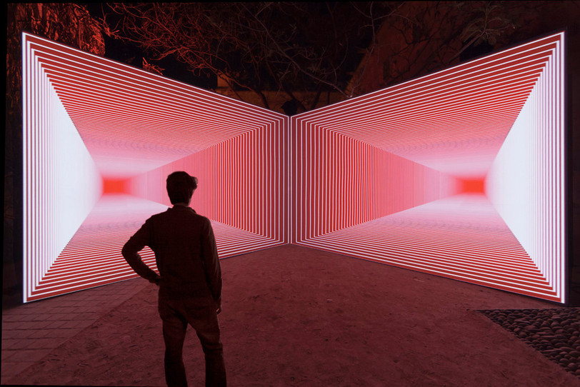
An example of a simple approach through projection – but surely not an easy one to create – is Onion Skin by Olivier Ratsi, who is on the AntiVJ visual label.


This experience is an elegant and totally mesmerizing exploration of point-of-view, perspective and vanishing point. It relies on principle known as “anamorphosis” (your vocabulary word of the day). Onion Skin, as is, certainly has relevance to art and visual science content and would be at home at many museums/exhibitions.

As an approach for an immersive experience,it also points out how a simple setup, with creative programming, can become a powerful experience that transports visitors out of an exhibition.

It got us thinking about if and how this approach could be used for various subjects and how that might be achieved. What comes to mind for you?

A final wild thought would be translating this technique and blowing it up for use in a large-screen format. That would be a fun experiment, don’t you think? Share your ideas here.


Posted in: Experiences and Museums

Tags: , , , ,

Leave a comment

losing the ocean for the waves

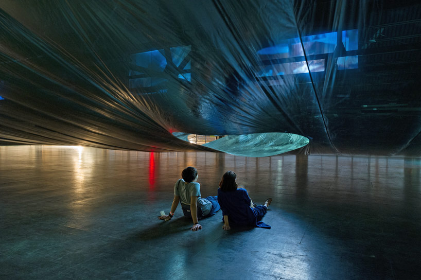
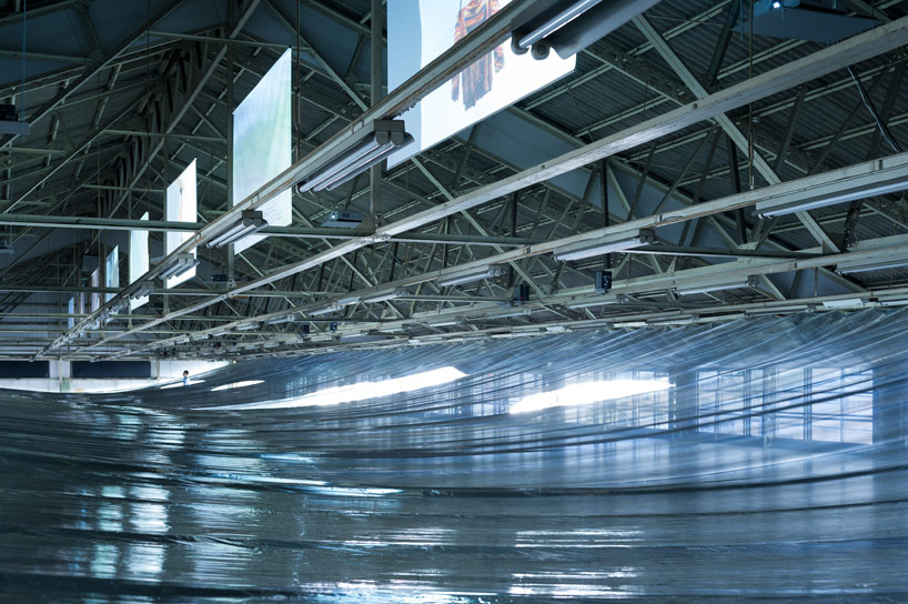
Last month an interesting installation opened for only a few days in Osaka Japan: My Thread – New Dutch Design on Films curated Eizo Okada .


The interesting part of this exhibition was the work done by Hideyuki Nakayama, that created light and experience separation between the video screens displaying the work of several artists.

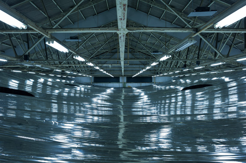
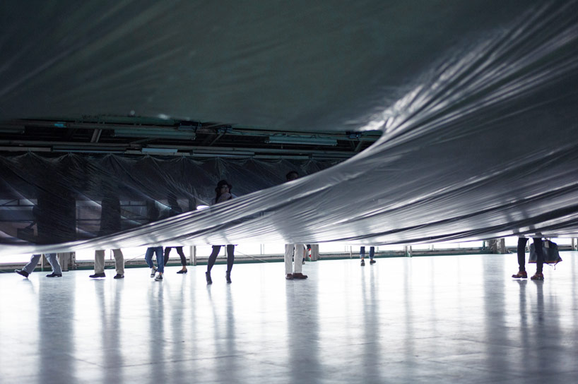
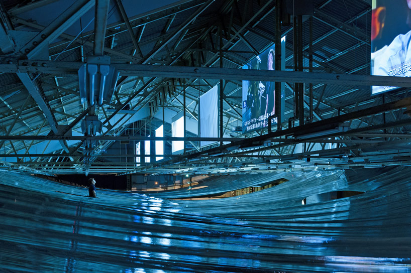
Hideyuki Nakayama adapted the metalized film used in emergency blankets to create a light, opaque, but air-porous layer between the screens and the floor below. Visitors are invited to walk beneath the layer and view the videos at designated spots between the layers.


What struck us was the almost eerie similarity of walking through or under a body of water.


Photos from the experience offer snapshots that reminded us a views “just under the surface,” to vistas across a calm body of water. How exciting it would be to encounter a series of experiences set into such a environment.

This made us ruminate on how often in experience design, museums lose sight of the power of such thinking.

Transforming the age-old adage about forest and trees to match our example above – too often we focus on the “waves” or individual experiences in an exhibition rather than the “ocean” that could be created. It is through experiencing the “ocean” that one can gain different and contextual insights into the nature of the “waves”.

In fact, other aspects of our popular culture – hit tv series, console games, and others – have moved toward creating the mega story with individual aspects that while standing alone create a larger, more powerful story.

Looking to future exhibition, it would be magical if we as a field could move from the waves to create more ocean experiences. How do you think this approach could enhance the museum experience?


Posted in: Experiences and Museums

Tags: , , ,

1 Response

tree as museum

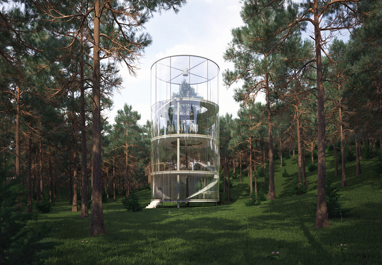
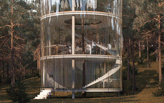
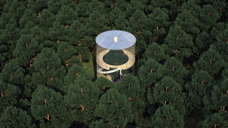
Here is a beautiful concept that certainly could spark ideas and thoughts for botanical gardens, nature centers, and even natural history centers: Tree in the House.


Tree in the House is an idea by almasov aibek of a.masco desgn. The idea of walking outside and then creating a structure to focus solely on one tree is very interesting. There are messages and metaphors that surround this idea, and an interpretive structure would include both science and art. (Pictures from Almasov Albek)

There is something very special about being in a collection and zooming in to one example.

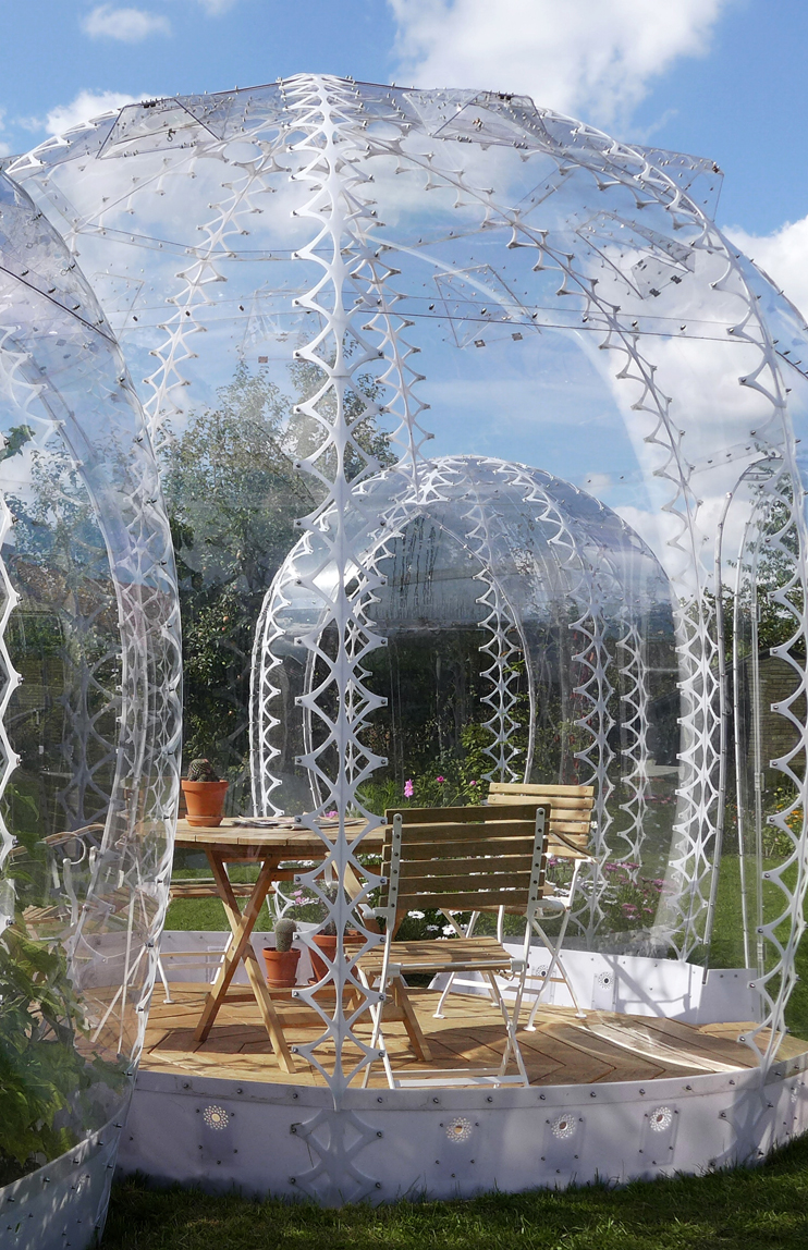
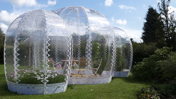
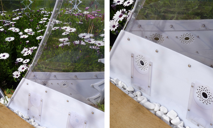
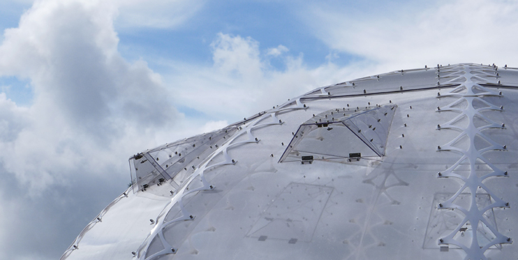
Meanwhile, another recent concept we’ve run across that brings structure to the outdoors is the “Invisible Garden House” by Simon Hjermind Jensen, principal of SHJworks.


These structures are heated by the sun and cooled by natural ventilation. What these might suggest are ways to create small, portable spaces for certain experiences out in a natural environment.

Both of these ideas offer playful and intriguing ways to interplay structure and the natural environment.

What similar examples have you seen? What new connections would you like to explore between nature and structure?


Posted in: Experiences and Museums

Tags: , , ,

Leave a comment

Hidden Messages

One element of our exhibition field that is often forgotten as a potential interactive or spark for exploration and inquiry is two-dimension graphics. This is unfortunate, as graphics, when used in imaginative ways, can make for striking or inspirational ideas. Here are two examples.

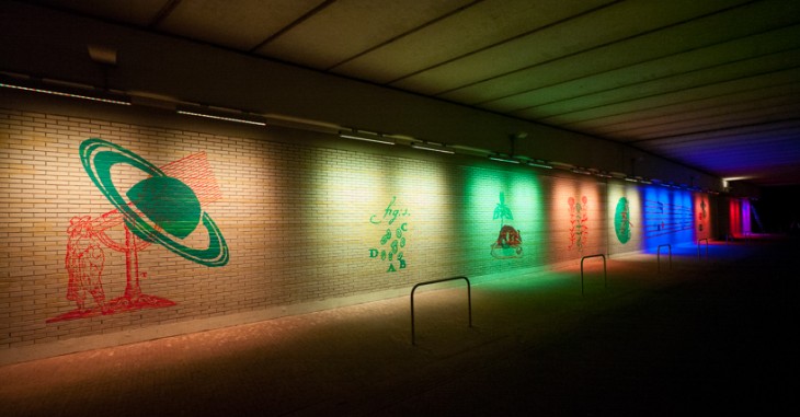
The first is a work by the artist Geert Mul called Exponential View.


This piece, which is in the Netherlands, reveals and makes visible a series of images related to the location of the tunnel, which is where the Dutch scientist and astronomer Christiaan Huygens lived. The fact that he proposed the wave theory of light makes it apropos that different wavelengths of light are used to create this experience. Certainly this idea could be used in smaller and more distributed ways.

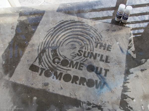
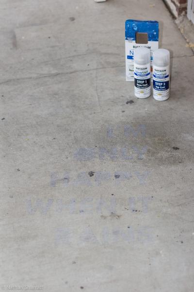
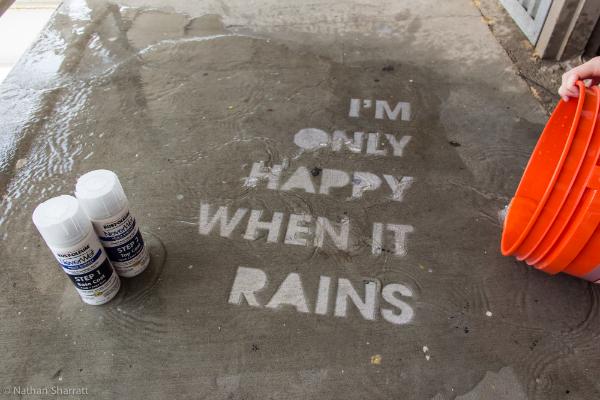
The second example comes from members of the Home Depot Community – Nathan Sharratt and Dana0814.


These images show some of the interesting effects that can be made by using NeverWet, a spray that repels water.

Imagine using this effect in a water table area or a fountain. All it would take is one visitor to discover the first hidden message and then use water to find others. (This, of course, might make a mess, but, wow, talk about inspiring exploration!)

These two examples show different ways graphics can be used to create engagement and inspire visitor exploration.

What interesting examples have you seen? What new ideas do you have for how technology can make graphics more interesting and memorable?

Posted in: Experiences and Museums

Tags: , , ,

Leave a comment

Drawing Part Deux – Randomness

Last week our weekly inspiration looked at how a robot could translate one’s drawing into sound and music. This week we ran across an interesting drawing experience that made us think about riffing on more common drawing experiences found in science centers.

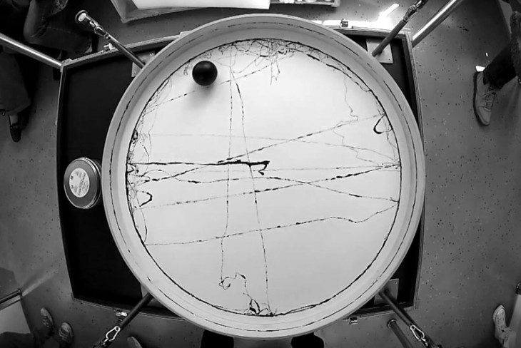
Below are images and a video of the Olafur Eliasson’s “connecting cross country with a line.” This is part of the project “Station to Station”


This experience of recording seemingly random movement along a train line using an ink ball reminded us here in the studio of the less random but similar in its “recording of forces” of a common science center exhibit the harmonograph. Here is a picture of one from Questacon in Canberra, Australia.


What this got us to thinking is what other common or perhaps not so common exhibits might we riff on and remove constraints to allow visitors to explore “randomness.” the idea of finding patterns in randomness is a key in the fields of science, engineering and math.

We believe that might make a wonderful direction to explore in a series of exhibits.

Of course we should mention that we also think it’s really cool to do exhibits on a train – that would be fun to do too!

What other “randomness” exhibits do you think might make up such an exhibition? Share them with us!

Posted in: Experiences and Museums

Tags: , ,

Leave a comment

Drone Experiences

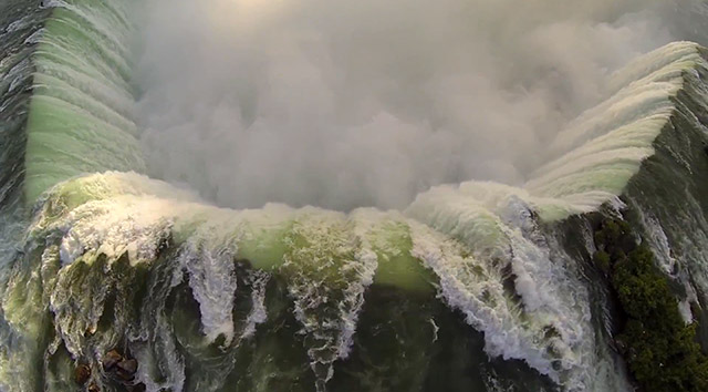
An emerging technology that feels like it has the potential to offer some interesting experiences for specific installations is the drone. One example of the capabilities of these devices is this home movie of Niagara Falls created by a drone owner.


Some opportunities we in the museum field might explore with drones include giving visitors access to places they can’t physically explore and providing rare or inaccessible viewpoints. Just last week, while we were in the Pacific Northwest, the Woodland Park Zoo staff (avid readers of this blog) sent us an invitation to discuss their philosophy and approach to interpretation. The Zoo has award-winning experiences within large natural environments that mix species as they would be mixed in their natural ecosystems. The downside of this approach is that, at times, the animals are far away from the visitors.  One of the ideas we brainstormed involved drones: Imagine letting visitors fly a drone out to find animals and observe them from a distance.

In addition to their function as remote viewers, drones also offer interesting insights into robotics, and they can provide excellent maker/tinkering opportunities. They offer a way for mobile device and their cameras to be used. Finally, they also provide a timely, relevant, and accessible experience through which to spark discussions about societal issues of technology, privacy, and information access.

Drones seem to be a ripe technology and medium for experience prototyping and designs.

We would love to hear your ideas about how drones might be used. Share your thoughts here.

Posted in: Experiences and Museums

Tags: , ,

6 Responses