art

One of the Five Coolest Things at the New Cooper Hewitt

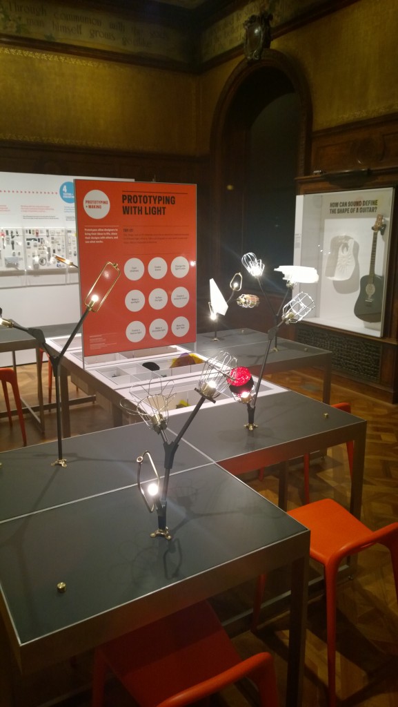
ALCHEMY studio’s vision for the Process Lab at the re-vamped Cooper Hewitt has drawn attention and sparked praise from publications such as Fast Company and others. Our team is proud to have been part of the creative team behind the renovated and revitalized Smithsonian Design Museum.


To see the full Fast Company review click here

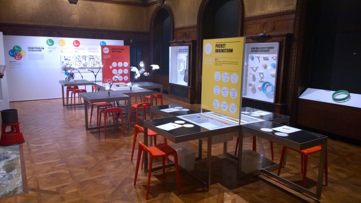
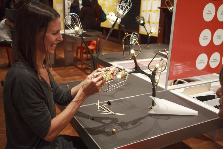
ALCHEMY studio was hired to work with the staff of the Cooper Hewitt to develop and prototype the experiences in the Process Lab and test how these would work within both the operating parameters of the museum and the overall design architecture. Activities found in the Process Lab were developed from a series of workshops with staff followed by prototyping with potential visitors. Activities were developed for both physical interactives as well as media platforms.


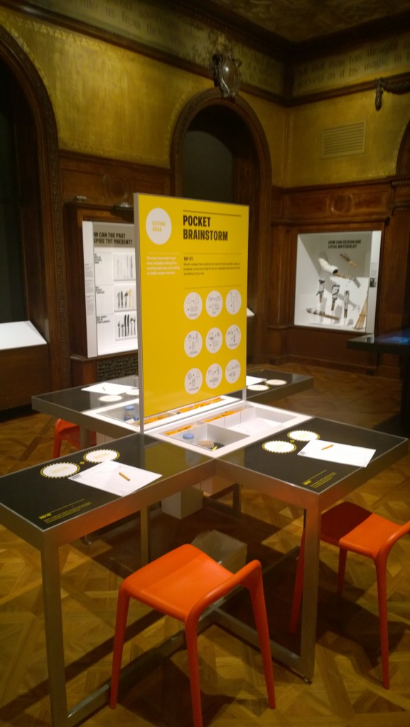
The Process Lab places visitors in the role of designer by inviting them into the design process itself: observing and identifying design challenges; brainstorming creative solutions; making models and prototypes; and testing new ideas.


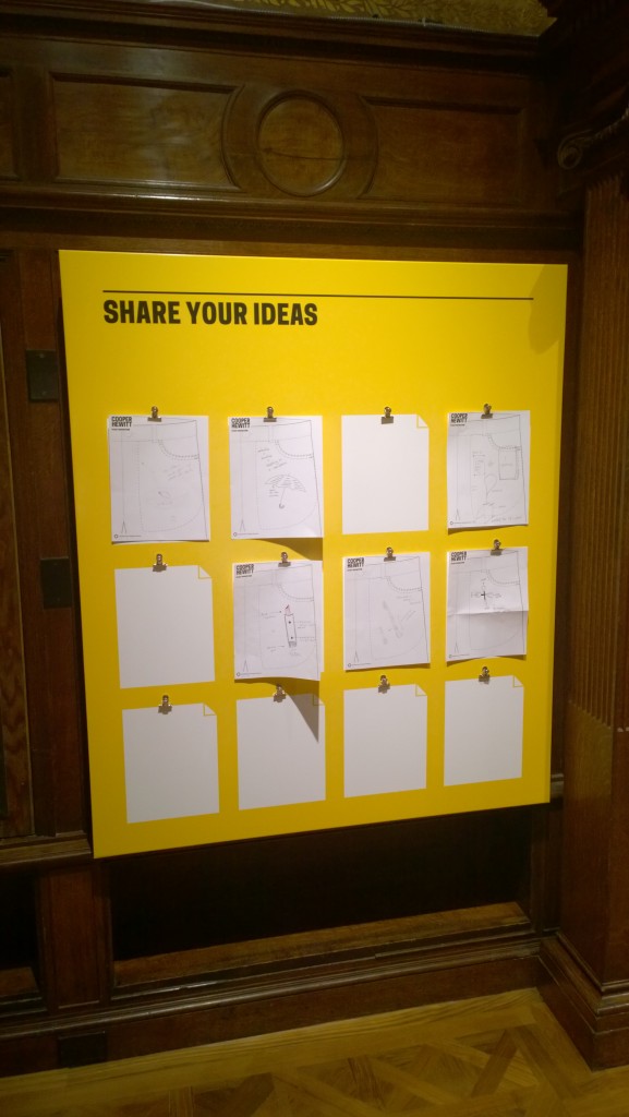
Activities include a central collaborative “lightscape” that lets visitors create shape, shadow, and color effects. Visitors also have the chance to create a design mash-up: making up a new product by combining two items from their bags – or by including a random oject. Visitors also improve existing designs, comment on others’ design choices, and add to a design talkback board.


The Process Lab has been drawing attention and praise for the creative, open-ended ways it invites visitors to take on the role of designer, engage with collections objects, and spiral through the design process itself.
 

Posted in: News

Tags: , , , ,

5 Responses

Light Explorations

So, after a mid-summer blog break, we’re back to our “weekly” inspirations about ideas we’ve come across that make us think about experiences, museums and the like. This week, we’ve encountered two interesting pieces that explore ideas we have mentioned before – reflection and light.

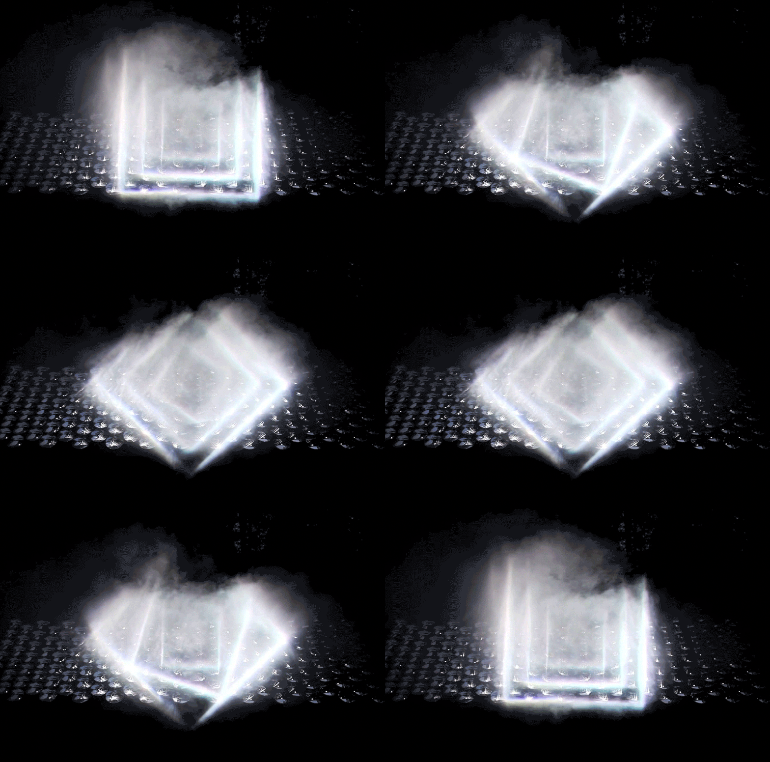
The first is Light Barrier by kimchi and chips a South Korean design studio.


Using principles of reflection, projection, and some carefully crafted light beams along with scanning technology, they create a mesmerizing three-dimensional display. What’s interesting to us is two-fold. First, it shoes how powerful three-dimensional display can be without having the “resolution” that we normally associate with “display” in the museum setting. Certainly, there are aspects of content, text and other display elements that could utilize this same power.

Secondly, as clearly evident in the work, there are many mathematical and natural science phenomena on display in the work as it is. Certainly, this could be a powerful way to engage visitors with this content.


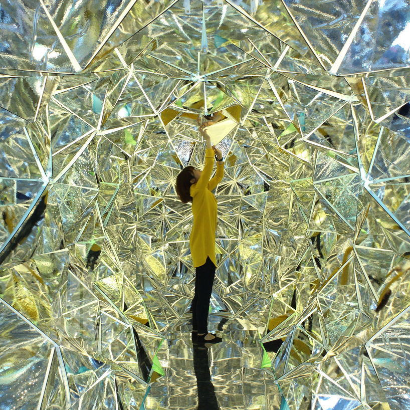
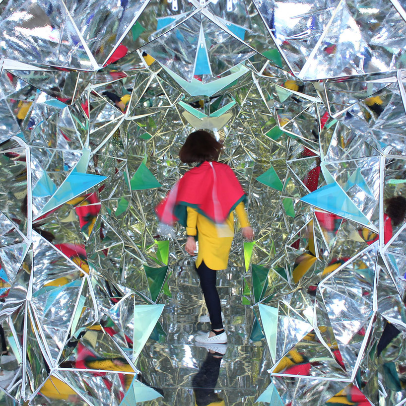
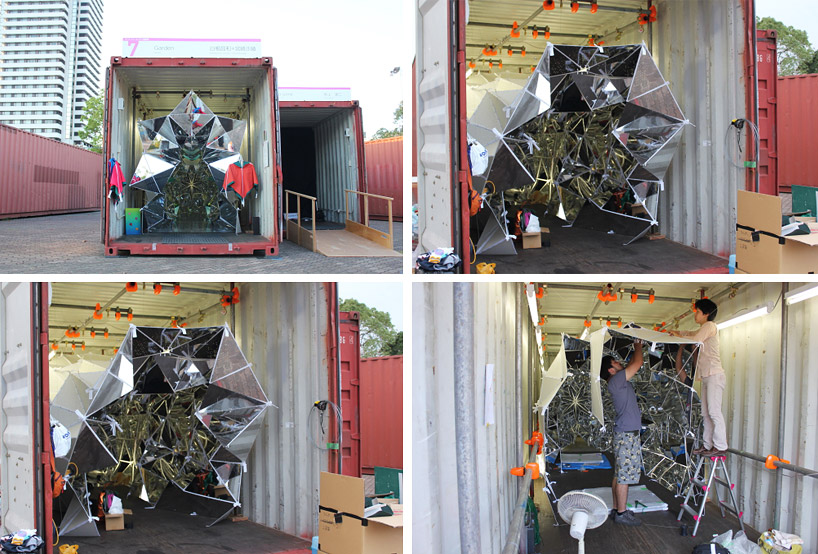
The second item we ran across plays directly with some of our other blog posts about reflection. Take a look at “wink” by Masakazu Sherine and Saya Miyazaki from Japan. It’s a walk-in kaleidoscope!


A fascinating part of this installation is that all of the panels are attached by zippers, making it almost infinitely changeable to the visitor – a kaleidoscope that changes while you are in it. This piece creates an almost magical space. It would be easy to see the same concept in an art or a children’s museum.

Where could you imagine installing these playful experiences? How would you adapt them to support something you’ve been thinking about or working on?

Posted in: Experiences and Museums

Tags: , , , , ,

Leave a comment

inspiration to start the summer

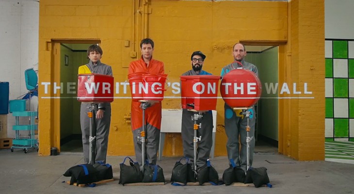
This week’s inspiration is fun, wonderful and an amazing example of optical illusions. Check out the new video from Ok Go. What a great inspiration to start the summer with.


Posted in: Experiences and Museums

Tags: , , ,

5 Responses

To infinity…

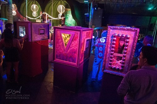
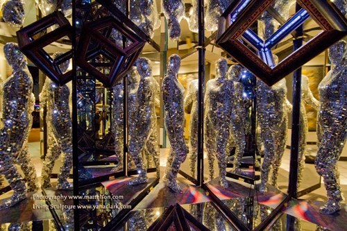
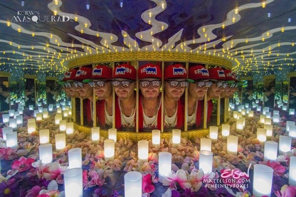
So, this week we have become very interested in the work of Matt Elson who creates Infinity Boxes. Perhaps some you have seen them at Burning Man.

Clearly, as indicated by the video (we’re sure the photographs only hint at the scene inside), the impact of these experiences is pretty special. As we have blogged about before, the exploration of infinity seems to fascinate people.


His work got us wondering about how the concept could be used to create similarly magical experiences about other subjects in ways that might be more impactful than a media piece.  Ideas that have come to mind include the inside of a cell, a diorama of a nature scene, perhaps even the subatomic world, another planetary surface… or even a mathematical theorem.


His experiences are an example of how some of the most age-old exhibition techniques can be used to great effect – perhaps even more so in the context of our digital world.


What does this technique make you think of? Where does your imagination go?

Posted in: Experiences and Museums

Tags: , ,

Leave a comment

3D Modeling

The past 10 working days have been very busy here in the studio. We have some new projects ramping up and several moving creatively forward, but we have had the chance to encounter a couple of very interesting projects that all demonstrate the idea of 3D modeling in new ways.

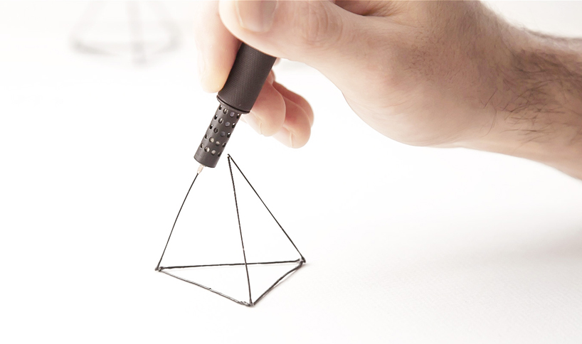
The first is Lix, the world’s smallest 3D printing pen in the world.


Well, this pen doesn’t exist yet, but it’s currently a Kickstarter project. Certainly, this direction of 3D printing will become increasingly prevalent in the creative fields, and we think it’s easy to see this technology on the museum floor. From art museums to children’s museums, the artistic and creative implications are easy to see. In science museums, while it might be easy to imagine something like this being used in a maker or tinkering space, this idea got us thinking about some new ways it might be used.

How might a 3D pen like this be used to document or record phenomena?

Could it be used instead of a pen for exhibits like pendulum drawing?

This trend of replacing a physical medium with something new is part of the allure of the other project we ran across recently – a piece called  ”36 Ventilators, 4.7m3 Packing Chips” by the Swiss artist Zimoun for the Museo d’Arte di Lugano


The amazing similarity of this piece to ocean waves and flowing water is breathtaking. No doubt, some aspects of size weight and the idea of many particles cause this movement to “flow” almost as a fluid. It reminded us of some of the natural phenomena exhibits seen at many science museums. We’re very intrigued by the idea of experimenting with this behavior in different spaces and different contexts.

What do you think? What other exhibits, installations, or devices do these projects remind you of?

Posted in: Experiences and Museums

Tags: , , , ,

2 Responses

gold bug

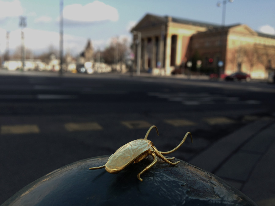
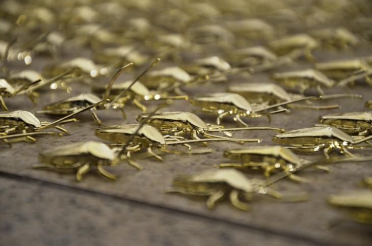
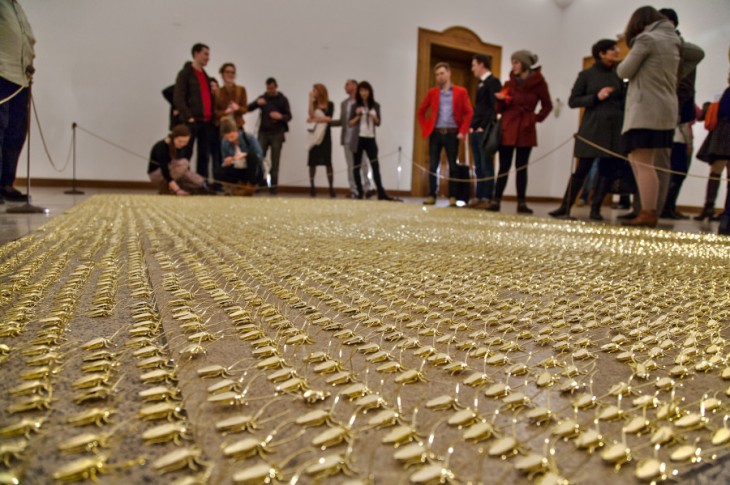
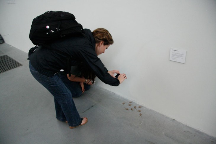
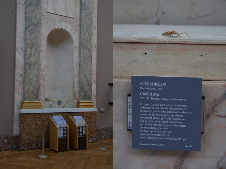
So, this week we wanted to highlight an artist and work that may not be new to many art museum readers but certainly might be new to some science and history museum people and probably also to many designers out there. The work is called The Golden Roach Project by the artist Miklos Kiss.


Miklos places these in museums around the world, as he states about roaches: “It is found anywhere in the World, considered everywhere as a pest and a source of infections, and exterminated anywhere possible. Opposite to this, the roaches in my creations go through multiple changes. Walking into the culture’s holy space, they turn to gold in the museums, which represent art, and this pushes the question of art. At this point the action is made classic and contemporary at the same time. The smuggling effect is “roachy” and reflects a contemporary approach, while in materials and workmanship it recalls of classic art pieces.”


He encourages others to take these roaches or buy them, and while almost all are just gold-plated plastic, one is actually pure gold. In addition, people can post images of their roach in various places and, if the citation is tagged correctly, it can go up his website.

Miklos draws attention to how this idea of smuggling could also be considered in reverse – “This should bring the attention to a reverse situation, where an effective and valuable object will be smuggled in on the way in to the museum.”


Here at the studio, we are loving several aspects of this whole concept – making something precious by its material and where it’s places, the sort of “treasure” aspect of the one gold roach, and the interactivity with the viewers in a medium where physical interactivity is not often seen.

It makes us wonder how some of these concepts could be exported and adapted to have visitors in other types of museums create an interactive and dynamic social expression physically. How might this idea be adapted for a science center? A zoo?

What do you think? What does this concept inspire you to want to try?!


Posted in: Experiences and Museums

Tags: , , , , ,

Leave a comment

sound, light, and image – new concepts

As we all know, there are constant technological and creative leaps being taken that impact and add to the palette of materials, techniques and approaches that can be applied to experience planning and design. This week we have run across three examples that have gotten us thinking and brainstorming how they might be applied.


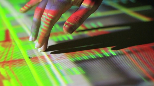
The first is an installation called Contact, created by Felix Faire as a research project at the Interactive Architecture Lab – Bartlett School of Architecture and now on display at the Royal Academy of Arts in London in the exhibition Sensing Spaces.


What Felix has done is create a way to make any hard surface into an interface. Certainly this piece will find its way into more museums but perhaps even more interesting is the idea of using this technique to make any surface a controller. In a museum setting, this might be a graphic panel, a piece of exhibition armature, or a vitrine. What is interesting is thinking about removing the need or ubiquity of the physical “interactive” control or screen.

You can watch a vidoe of how Contact was made here.

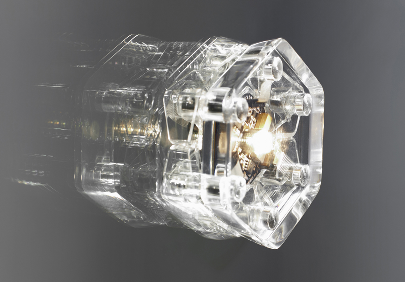
The second example is a new lighting system from Codha called Crypsis. Take a look.


Using a system like this would certainly alter significantly the way we may light artifacts and other items in display cases. In fact, this is the first way this system will be tested. In addition, this offers a unique opportunity for museums to have visitors experiment with light and could also be incorporated into physics exhibits or even maker spaces.

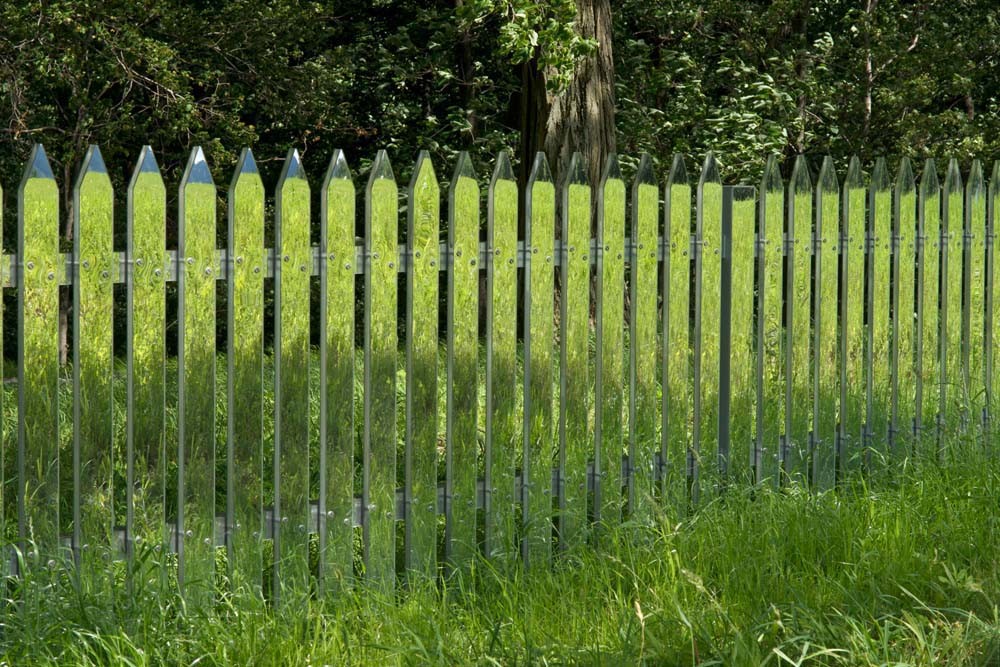
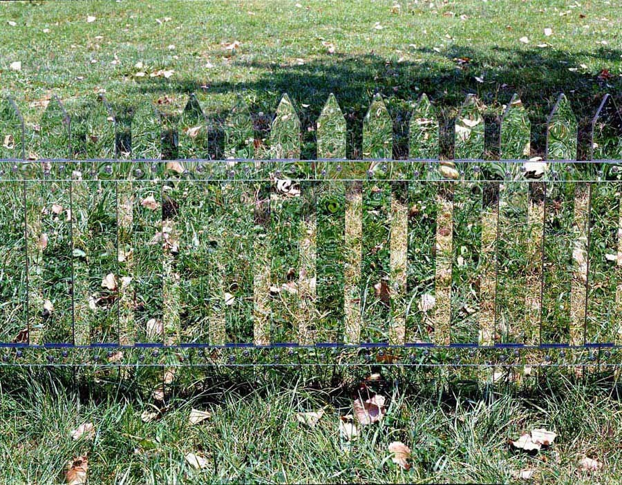
The final interesting piece is the mirror fence concept by  Alyson Shotz.


Simple in its execution and an interesting work of art, the concept of the mirror fence seems like it could be useful in any situation where you need to create a separation of space but you don’t want that operation to be detectible from a visitor’s perspective. For us, zoo enclosures came to mind immediately. Where could use imagine using a mirror fence?

We’d love to hear from you about what ideas these examples sparked for you.


Posted in: Experiences and Museums

Tags: , , , , , ,

Leave a comment

maker music

Recently, ALCHEMY studio was engaged to begin the design and implementation of a new space for an emerging science center in Virginia. As part of the Museum’s plan, they are being offered the opportunity to experiment and test program and exhibit ideas in a small space in a local shopping area. We call it The Lab – a space where visitors will get to experiment, experience and tinker while the emerging science center will do the same through prototypes.

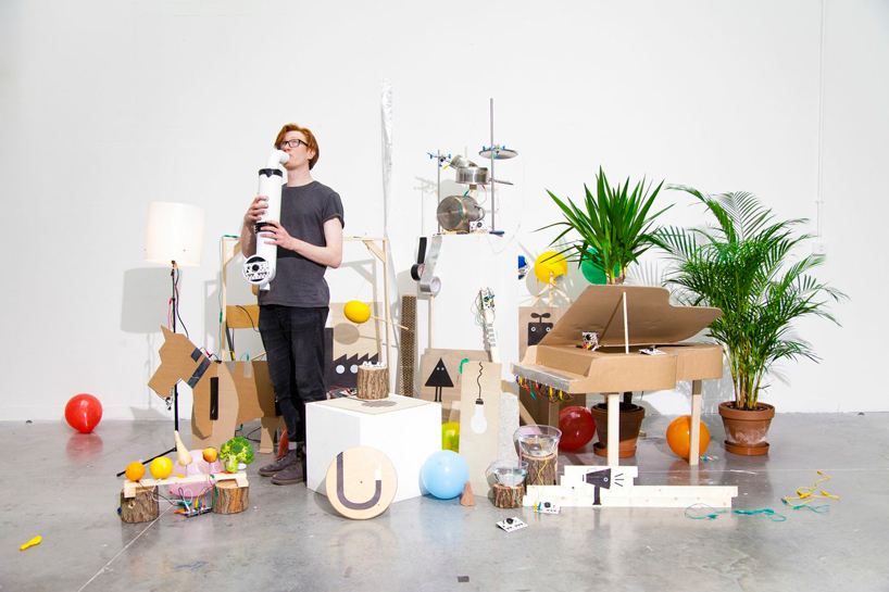
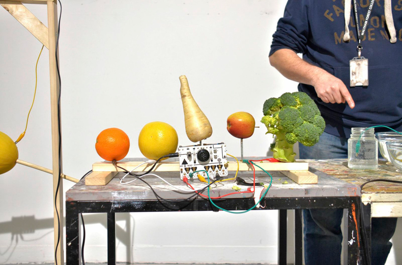
As part of our work, we are exploring all kinds of new and different experiences that offer something unique but also meet the desired experiential and impact goals.  One interesting example that caught our eye is the OTOTO by Dentaku and developed with Near Now. Take a look.


;


This experience certainly shows promise as an activity that could be part of many tinkering and making spaces. This is certainly an opportunity to allow visitors to express creativity – one driver for these spaces. But, as importantly for us here at the studio,

it offers the opportunity to explore and provide interpretive scaffolding for visitors to learn about science concepts and technological operations – something sometimes lacking in maker space activities.

Meanwhile, music offers a wonderful way to engage audiences who might be disinclined to explore these subjects.

Another example to explore would be having visitors experiment with sampling and learn musical and sound concepts while creating. This idea came to us through this experience by johnnyrandom who created a musical symphony from bicycle components. Here it is.


We would love to “hear” your ideas on this (pardon the pun!) and learn about similar experiences you might have seen.

Posted in: Experiences and Museums

Tags: , , , , ,

1 Response

immersive color and sound

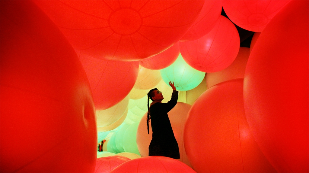
To start our new year, we became enthralled over the holidays with the latest installation by Team Lab called Distilling Senses: A Journey through Art and Technology in Asian Contemporary Art located at the Hong Kong Arts Centre.


In this world of giant orbs, the visitor’s touch changes the color, but the color also changes when the orbs run into something or are affected by the behavior of other spheres around it. Watching the video, the experience appears to be truly mesmerizing.

While a cynical person might describe this as just an over-scaled techno ball room, the experience creators wanted it to communicate how the web allows for interconnectivity and information dissemination. At the same time, a space like this could provide an experiential opportunity to engage with subjects where scale or location would make it impossible to visit.

What is certainly clear is how different and how totally inviting this experience is. It’s a great example of how both scale and immersiveness create a space that draws you in more than any “literal” interpretation of the internet. While, admittedly, it is not very interpretive, it could couple with more interpretive experiences and allow museums to be more impactful.

Over the holidays, did you run across anything mesmerizing?


Posted in: Experiences and Museums

Tags: , , ,

Leave a comment

new real time data

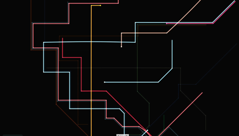
One of the areas that we believe artist and exhibit designers will continue to explore is the world of using real-time data to provide an understating or awareness of our world today – right now! We previously looked at some earlier examples here in this blog, here. Recently, we’ve run across some new examples to enjoy and consider. The first is http://www.mta.me/ by Alexander Chen.


Here is video from the site:


This experience turns the New York Subway map into a musical instrument which varies depending on when you launch the website because it takes data directly from current subway movements.

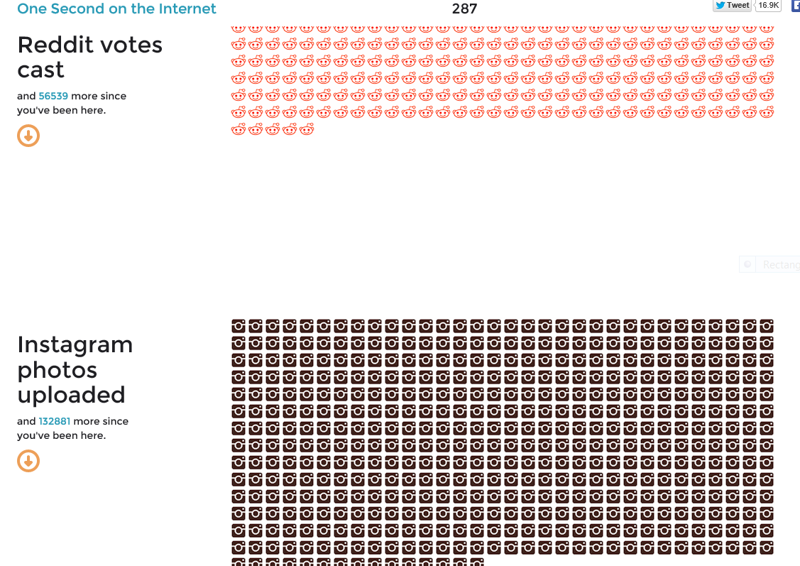
The second example is the web site http://onesecond.designly.com/ , designed by designly.com.


We believe that the fascination with understanding the current state of the world, whether it be straightforward or through an artistic expression such as music, relates to a key aspect that museums often struggle with:

How to make a visitor’s next visit truly different from the last time they visited.

One way to respond to this challenge is to explore how to celebrate and present, in both engaging and three-dimensional ways, the once-in-a-lifetime experience that is this very second on the timeline.

What interesting examples of real-time data have you seen? What would you like to see?! Share your ideas here.

Posted in: Experiences and Museums

Tags: , , ,

Leave a comment