February 2013

Mechanical Interactive Walls

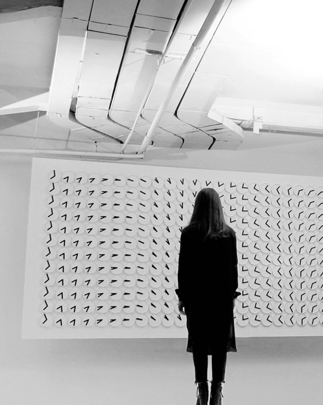
Some of the exhibits that have always seemed to suck us into mesmerizing states of fascination have actually been interactive (and at times non-interactive) large-scale wall experiences. Recently, we have become aware of two that should get your brain turning and will no doubt “spin off” countless ideas. (Pardon the pun, which you’ll understand when you see these.) The first is a work by the design group called Humans Since 1982. This is called “A Million Times.”


Made with clocks (a subtle time-related experience, connected in this way to the melting piece Calamidad Cósmica), this piece can create messages and depict complex patterns and fields, suggesting many ideas for riffing and evoking many related ideas and aspects. A system like this could be responsive to viewers or to objects such as magnets or other more technological EM transmitters (i.e. cell phones anyone?). This could be a beautiful way to engage people in some complex ideas. On its onw it’s a beautiful, evocative piece.

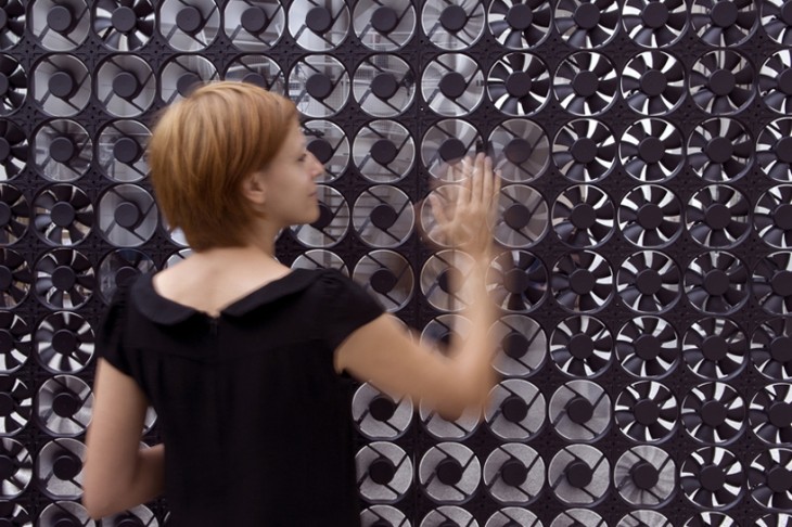
Another piece we ran across was the experience “Flow 5.0” by Daan Roosegaarde a Dutch artist.


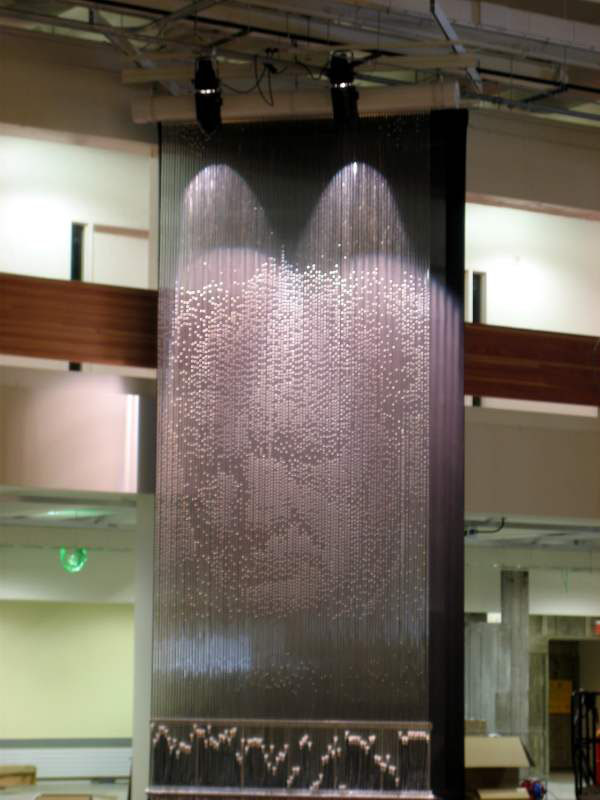
Here, what interests us is that fact that this interactive piece is different than, say, “Pipe Dream” by Bruce Shapiro    
 

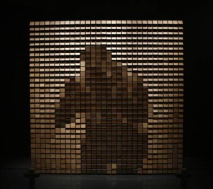
or the work of Daniel Rozin (like this at the Perot Museum).    


“Flow 5.0” actually sends something physical back to the viewer – moving air. This could open up other ideas about what else could touch the viewer/user that they might explore or appreciate.

Certainly, with both the physical and visual interactive and non-interactive wall experiences, there is ample material and inspiration to evoke some truly immersive and memorable museum visits, not to mention make many buildings more engaging.

Let us know about more if you run across them. What ideas do these spin off?
Posted in: Alchemy Today, Experiences and Museums

Tags: , , , ,

2 Responses

creating a smile with scale

To combat the winter blahs this week our inspiration takes us back to playing with scale but with a little levity.  As we have mentioned before,  playing with scale is both an artist’s as well as a designer’s invaluable tool. While used as a sense of awe, its role in creating humor and fun – a moment of levity in a serious world or serious museum “environment” – should perhaps be explored more often. Here are two favorites that have passed by our desk this week.
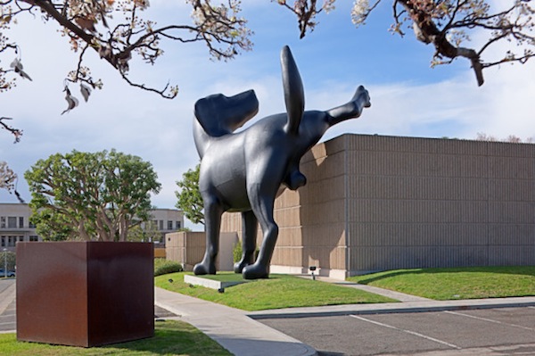
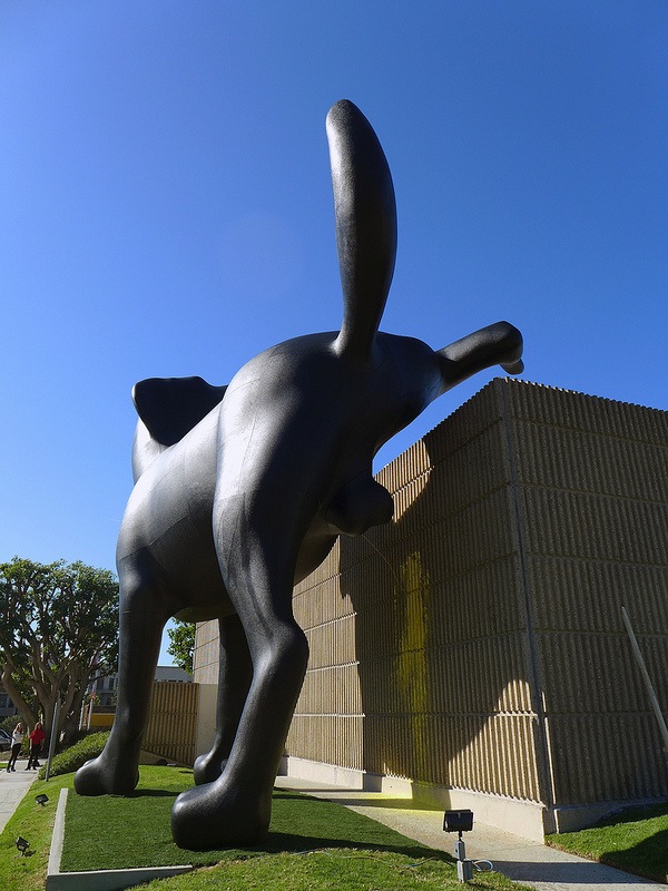
The first is the great installation called “Bad Dog” (we need to admit that ALCHEMY studio has two office Labradors).

Yes, that’s yellow paint that get sprayed on the museum wall. Check out the public’ reaction through this local tv story!

This work, done by Richard Jackson, is part of an exhibition called “Ain’t Painting A Pain” at the Orange County Museum of Art, which provides a retrospective of the Los Angeles artist’s work.

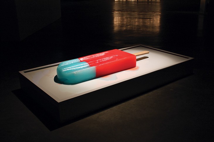
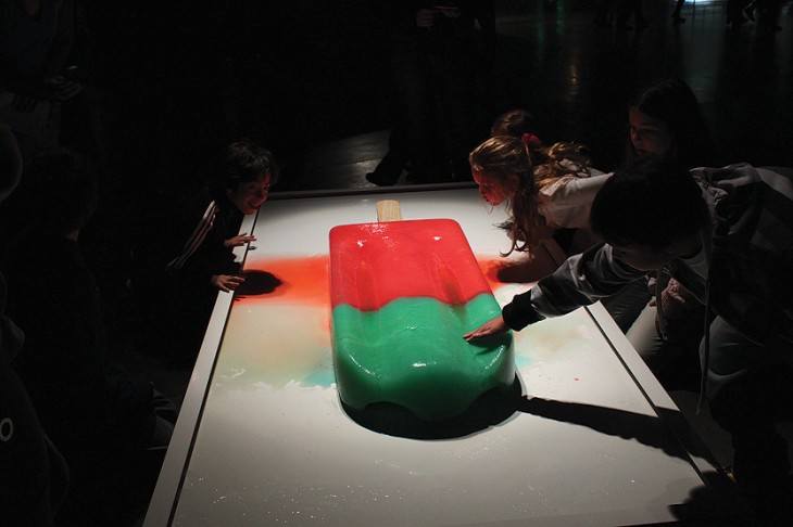
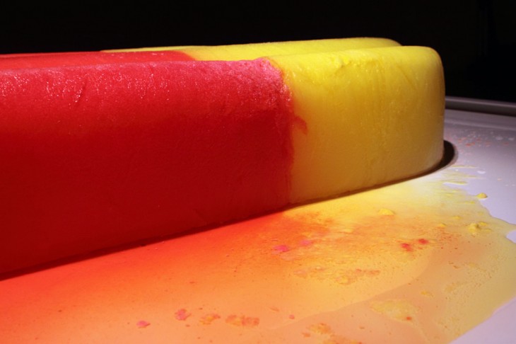
The second is the piece “Calamidad Cósmica” by the artist Luciana Rondolini.


These giant popsicles are intended to have viewers reflect on the process of time elapsing. Of course, they also evoke the fun and memories that such items have played in one’s life. Surely an exhibit such as this would be great fun in a children’s museum or as a surprise encounter in an outside gallery.

Be sure to send us your fun encounters with scale and look for some upcoming inspirations sparked by ideas about time.

Posted in: Experiences and Museums

Tags: , , , ,

Leave a comment

Museum Directions

InPark magazine in its latest issue about museums asked ALCHEMY studio, Wayne LaBar to provides some thoughts on the direction of museum interactivity. You can check it out at the following link.

Posted in: Experiences and Museums, News

Leave a comment

3D Projections

Amazing 3D projection projects – Moving from informational to expression.

In the museum and experience context, the idea of projection to convey information  is a common occurrence.  Here at the studio we are looking to explore how the projection itself  - not the content of the projection – can be used to excite, awe, and engage the public in ways maybe no one thought it could. You might say these are “engagement screens.”

On side of the scale, where the projection is “complete” but the screen invites interactivity, is this novel and cool “water” projection by art studio Red Paper Heart.

Wow made us want to dive right in.

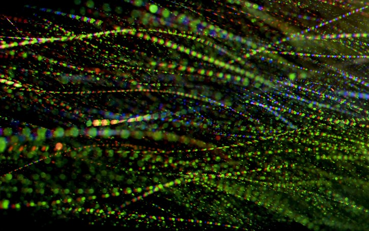
On the opposite side of the spectrum, the screen’s inability to express the complete image is the beauty and allure of this experiment that Brian Mafftt did during the recent “Nemo” winter storm. Funny, in reality it also uses “water” like the above example – just in a different form.


In fact, you can tell it’s a DLP projector by the red, green and blue “sparkles” – a wonderful way of showing how a projection image is composed of these colors. You can see some of his still images here.


Now, of course, we have seen images projected on fog and images made of water, but there is something compelling about both of these and the fact that the “screen” itself can be the power of a projected experience versus the image projected. Obviously, a powerful experience would be to marry both of them. If you have other examples or ideas, please feel free to share them here.

Posted in: Alchemy Today, Experiences and Museums

Tags: , , ,

Leave a comment

wonderful web play

These days here at the studio, we are always on the hunt for innovative and engaging ways to interact with the digital environment. This certainly applies to how visitors might interact with something that has a screen. After all, resorting back to traditional interfaces and imagery seems pointless in a world where our home digital world is complex.

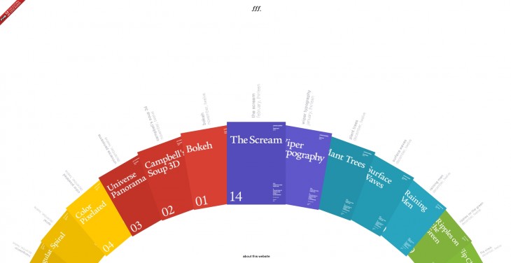
A recent source of inspiration is the developing portal/palate of experience created by Jongmin Kim of Form Follow FunctionOne note: From video this site appears to be designed first for the iOS. Try you iPad if you have one. We found at times that our Chrome browser had problems working the site. You might need to use IE or Safari. It’s a little wonky at times.

form follows function

While we suggest you spend some time experimenting and exploring these (all of which we found to be great fun), there are certain ones that felt instantly transferable to some of the content we are often trying to portray.


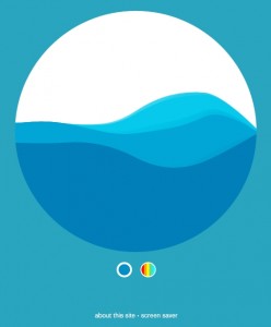
Surface Waves

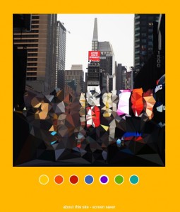
Triangulation


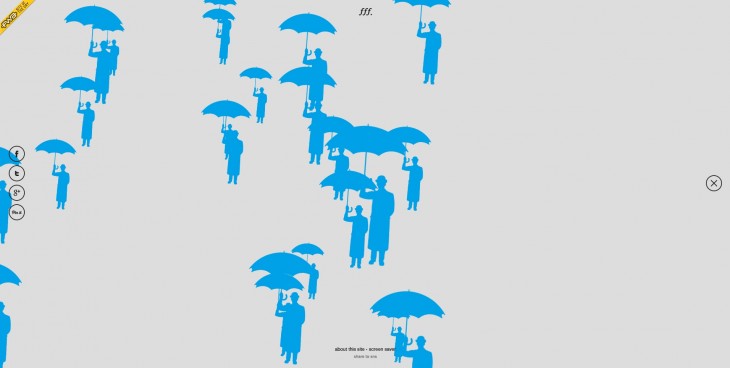
Try “Color Pixelated,” “Surface Waves,” and “Ripples on the Green” to name a few. And as you will see, there are more experiences coming!

We were instantly struck by how interesting some of these might be if projected in a large format, or represented so visitors could interact with their whole bodies rather than just a mouse or finger. What this also goes to show is that, often, we try to use computers in exhibits to cram in lots of information while, instead,

these make the interactivity laser-like in focus – a nod to the idea that simplicity can make for better and more engaging experiences.


We suggest you also look at Jongmin’s other work on his site.

One note: We found at times that our Chrome browser had problems working the site. You might need to use IE or Safari.

Let us know your thoughts and reactions!


Posted in: Experiences and Museums

Tags: , , ,

Leave a comment