These days here at the studio, we are always on the hunt for innovative and engaging ways to interact with the digital environment. This certainly applies to how visitors might interact with something that has a screen. After all, resorting back to traditional interfaces and imagery seems pointless in a world where our home digital world is complex.
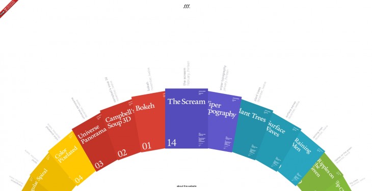
A recent source of inspiration is the developing portal/palate of experience created by Jongmin Kim of Form Follow Function. One note: From video this site appears to be designed first for the iOS. Try you iPad if you have one. We found at times that our Chrome browser had problems working the site. You might need to use IE or Safari. It’s a little wonky at times.
While we suggest you spend some time experimenting and exploring these (all of which we found to be great fun), there are certain ones that felt instantly transferable to some of the content we are often trying to portray.
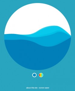
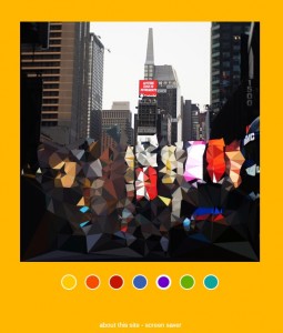
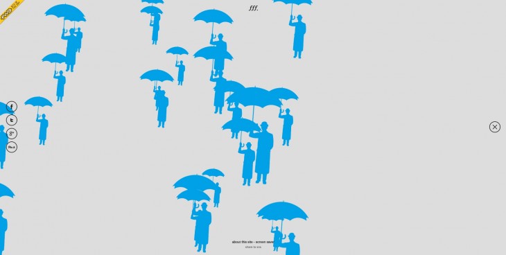
Try “Color Pixelated,” “Surface Waves,” and “Ripples on the Green” to name a few. And as you will see, there are more experiences coming!
We were instantly struck by how interesting some of these might be if projected in a large format, or represented so visitors could interact with their whole bodies rather than just a mouse or finger. What this also goes to show is that, often, we try to use computers in exhibits to cram in lots of information while, instead,
these make the interactivity laser-like in focus – a nod to the idea that simplicity can make for better and more engaging experiences.
We suggest you also look at Jongmin’s other work on his site.
One note: We found at times that our Chrome browser had problems working the site. You might need to use IE or Safari.
Let us know your thoughts and reactions!


