As we all know, there are constant technological and creative leaps being taken that impact and add to the palette of materials, techniques and approaches that can be applied to experience planning and design. This week we have run across three examples that have gotten us thinking and brainstorming how they might be applied.
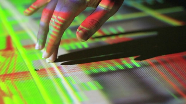
The first is an installation called Contact, created by Felix Faire as a research project at the Interactive Architecture Lab – Bartlett School of Architecture and now on display at the Royal Academy of Arts in London in the exhibition Sensing Spaces.
What Felix has done is create a way to make any hard surface into an interface. Certainly this piece will find its way into more museums but perhaps even more interesting is the idea of using this technique to make any surface a controller. In a museum setting, this might be a graphic panel, a piece of exhibition armature, or a vitrine. What is interesting is thinking about removing the need or ubiquity of the physical “interactive” control or screen.
You can watch a vidoe of how Contact was made here.
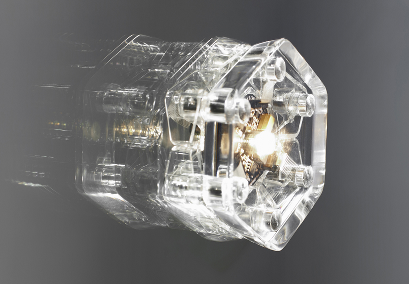
The second example is a new lighting system from Codha called Crypsis. Take a look.
Using a system like this would certainly alter significantly the way we may light artifacts and other items in display cases. In fact, this is the first way this system will be tested. In addition, this offers a unique opportunity for museums to have visitors experiment with light and could also be incorporated into physics exhibits or even maker spaces.
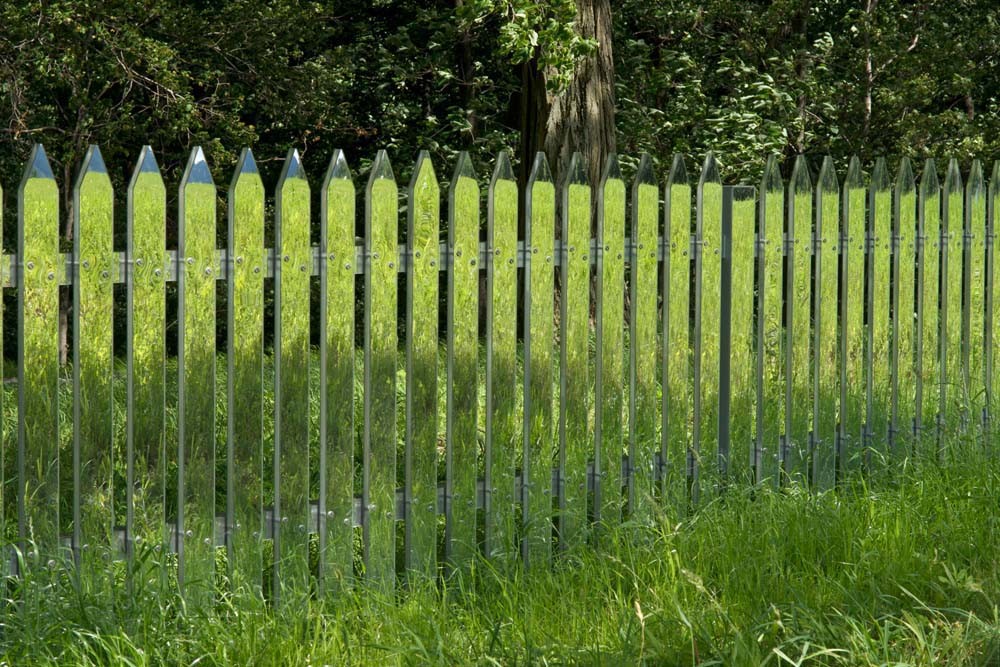
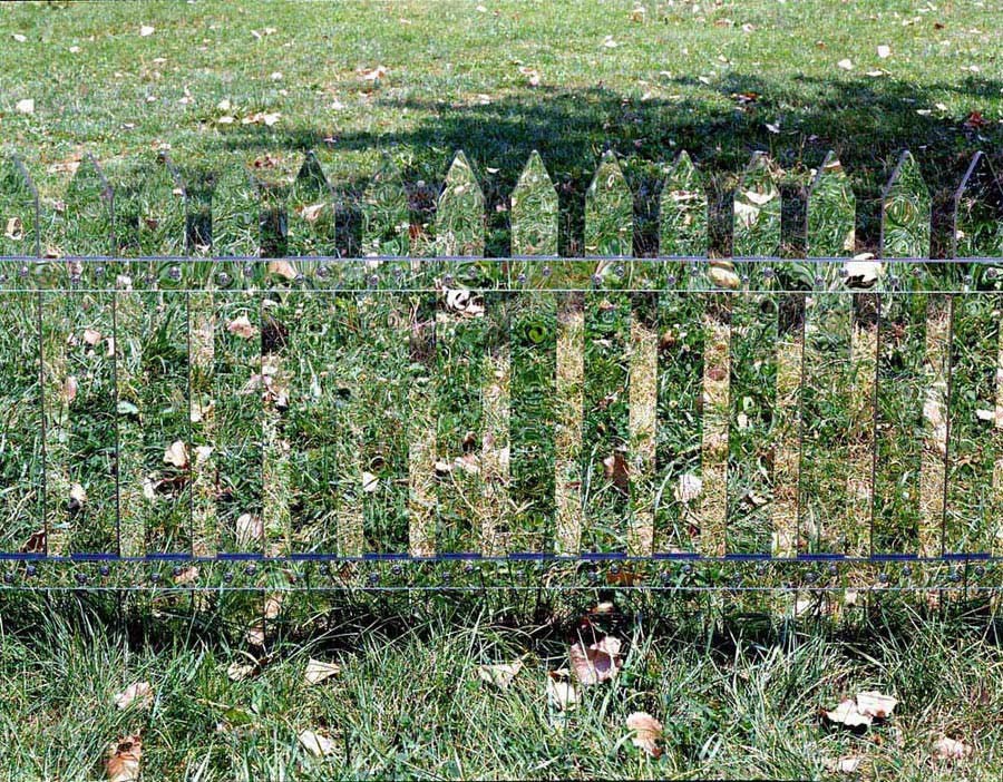
The final interesting piece is the mirror fence concept by Alyson Shotz.
Simple in its execution and an interesting work of art, the concept of the mirror fence seems like it could be useful in any situation where you need to create a separation of space but you don’t want that operation to be detectible from a visitor’s perspective. For us, zoo enclosures came to mind immediately. Where could use imagine using a mirror fence?
We’d love to hear from you about what ideas these examples sparked for you.
